Forms are often a necessary part of the website creation process.
That doesn’t mean that they’re easy to build, of course. They can be. But not always.
Maybe they need some fancy features, like conditional logic or calculations, in order to work the way you want. Or maybe they’re just ugly and you’re not sure how to “pretty” them up.
If you’re not a web developer or designer, but you’re still building forms yourself, it might feel intimidating to tackle the complexities of form building.
This is doubly true if you have questions about the form-building process.
What are the best tools for form building? How many forms fields do you need? What happens after someone submits a form? What does a good form landing page look like?
The good news is that you don’t have to be a web developer or designer to build functional, optimized web forms. You just need a few answers to your questions.
With that in mind, here is a simple guide to building web forms in WordPress (even if you’re not totally WordPress-savvy).
How Form Design Impacts the User Experience
Before we dive into the specifics of form building and optimization, it’s important to understand the “why” behind the form you’re building.
When it comes time to build your forms, you will need to know:
- How long the form should be
- What sort of features it should contain
- What fields it should include
- What it should look like
- Where it should be placed on your website
- Whether or not it’s converting like it should
Each type of form will have different “rules” that impact its creation.
A contact form and a product purchase form are very different, and should look, feel and act differently, for example.
But beyond creation, forms also play a role in how users experience and relate to your business.
In their book, Forms That Work: Designing Web Forms for Usability, authors Caroline Jarrett and Gerry Gaffney believe that there are three keys that drive form submissions:
- Relationship — Is the form (or the website) trustworthy?
- Conversation — Is the form asking questions the user can answer?
- Design — Is the form itself easy to use (clear and concise)?
Here’s how that breaks down in practical terms.
1. Forms must communicate trust
Even if you built the most functionally advanced and beautiful form on the planet, you won’t get submissions of people don’t trust it.
This means that your form design — the look, but also the questions themselves — must communicate trust.
Take a look at this example of this simple contact form:
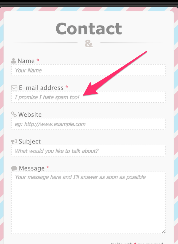
Do you notice the phrase “I promise I hate spam!” in the email address box? This is a trust signal.
It says to the user, “We won’t violate your privacy if you fill out and submit this form. You can trust us with your private information.”
Even the most basic contact form or email opt-in should evoke trust and protect your relationship to the user.
This might mean keeping questions to the scope of the form (e.g. don’t ask for a phone number if you’re not going to call) or it might mean tailoring the submission process to specific users.
Amazon, for example, simplifies their sign-up/sign-in process for registered and new customers.
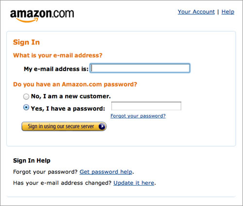
This shows that they understand that more than one type of user is filling out their form, but that every user should have the same (quick, easy) experience, which is a subtle trust signal.
The more trust you can build with the user, the more form conversions you will see.
2. Forms must ask the right questions
Filling out a form is just like a conversation. One side asks questions, the other responds, and then the first side confirms.
But it’s not an interrogation. Or, at least, it shouldn’t come off that way.
Form labels, for example, should be helpful and descriptive, and not just assume that users know what information they’re about to be asked.
The order of the questions should also be logical. If questions are confusing, an explanation should exist somewhere, like a pop-up or even in the form label itself.
Here’s an example from Yahoo’s registration form (“In case you forget…”):
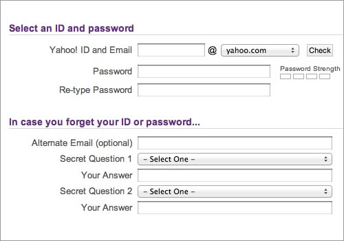
This is a great example of a form label that clarifies the questions beneath it (it’s an optional section, not a mandatory one) but is also helpful. If you forget your password, you don’t need to go through extra work to change it.
It’s also conversational. It treats you like a real person, who probably forgets your password (as we all do).
Forms that use a “conversational tone,” like the example above from Yahoo, tend to perform better than those that sound like they were written by robots.
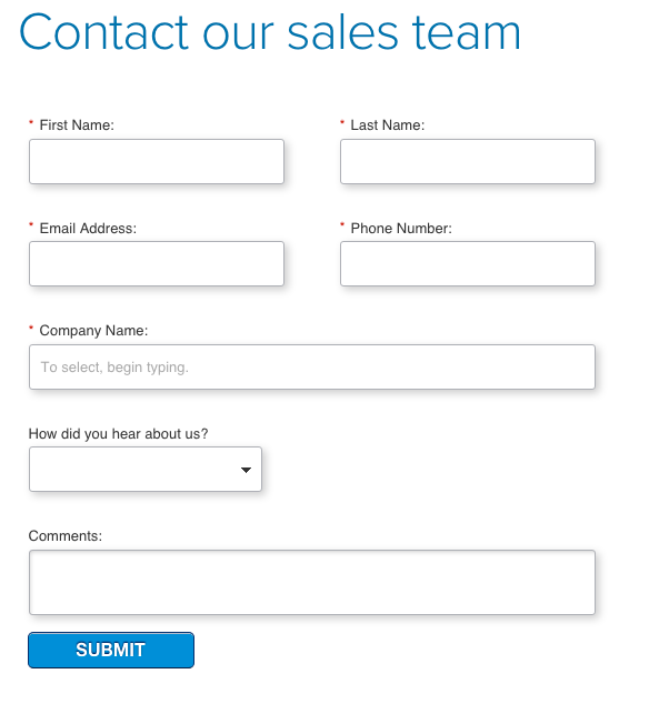
3. Forms must be visually appealing
Design is another important component to form conversions.
Take this form, for example:
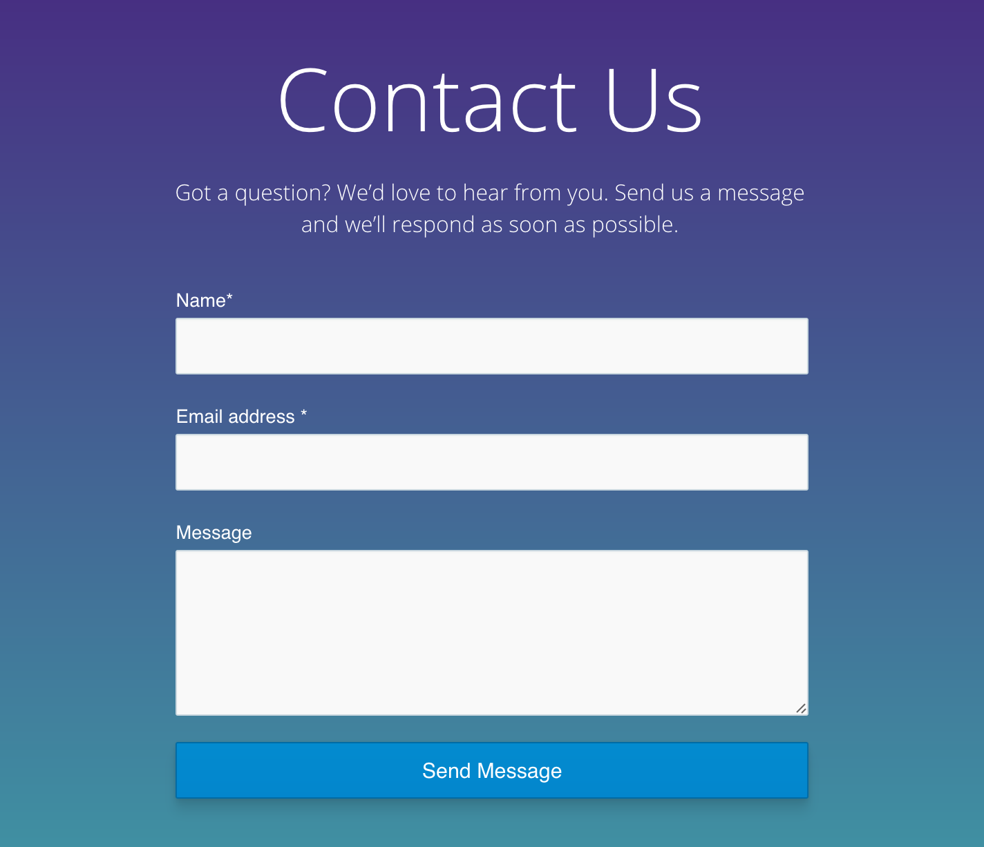
It’s clean, uncluttered and straight to the point. It’s a well-designed form from a functional standpoint, but it’s also nice to look at (good use of colors and shading).
But good form design is about more than just choosing certain colors or font sizes.
It’s also about things like form field order and form length. Form length can impact conversions, for instance.
But it’s not something you would necessarily think about if you’re not a web developer or designer who builds hundreds of web forms all the time.
It’s the little things that matter when it comes to form design. It’s about the surrounding text and images.
Take a look at this example from Salesforce:
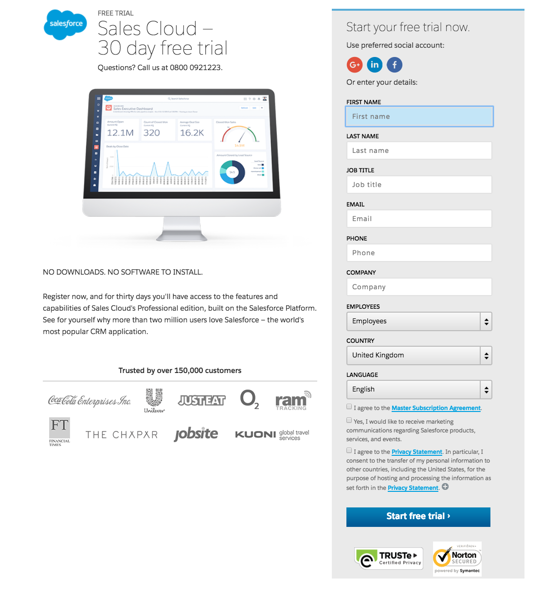
The images on the landing page of the form play an important role in building trust. Notice the “trusted by over 150,000 customers” wording, the logos, and the verified trust symbols at the bottom of the form itself.
These design elements enhance the form.
When you’re thinking about building forms, you have to consider how each of these elements — relationship (trustworthiness), conversation (questions), and design — all work together.
Each type of form you create will combine these elements in different ways.
The Basics of Form Design
Now that you understand the elements of a form, it’s time to get into the basics of form design.
Most forms include the following components:
- Structure — The order of your form fields as well as the form’s logical flow from one section to the next
- Input fields — Your text fields, checkboxes, radio buttons, and so on.
- Field labels — Descriptive text that explains what each field is for
- CTA button — The Call-to-Action (CTA) button either completes the form or moves them to the next stage (in a multi-step form)
- Confirmation — This could be a thank-you page or some type of confirmation message, or an error message if something went wrong
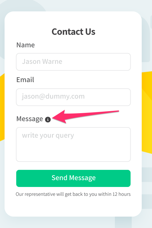
Some forms might also include “assistance” features like label explanations:
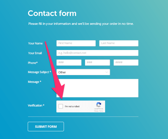
Or verification fields, like reCAPTCHA:
Here is a rundown of how each component impacts design.
1. Form Structure
How you organize your form matters.
A single-step form with limited form fields, like an email opt-in form, is fairly easy to organize. It usually goes something like: name, email address, CTA button.
But longer forms require a different organizational structure. You might have to use multi-step form structure.
Multi-step forms are most commonly seen in ecommerce checkout forms, like this:
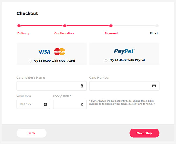
But they can also be used for longer contact forms, surveys, event registrations, or anything that requires multiple sections and/or form fields.
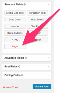
In WordPress using Gravity Forms, you can create multi-step forms (also called multi-page forms) using the standard form creation process, but adding “pages” to separate sections.
Multi-step or multi-page forms can be great options even if you don’t have all that many form fields.
When one site changed their consulting enquiry form from a single-step contact form to a multi-step form, for example, they saw a 743% increase in leads.
They found that the multi-step form reduced “psychological friction” for the user and that it was less overwhelming for them to complete. The progress bar also encouraged form completion.
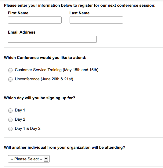
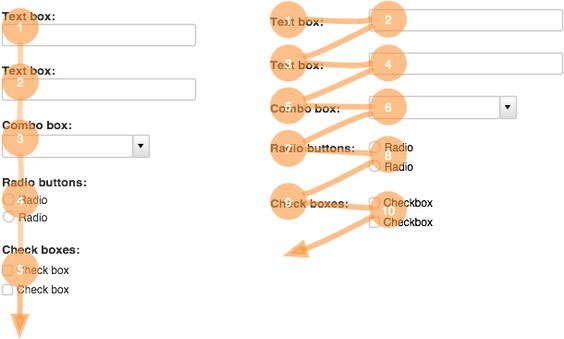
But if you do decide to stick with a single-step (single-page) form structure, it’s important to group related content together or provide some type of visual separation:
You also want to avoid placing questions directly next to each other, and instead stack them.
Eye-tracking studies have shown that side-by-side positioning tends to be less effective than stacked positioning (with the exception being for date or time fields).
How you structure your form is up to you. Just remember to keep it as logical and orderly as possible so users don’t get confused.
2. Input Fields
The next component of form design is the input fields themselves.
Simple forms might include just a couple of text fields, while “complex” forms might have password fields, dropdowns or radio buttons, checkboxes, date-pickers, calculations, and so on.
The type of form will determine the number of inputs you ultimately need.
Product order forms, for example, might need extra fields that communicate trust (like password verification), progress bars, cost calculations, and account creation options.
In one survey, respondents indicated that each of those input fields impacted whether or not they completed the checkout process.
Skip one of those input fields on something like an order form and it might hurt your conversions.
On the other hand, too many fields can also impact conversions.
Expedia, for example, lost $12 million when they added a “company name” input field to their booking form, but saw improvements to their conversion rates when they removed it.
Consider removing all non-essential input fields from your forms to simplify them. Or consider adding conditional logic to expand or simplify forms based on who is filling them out.
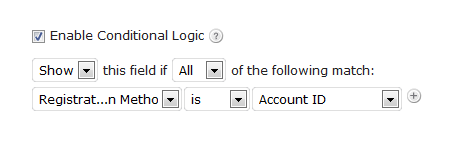
This way only certain form fields appear to certain users, so only the essential information is being presented to the majority of your site visitors.
This not only cleans up the look of your form, but gives users the advantage of answering only the questions they absolutely need to.
3. Field Labels
The way you label your input fields will either make the form easier or harder to complete.
Google’s user experience team found that their form completion time increased when form labels were aligned above the input fields, rather than next to them, and that left-centered labels were more favorable.
They reasoned that left-sided, top-sided labels caused fewer “visual fixations” and helped the user process the questions faster.
Aside from alignment, labels should have a short and clear headline.
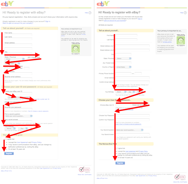
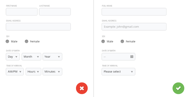
In 2011, Amazon changed their registration forms from this:
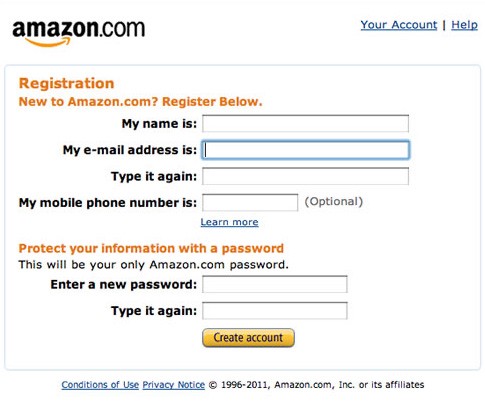
To this:
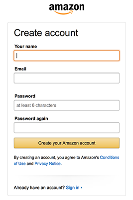
Which not only helped the design of the form, but also made it easier to understand what fields are required.
Now there are clear labels (“Your name,” “Email,” “Password,” “Password again”) and a clear CTA button that simplifies the process.
It doesn’t necessarily matter whether or not you use upper or lower case (“Your name” vs. “Your Name”) as long as things are consistent.
4. CTA Button
The CTA button guides users to the next stage of the process, whether it’s the submission point or simply the next step in a multi-step form.
But it’s essential for the CTA button to communicate what will happen once it’s clicked.
This can be something as simple as “Submit,” but you should make sure that your CTA button will improve your conversions.
In one test by BettingExpert, they switched their CTA button to add the result the user would receive upon submission:
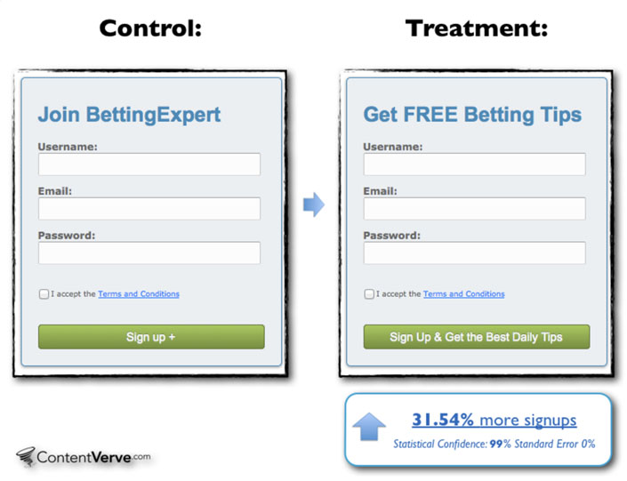
They received 31.54% more sign-ups, even though their CTA button was longer.
But a longer CTA isn’t necessarily the best option in all cases, especially depending on where your form is listed on your site and the form type itself.
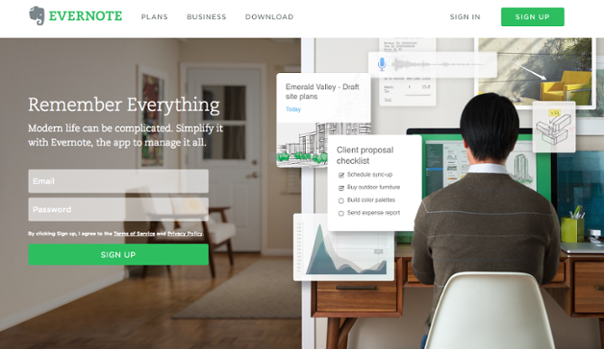
A homepage sign-up form, like this one from Evernote, does perfectly well with two words:
It’s best to play around with your form CTA button to see which will be the most effective.
You can do this by A/B testing your buttons and your forms after completion (you can learn more about customizing your CTA buttons using Gravity Forms here).
5. Confirmation
Last but not least, your form needs some sort of confirmation feature.
This might be a thank-you page, an email notification, a pop-up, or all three.
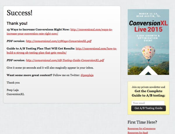
Ideally, the form confirmation should do two things:
- Confirm that there were no errors and the form submitted properly
- Lead the user to the “next steps” of interacting with your business
If you’re just worried about the first one (proper submission), a pop-up might be enough to let the user know that everything worked.
But if you want to take things a step further, consider using a thank-you page or email notifications to add more to the interaction.
You might include a referral link, for example:

Or way for them to follow you on social media.
Other pertinent information might help, like how long they should wait to hear from you, when their download will be ready, or what else on your site might interest them.
Giving them something more allows you to truly optimize your form for conversions, not just for information gathering.
WordPress form building tools
At this point you should understand what goes into creating your form.
If you’re using WordPress, you can start building your form structure with a tool like Gravity Form’s drag-and-drop builder.
This will allow you build a basic form with input fields, form labels, conditional logic, and almost anything else you might need.
But if you’re still not sure how to structure your forms, take a look at these live demos. It should give you a standard template for building your form, which you can then build off of if needed.
You can also check out this WordPress landing page (using Gravity Forms) guide here.
How to Optimize Your Forms
Once you know how to build a form, the next step is learning how to optimize your form for maximum conversions.
Here are a few areas on your form that deserve your attention:
1. Play around with form location
Form location matters for conversions.
When it comes to homepage forms, having it above the fold (one of the first thing your user sees on the homepage) can help improve conversions.

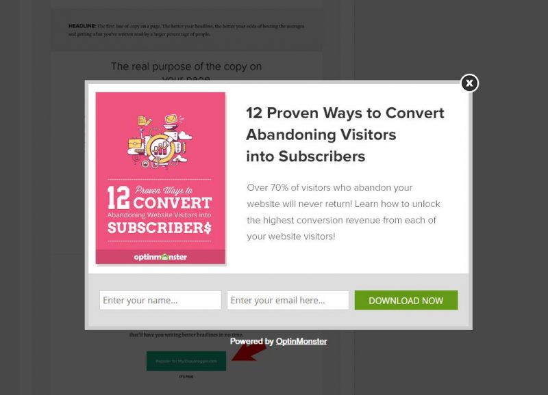
If you have something like an opt-in form, you can also use a timed pop-up to put your form front and center on any landing page of your site, including blog pages.
If your form is on a page with other non-form related content, make sure you find ways for it to stand out.
2. Remove unnecessary fields from single-step forms
We’ve already mentioned this a bit, but it’s an important point of optimization you don’t want to overlook.
Consider removing any form fields that you don’t absolutely need, like phone number, age, location, job title, and so on.
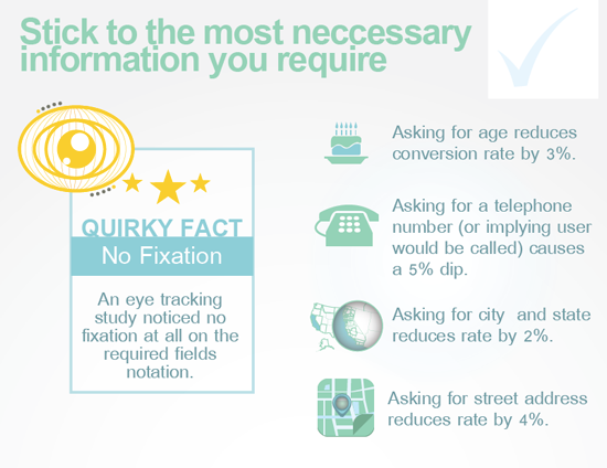
Unless your sales team uses this information to nurture leads, skip it.
3. Add fields to multi-step forms
Of course, the opposite is often true for multi-step forms.
In one case study, a company added form fields and increased their conversions by 214%.

The study suggested that because multi-step forms are less overwhelming for users, asking more questions can help create a sense of momentum.
When users see the progress bar, they experience what’s known as the “endowed progress effect“, a psychological trigger that makes it easier to complete something if we think we’re making progress.
So the more questions you add to the form, the more pages users will progress through, and the more likely they will be to submit the form.
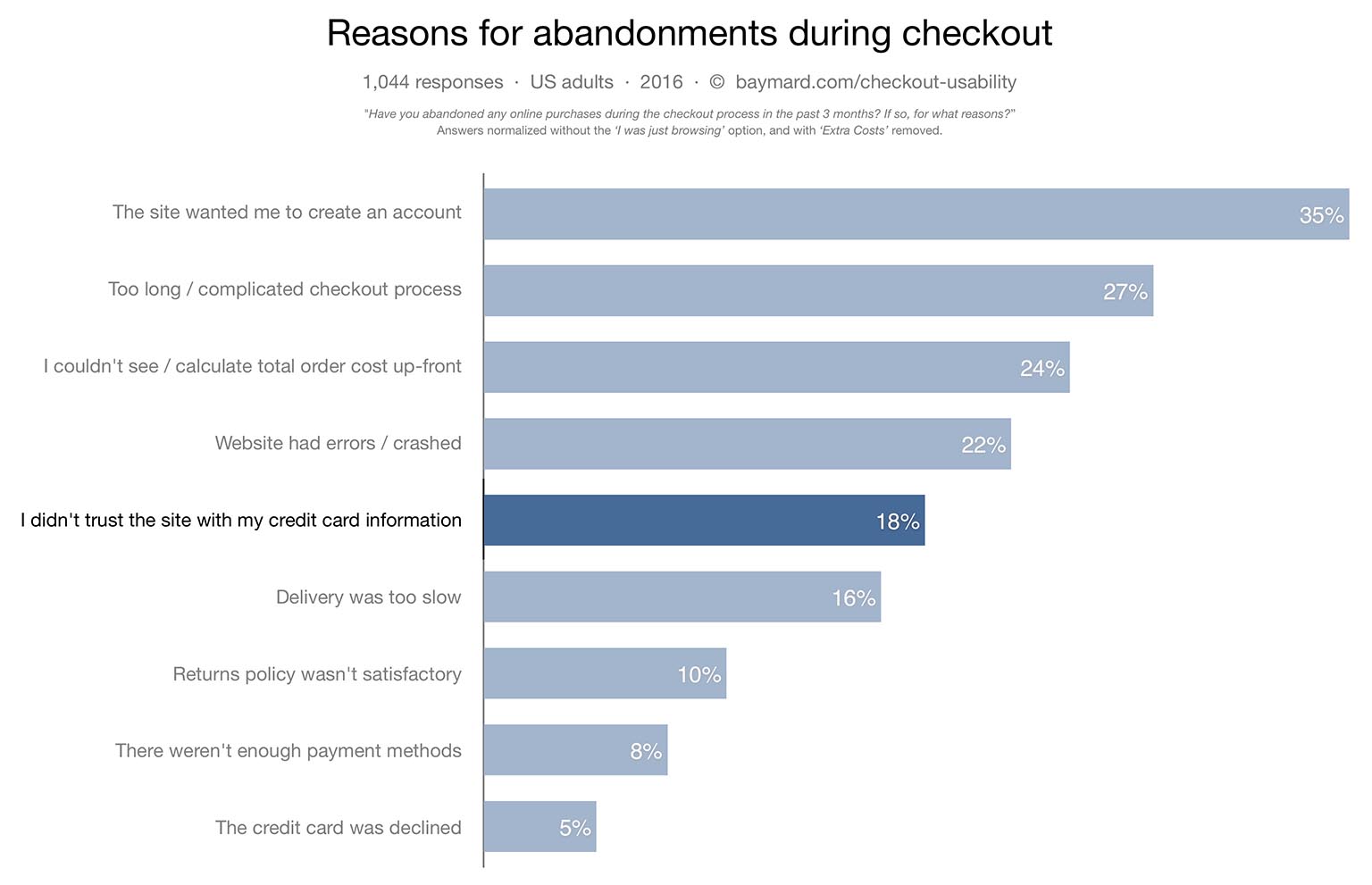
4. Clearly label payment fields
In research done by The Baymard Institute, they found that “92% of top ecommerce sites have inadequate form field descriptions in their checkout process”
When asking for important information, like credit card details, it’s important to clarify the best format for the user to share information.
Take a look at this example below:
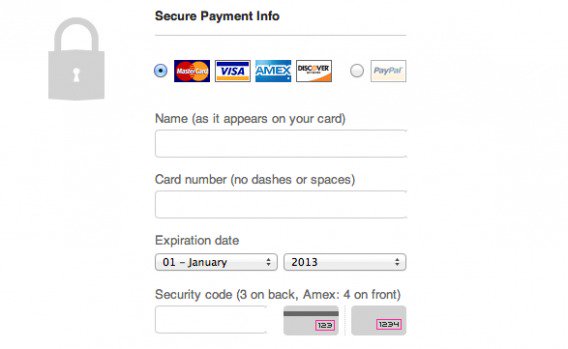
The clarifying text explains that users shouldn’t just input their name, but their name as it appears on their card.
It also explains how users should input their card information and what the “security code” means.
There are other ways you can clarify this information outside of your label, like including a pop-up or a link to explanatory text. But it should be included in your form in some degree.
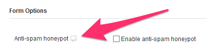
5. Use reCAPTCHA (or no CAPTCHA)
CAPTCHA has long been the go-to solution for user verification and anti-spam measures, but it doesn’t really work for conversions.

When Animoto removed CAPTCHAs from their sign-up forms, they boosted their conversion rate from 48% to 64% in a short period of time.
In another case study, one developer removed all CAPTCHA from his forms and found that spam submissions didn’t increase at all.
It’s not that you can’t use some form of verification, of course. But if you’re looking to make things easy on the user, it’s better to skip the CAPTCHA step unless absolutely necessary.
Even then, you can use something like the honeypot method to stop spam instead
6. Add details to your error messages
Another thing that impacts conversions is your error messages.
When something goes wrong, it’s important that the user understands exactly what is wrong and how to fix it. When left with doubt, users can easily say, “Forget it!” and leave without completing the form.
In this example, one form user points out the frustrating process of being given an error message with no chance to rectify it, saying, “I wish they’d have given me a ‘password recover’ option in case that was my email.”
He goes on to note that ambiguity in error messages (when the user doesn’t know what’s wrong) can hinder the submission process and make trust-building difficult.
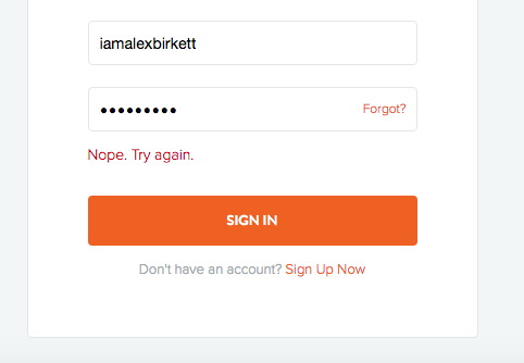
In order to create a better experience for the user, it’s important to clarify anything that goes wrong and explain what the user should do to fix it.
7. Optimize for mobile
In fact, more and more users will be using mobile devices to browse your site (and submit forms) from now and into the future.

Following the best practices in this post should give you a form that is mobile-friendly, but there are a few things you need to remember.
Stacking your form input fields and labels vertically (instead of piling them next to each other) can help their appearance on mobile devices.
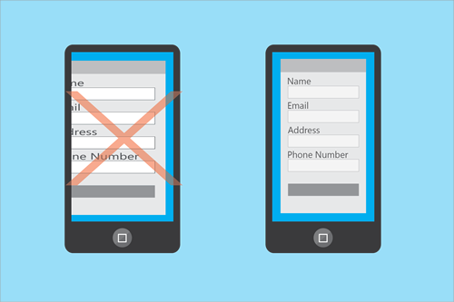
Adding collapsible menus and dropdowns can also help mobile users navigate mobile forms faster and easier. You should also use fewer form fields if possible, and increase the size of your CTA button.
The more you can do to help the appearance and functionality of your forms on mobile devices, the better your conversion rate should be.
The “best” conversion rates for your forms
While it would be nice to say that you could just follow all the rules laid out here and create awesome, optimized forms, it’s not always the case.
You might have an audience that prefers certain CTA buttons, or likes their forms to be single-step rather than multi-step, so all the examples above could be meaningless to you.
The only way you’ll know for sure is to A/B test for the highest conversion rate. But before you can start A/B testing, you have to know the ideal conversion rate for your forms.
When Formstack released their benchmark Form Conversion Report, they found that conversion rates for forms actually depended more on industry than form type.
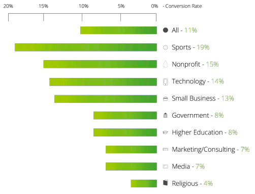
The average conversion rate for most sites was around 11%, meaning that if you have a conversion rate of around 15%, you’re probably okay.
If you’re seeing rates under 10%, that’s not necessarily an indicator that things are wrong if you’re in the marketing or media industry.
The only time you have to worry is if you’re seeing conversion rates around 2-3% for your forms, which is low for almost all industries.
How to find your form conversion rate
So, how do you figure out your conversion rate?
The conversion formula looks like this:
Conversion rate = number of desired actions / number of units
If 2,000 people visit your form landing page, but only 80 sign-up for your email list, then your conversion rate is 4%.
You will have to take a deep dive into your analytics to determine your conversion rate.
You can do this process manually by comparing your form submissions to your landing page traffic number, but if you’re using a tool like Google Analytics, there are ways you can set it up to automatically track conversions.
You want to make sure that you’re not just tracking the traffic numbers and bounce rates or conversion rates that Google Analytics gives you right off the bat, however (it might not be accurate).
What you want to do is setup event tracking for every form you’ve created.
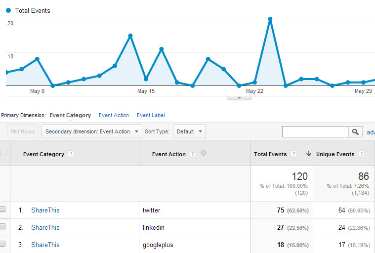
Event tracking will enable Google Analytics to compare an event (a sign-up) against your traffic to give you a more accurate conversion and bounce rate.
That way you can determine your conversion rate for every form so you know whether or not you need to adjust any elements to improve your conversions.
Once you have a solid idea of what your conversion rate is, you’ll want to do some A/B testing to see if you can improve it.
How to A/B Test Forms in WordPress
If you’ve never performed an A/B test before, don’t feel intimidated. There are plenty of tools out there to get you started.
But before we look at tools, here’s what you need to know about A/B testing.
What to know about A/B testing your forms
A/B testing (also called split testing) is the process of creating two versions of the same form (or landing page, website, etc.) to see which one performs better with a specific audience.

The goal is to identify any elements that are causing your forms to underperform.
For example, if some users will fill out a form if it just asks for their name and email, but won’t fill it out if it asks for their phone number too, then you know you should remove the phone number input field to improve conversions.
There is some room for error and mixed results, of course. Not every A/B test will reveal anything significant about your forms.
But it can give you better understanding into how your forms are generally performing.
If you’re worried about creating multiple forms and landing pages and programming and coding your website, don’t worry.
There are non-developer friendly WordPress plugins you can use to help with this.
A/B testing WordPress plugins for non-developers
Here are a few of the basic A/B testing tools/plugins you can use:
WordPress Calls to Action – While this was originally created to test landing page headlines, you can also use it for form CTA buttons and other content on your form landing pages. It’s a free plugin that allows you to track conversion rates as well as setup multivariate testing (when you modify more than one element at once).

WordPress Landing Pages – While not form related, this will allow you to split test your form landing pages for better conversions. You can easily clone pages and change elements for multivariate testing.
Simple Page Tester plugin – This is a very user-friendly WordPress plugin that will enable anyone to A/B test forms, whether or not you understand code. It’s free, but it does have a premium upgrade ($59) that adds some additional features.
Nelio AB Testing – This A/B testing tool is extremely robust, and includes features that you won’t find with other tools, like heatmaps that show exactly where your users are looking.

The ongoing A/B testing service is not free, but if you create a lot of forms and you’re worried about your conversions, it’s worth the cost. The basic plan will run you around $24/month, while the prices go up to $74 for the professional level and $214 for enterprises.
For those that are price-conscious, they do have a free plugin for WordPress that can be added to your sites to test your forms in a pinch. You won’t get some of the advanced features, but it’s better than nothing.
A/B Press Optimizer – This plugin gives you a lot to work with, including unlimited testings. The Personal plan is around $49 (for one website) and prices go up from there ($99 and $199, respectively), but you get real-time reporting and support from professionals.
If none of these tools appeal to you, you can always manually A/B test using Google Analytics (you can find a more in-depth guide to the process here), which is completely free.
A/B test you should perform
But what sorts of things should you A/B test, exactly?
Here are a couple options:
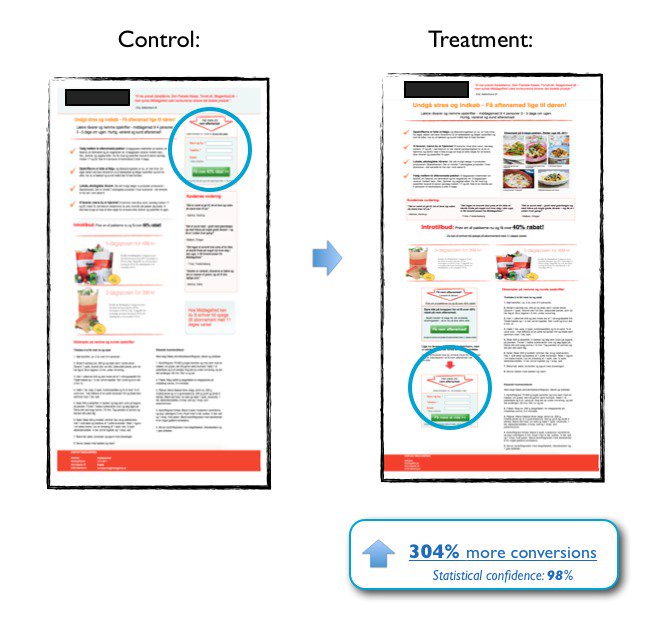
Test the placement of your form on the landing page
Play around with landing page locations to see what works best. You might try above the fold, below the fold, or both.
In one case study, a form that was moved below the fold in an A/B test saw 304% more conversions than the original location at the top of the page.
If your form is on a dedicated landing page, test whether or not your landing page copy works better to the side of the form, or above/below it instead.
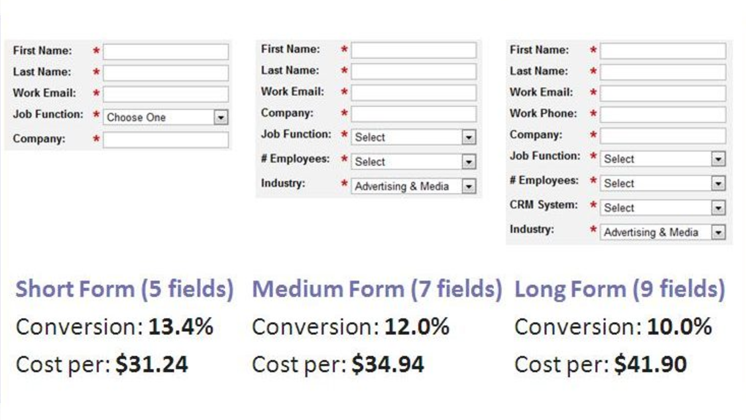
Test the number of form fields
While most forms might benefit from fewer form fields, there are certain cases where more is better (like the multi-step form).
But you’ll never really know for sure unless you test it.
As this infographic by Quicksprout shows, in some cases limiting the number of fields to just three improves conversion rates by 25%.
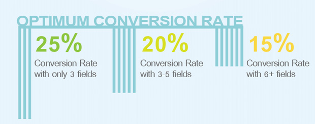
But even having around 6-7 fields will improve conversion rates, and your users might prefer to have more questions to answer depending on the form type (like an event registration, for instance).
So test multiple variations of your form, including options for minimal form fields and options with more form fields just to be sure.
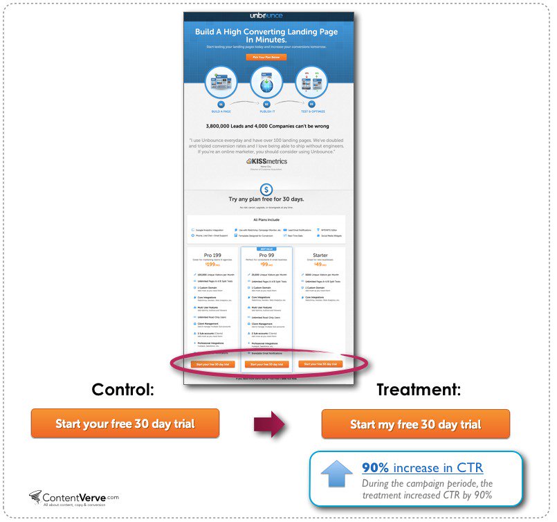
Test your CTA button text, placement and color scheme
In this case study, a split test was performed on the form’s CTA copy. The phrase “Start your 30 day trial” was simply changed to “Start my 30 day trial” and conversion rates increased by 90%.
There’s plenty of other things about your CTA button that might impact conversions, like color, button shape or even button size.
An orange button on a blue form or landing page background often gets higher conversion rates, for example.
You won’t really know what works until you test it, however.
Test your form’s landing page headline
In addition to testing things like CTA and placement, you also want to test your form’s landing page headline (if it resides on a landing page).
In one experiment, marketer Laura Roeder reconfigured her form sign-up page from this headline:
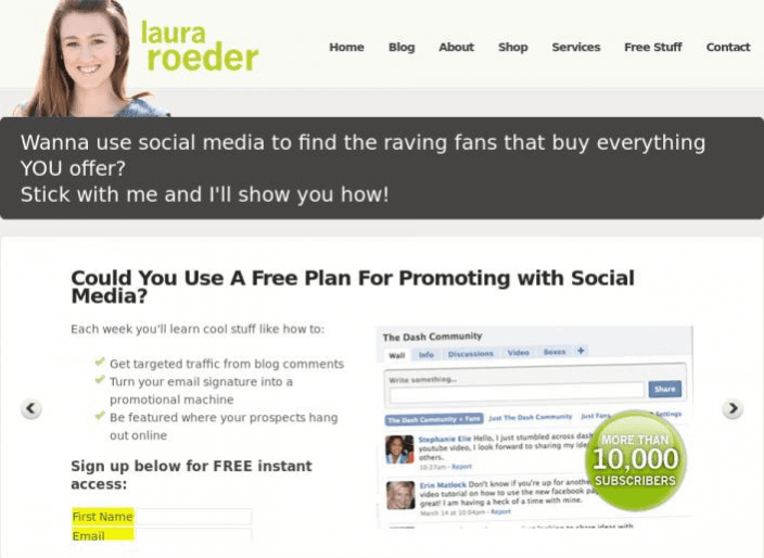
To this headline:
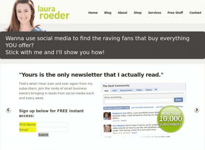
While the initial headline was okay, she felt that the question could have easily been answered with a “no” just as easily as a “yes.”
By changing the headline to a statement (a trust-building statement), she increased her sign-ups by 24.31%.
Test a single-step form versus a multi-step form
In one experiment by Conversion Fanatics, they found a multi-page form increased conversions by 52.9% over their control page, where the single-step form only had a 40.3% improvement in their A/B test.
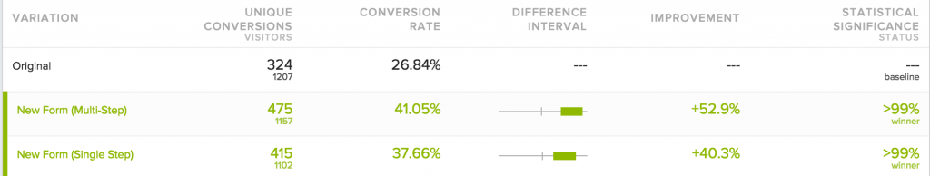
They concluded that while the single-step form “didn’t quite outperform the new multi point process,” it was still a “valid option” in many other situations.
If you’re noticing that your form conversion rates are suffering, you might consider switching to the opposite form structure to see if it helps.
Turning a single-step form into a multi-step might improve conversions, for example, or you might find that it makes them significantly worse.
Or you might find that a single-field multi-step form works better.

In any case, if you can’t pinpoint the problem with the form structure, there’s probably something else going on with your form that’s hurting conversions.
The important thing to remember when it comes to A/B testing is that just because something works “in general” doesn’t mean it will work for your audience or your form.
That’s why it’s so important to A/B test.
Without testing, you won’t know if there’s something you could be doing better to improve your conversion rates.
If you’re going to go through the trouble to build a WordPress form, take the time to test them.
Final Thoughts
Form building isn’t necessarily the easiest thing in the world, but it doesn’t have to be unnecessarily complicated, either.
The important thing to remember when form building is first to understand how your forms will ultimately impact your users.
Forms are designed to build trust, gather information and appeal to the user visually. Your first goal in building forms should be to focus on those three things.
Aside from that, the basics of form design are relatively straightforward.
Most forms include a basic structure, input fields, labels, CTA buttons and some form of confirmation.
Of course, those elements can be flexible, so it’s important to look for form inspiration or find templates if you get stuck.
After your form is built, you want to focus on the elements that will truly optimize your conversions. These include form location, number of fields, labels, reCAPTCHA, error messaging, and mobile usability.
And finally, once you’ve built your forms you want to be sure to A/B test them for conversions.
While the process might seem tedious at first, the more you practice building and testing your forms, the easier it will get.
Who knows… maybe you’ll get so good at it you’ll become a form building developer yourself!