If you gave a set of the same building blocks to 10 different people, you’d most likely end up with vastly different results.
The same is true of WordPress plugins.
Give 10 developers the same access to Gravity Forms, for example, and you’ll get 10 different forms. But that’s sort of how we want it to be.
Gravity Forms gives you the building blocks to create almost any type of form you could think of, and there are some pretty cool things that developers have done when given free reign.
With that in mind, here are 5 examples of cool forms that use Gravity Forms as a foundation.
The Animated Form
Not every form needs to look like it was designed with Gravity Forms. In fact, sometimes you don’t want users to know that they’re even filling out a form.
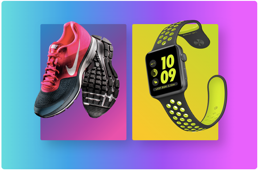
In one form demo created by Jetsloth, they combined Gravity Forms with another plugin (Image Choices) to create a completely visual, animated form instead of something more traditional.
Here’s what the form looks like:
Here’s the hover-over of one the image on the left (notice how the image shrinks):
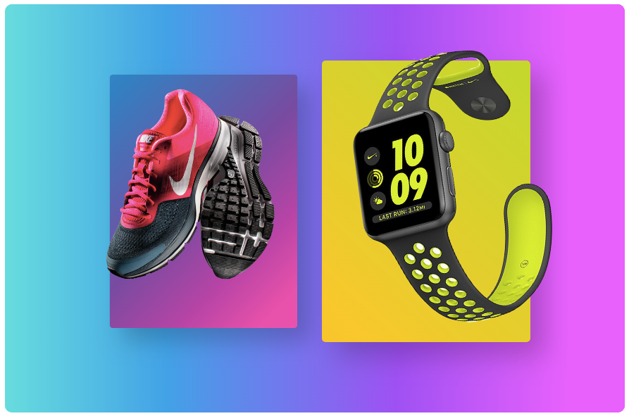
Once selected, the image is highlighted and, presumably, additional information would appear if it were a functional form (this demo simply showcases the animation).
The coolest part of this is that it shows that forms don’t have to be narrowed down to questions with an answer box.
You can truly be as creative and design-oriented as you want to be without having to worry too much about the technical aspects.
The Conditional Logic Survey
A lot of forms use conditional logic to display or hide specific questions on a form.
But Mish and Rob, the team that run Making it Anywhere, have done something pretty cool with their use of conditional logic by adding it to almost every question on their “getting to know you” survey.
Here’s what the survey looks like when you first arrive on the page:
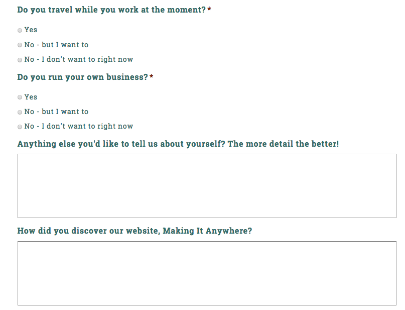
It’s a cleanly designed form with only a handful of questions. Where it gets interesting, however, is when you start choosing between the yes and no radio buttons.
Here’s what the form looks like when you select “Yes” to the first question:
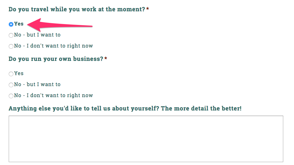
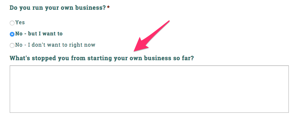
Not much has changed. But now select “No – but I want to”:
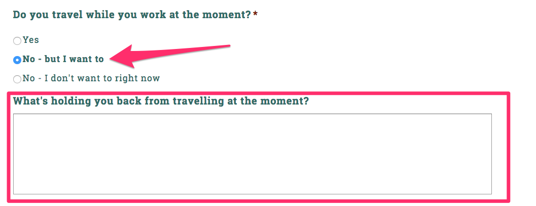
The question underneath that section completely changes (if you choose “No – I don’t want to right now” it’s the same as answering “Yes”).
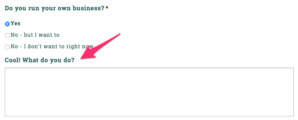
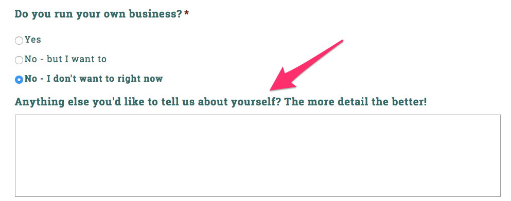
If you look at the following question, “Do you run your own business?” every answer changes the follow up question underneath it.
Here’s the box if you answer “Yes”:
Here’s the box if you answer “No – but I want to”:
And, finally, here’s the box if you answer “No – I don’t want to right now”:
The whole form is customized based on the user’s answers.
This is a great way to customize an intake form or survey to get more information from users without having to build a big, multi-step form.
Of course, multi-step forms can be good too…
The Mega Multi-Step Form
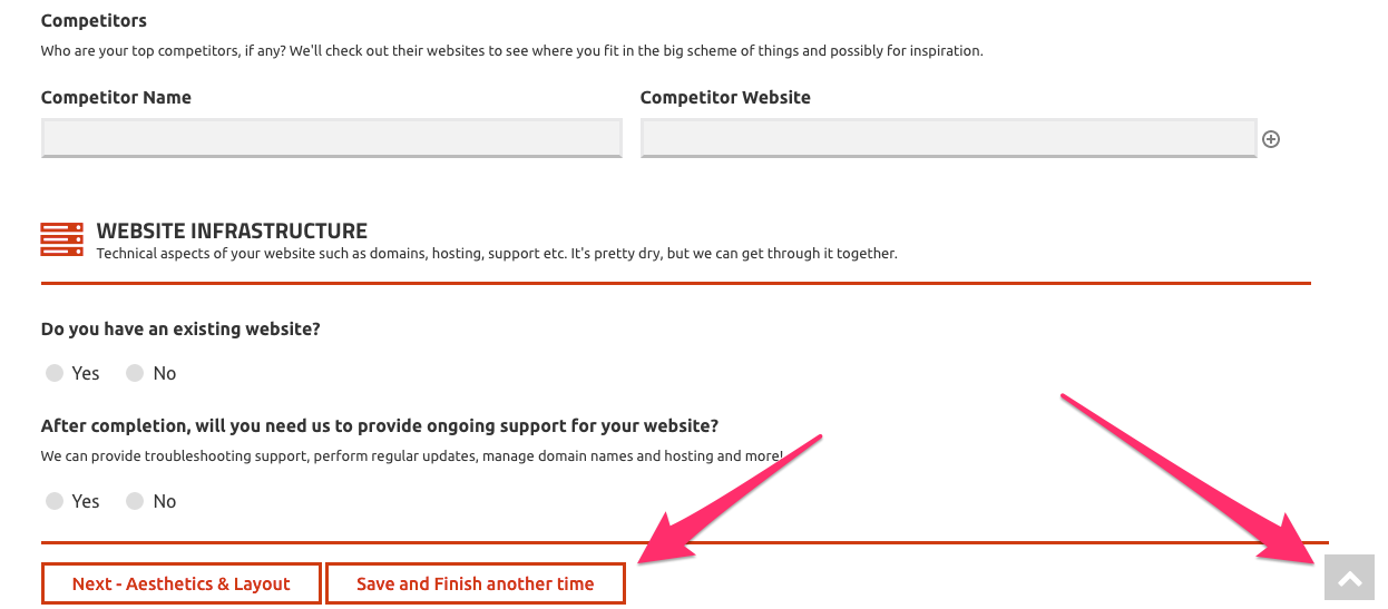
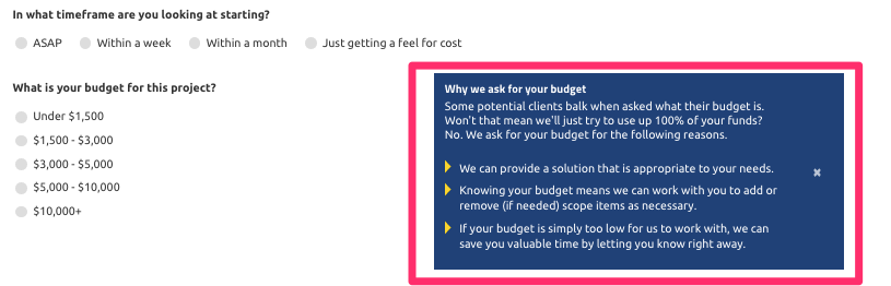
Sometimes you need to build BIG forms, which is just what the team at Phoenix Web Development needed for their “Get a Quote” form.
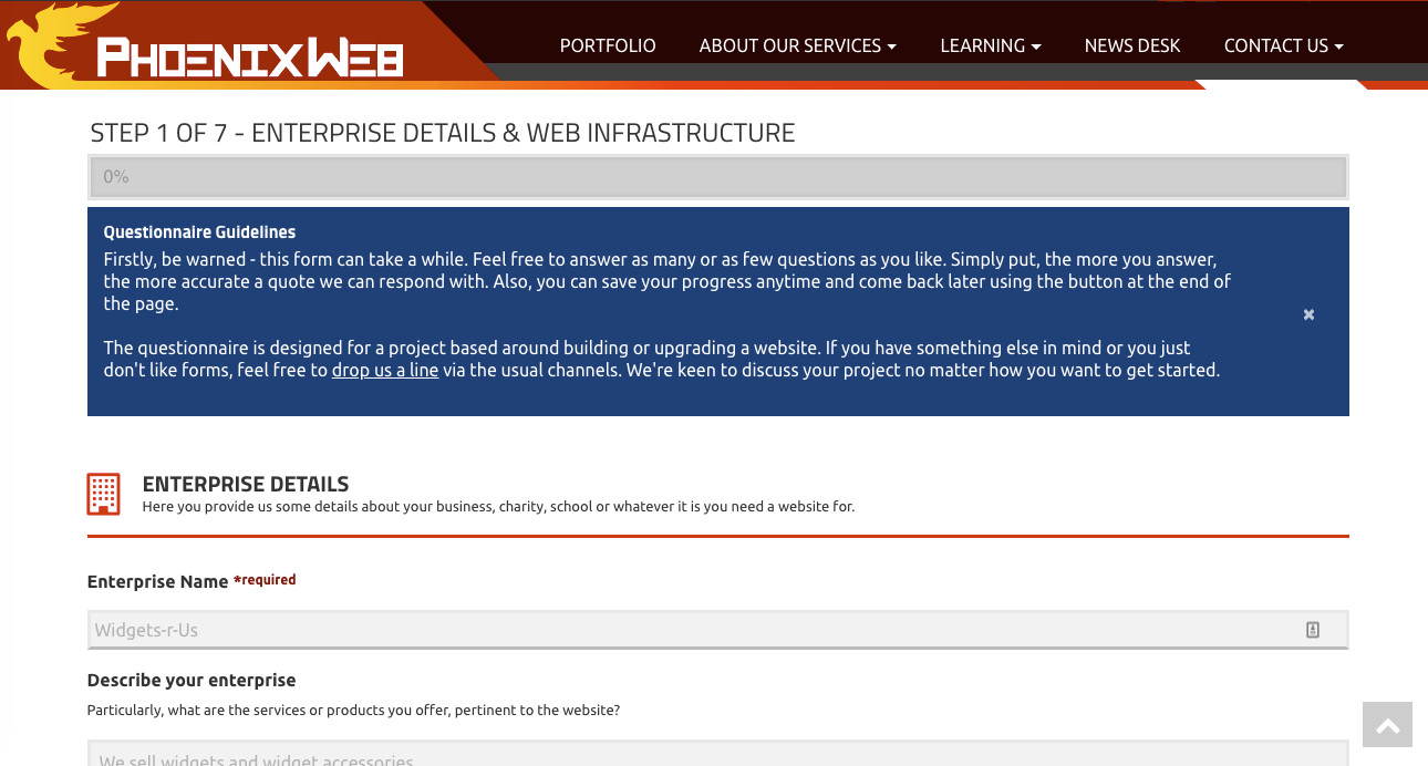
Not only is it a multi-step (also known as a multi-page) form, but each page has several longer sections.
According to Web Developer James Jones, they created their form as a way to gather as much information from customers as possible so they could give an accurate quote the first time around.
You’ll notice the warning sign at the top of the form’s page as well as a progress bar:
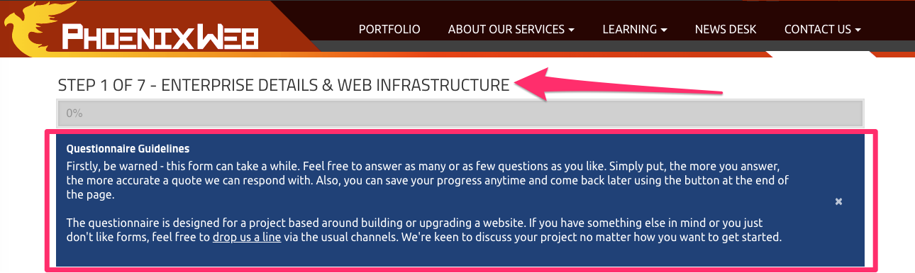
It begins, “Firstly, be warned – this form can take a while.”
Jones admits that not many people fill it out simply because it does takes so long to complete, but they worked hard to make sure it was user friendly.
The people who do take the time often get the most accurate quotes, compared to what they’d get from a simpler questionnaire.
A few notable parts of this form include the “Back to top” button that scrolls with the form as well as a “Save and Finish another time” button.
There’s also explanatory text for some questions that clarify why they’re asking for it.
Even though it’s gargantuan compared to many other quote request forms, it’s one of the the best example out there of a big Gravity Forms form that’s also perfectly functional and user-friendly.
The Branded Form
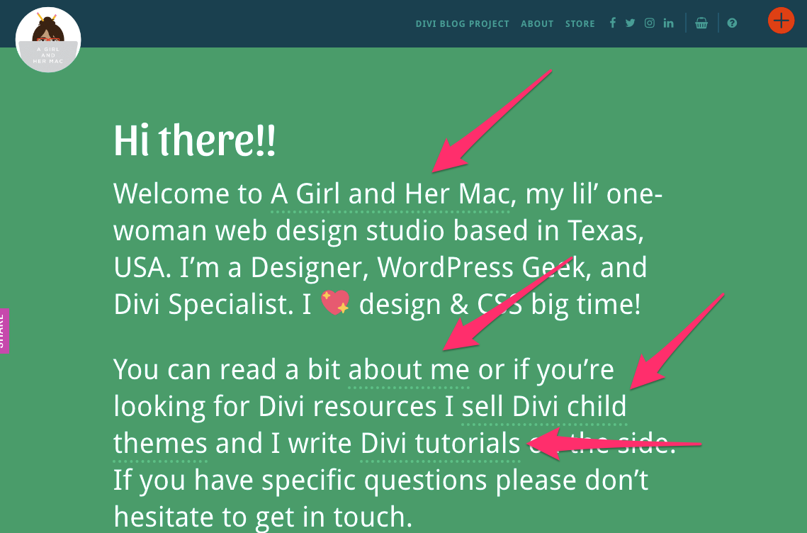
One great example of a simplistic yet well-branded form comes from the site A Girl and Her Mac. When you first come to her website, you’ll notice that her branding is very personalized.
She has a introduction letter as her homepage, with in-text links to different pages in place of standard navigation (though there’s still some navigation at the top).
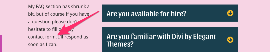
When you click the “?” button in the top right hand corner, you’re taken to a dynamic FAQ page instead of a contact page.

But you’ll notice that there is still a link to a contact form (also in-text, same as her homepage).
This brings you to a Gravity Forms contact form that looks like this:
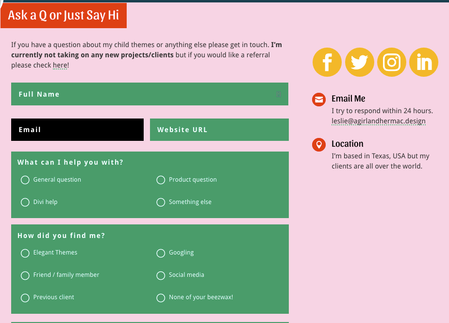
It’s a relatively simple form. No fancy features other than some color changing on hover-over (you’ll see it on the black email bar in the image above) and some radio buttons.
But the thing that’s cool about this form is how well it fits into the overall design of her site.
She hasn’t just created any old contact form, she’s built her contact form. With her “wacky colors” and all.
And that’s what Gravity Forms is really about. It’s a building block to give people exactly what they need to build forms that work for their brands.
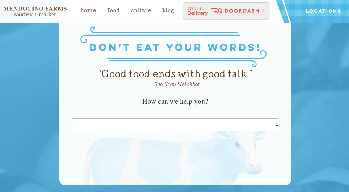
The Multi-Purpose Form
Forms can also serve as more than just a contact point.
They can be used to give information or request services, or sometimes both at the same time, as in the case of Mendocino Farm’s contact form.
When you arrive at the page, you’re met with a simple (blank) dropdown menu after the question, “How can we help you?”
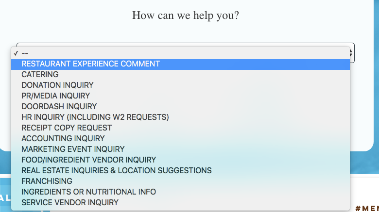
If you click on the dropdown, you have several different options to choose from:
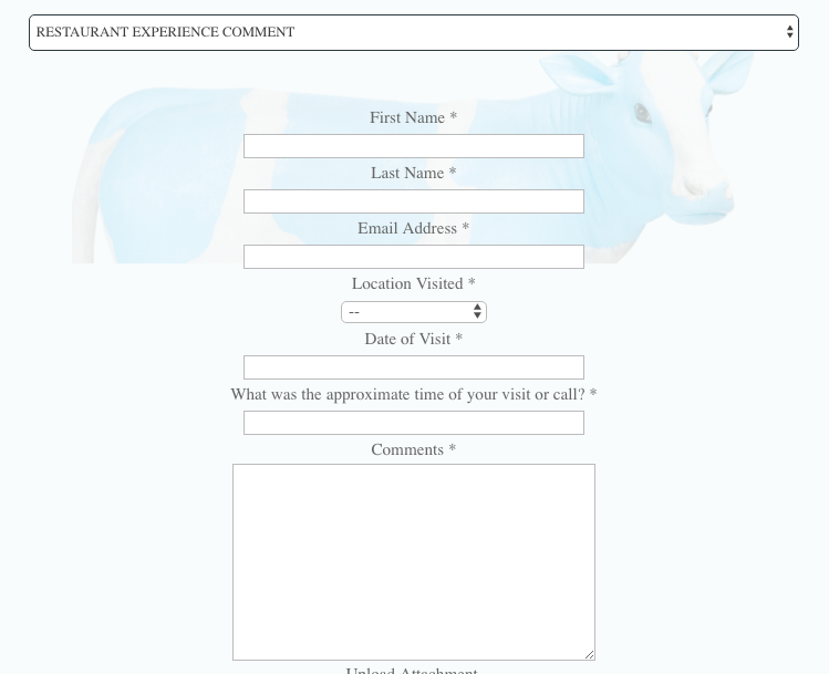
If you want to simply leave a comment, the form that appears looks like this:
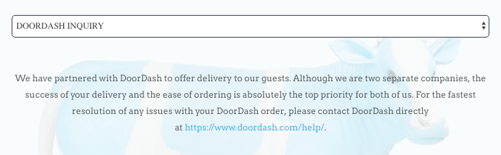
Whereas if you want to know about Doordash, the service that delivers Mendocino’s food directly to your door, the form isn’t a form at all, but rather information:
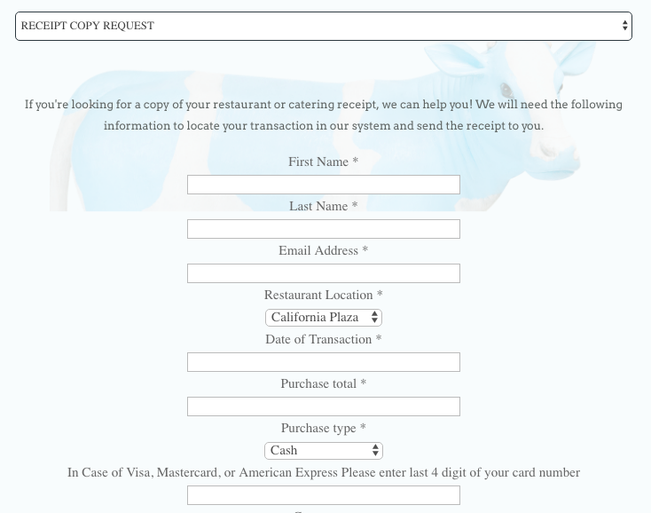
If you want to request a receipt for your meal, on the other hand, you get a form that looks like this:
Depending on the dropdown, the information presented (forms, form questions, text, etc.) is different.
Mendocino Farms has created multiple touch points for customers depending on their needs, but it all sits in one location on their site.
Easy to find and easy to use. What could be better than that?
Final Thoughts
There’s no one right way to use Gravity Forms, and because of that, people are out there doing some pretty cool things.
While some of the above examples were built using code or specialized developers, some of them (like A Girl and Her Mac) could just as easily be built by anyone with a Gravity Forms plugin.
That’s the whole point.
Gravity Forms is simply a set of building blocks to give you anything you need. There are plenty of other plugins, add-ons and extensions that can help you achieve some cool things, too.

If you want to keep up-to-date with what’s happening on the blog sign up for the Gravity Forms newsletter!
"*" indicates required fields