Accessible forms create better experiences for everyone.
They help visitors using screen readers, keyboard navigation, and assistive technologies complete your forms successfully. They also make forms easier to understand and use for every visitor.
With Gravity Forms 3.0, accessibility improvements are now built directly into every new form by default, helping you create more inclusive forms from the get-go.
Thanks to these updates, Gravity Forms 3.0 makes it easier to create forms that support WCAG 2.1 AA standards. Accessible settings are now enabled by default for every new form, and several underlying components have been improved to offer stronger keyboard navigation, screen reader support, semantic markup, and layout consistency.
These updates reduce manual setup, help prevent common accessibility mistakes, and give developers, agencies, and site owners a stronger starting point for every form they create.
Accessible settings are now enabled by default
In Gravity Forms 3.0, accessible form settings are automatically enabled for every newly created form.
Previously, users needed to update these settings during the form creation process. That extra step created room for inconsistency, especially across large sites, agency builds, or projects involving multiple team members.
Now, every new form begins with the accessible settings already in place.

This helps reduce configuration work and lowers the risk of someone accidentally creating a form without the settings needed to support WCAG 2.1 AA accessibility standards.
It also makes accessible form building easier to scale. Agencies can establish more consistent standards across client sites, developers can spend less time reviewing basic configuration, and internal teams can create new forms with greater confidence.
Existing forms are not changed automatically. Site owners can enable the accessible settings for those forms at any time through the individual form settings.
Improved Datepicker accessibility
Date fields can create significant barriers when they are difficult to navigate without a mouse or unclear to someone using a screen reader.
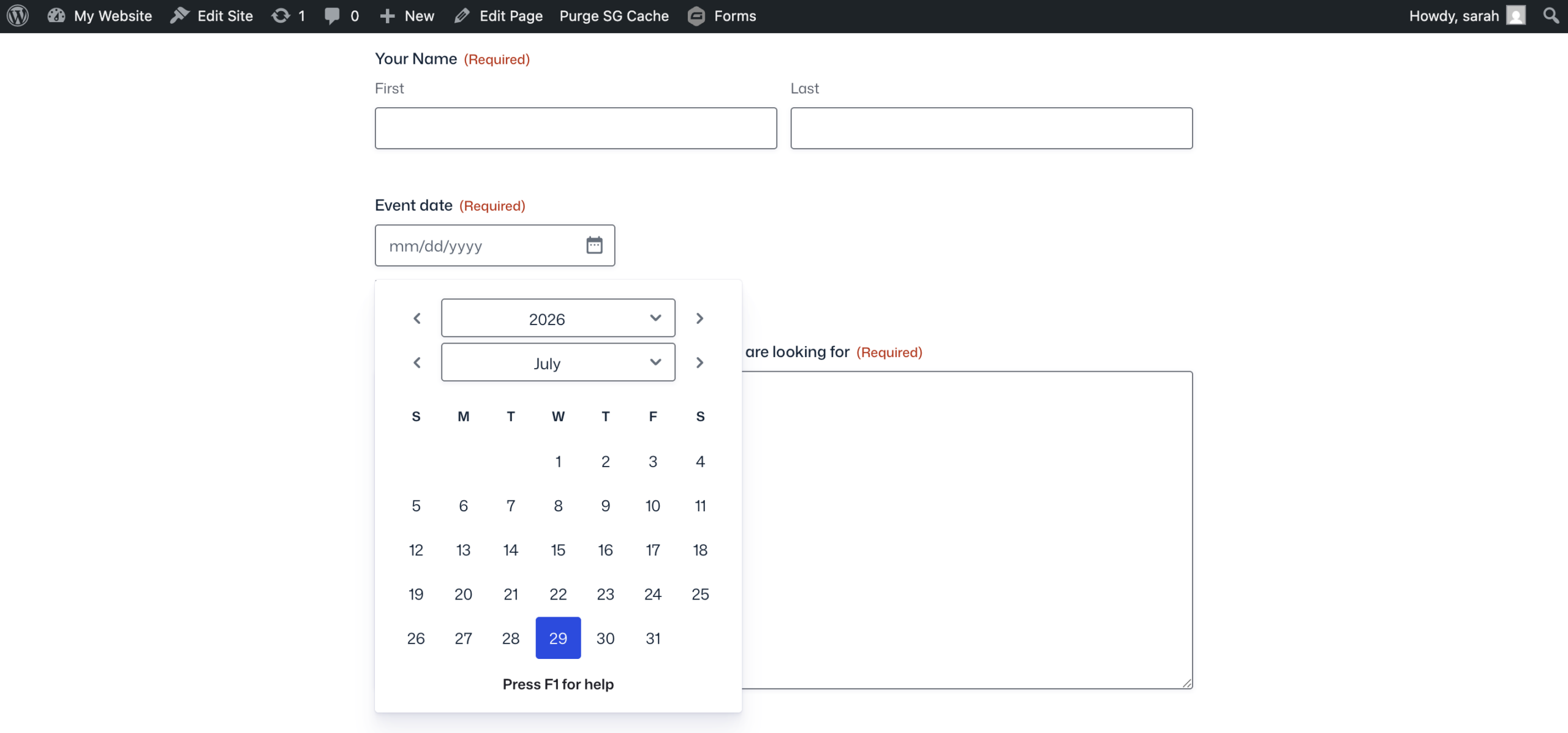
Gravity Forms 3.0 replaces the jQuery UI Datepicker with the WhatSock library, providing improved keyboard navigation and stronger screen reader support. This makes it easier for users to move through dates, understand the available controls, and select a date using assistive technology.
For businesses, these improvements can make a meaningful difference across forms used for:
- Event registration
- Booking requests
- Job applications
- Membership forms
- School enrollment
- Service inquiries
A Date field may appear to be one small part of a form, but it can prevent someone from completing the entire process when it is not accessible.
The updated Datepicker helps remove that barrier. To learn more, visit the Gravity documentation.
Modernized input masks and character counts
Gravity Forms 3.0 also updates the technology behind input masks.
Input masks now use imaskjs, a vanilla JavaScript solution that loads asynchronously and removes the previous jQuery dependency.
Input masks help guide users as they enter information such as phone numbers, dates, identification numbers, or other values that need to follow a specific format.
Modernizing this functionality helps make form interactions more efficient while reducing reliance on older frontend dependencies.
Character count functionality has also been modernized as part of this work.
Character counts are commonly used on Paragraph fields and other text inputs with length limits. They give users clear feedback about how much content they can still enter, which can be especially important for applications, support requests, submissions, and forms with strict content requirements.
Together, these changes improve the underlying form experience while modernizing the scripts responsible for key field behaviors.
More consistent and semantic button markup
Submit buttons now use semantic <button> elements instead of <input type=”submit”> or <input type=”button”>.
This creates more consistent button markup across Gravity Forms and provides a clearer semantic structure for browsers and assistive technologies. It also gives developers more styling flexibility.
The <button> element can support more flexible content and presentation than an input element, making it easier to customize buttons while preserving meaningful HTML.
For agencies and developers maintaining design systems, this can help standardize form buttons across a website and reduce the need to work around different markup patterns.
For users, it provides more predictable and accessible form controls.
A unified Choice Alignment setting
Gravity Forms 3.0 introduces a unified Choice Alignment setting for Checkbox, Radio, and Multiple Choice fields.
All three field types now use the same layout options:
- Vertical – Displays choices in a single column.
- Horizontal – Displays choices inline.
- Columns – Arranges choices across multiple columns.
This replaces the previous mixed approach, where choice layouts were managed differently across field types.
The updated setting makes form layouts easier to understand, configure, and maintain. It also provides a more predictable and repeatable way to present choice-based fields across a form.
A clear single-column layout may be easier to scan for longer answers. A horizontal layout can work well for short groups of simple choices. A column layout can help organize larger option sets without creating an excessively long page.
That consistency matters for accessibility and usability.
Better accessibility with less manual work
Accessibility work often becomes difficult when it depends on every person remembering every setting on every form.
Gravity Forms 3.0 improves that process by making accessible settings the default and strengthening several core form components at the same time.
For agencies, that means a better starting point for every client project.
For developers, it means more modern JavaScript dependencies, semantic button markup, and more consistent field settings.
For businesses and organizations, it means fewer barriers across important experiences such as registrations, applications, payments, bookings, and inquiries.
For visitors, it means forms that are easier to navigate, understand, and complete.
Accessibility still requires thoughtful implementation
The improvements in Gravity Forms 3.0 make it easier to work toward WCAG 2.1 AA compliance, but accessible settings alone do not guarantee that an entire form or website will meet every requirement.
You will still need to make thoughtful decisions about labels, instructions, color contrast, error messages, field layouts, content, and the surrounding WordPress theme.
Custom styling and third-party plugins can also affect the final experience.
Gravity Forms provides an Accessibility Guide for Developers with detailed implementation guidance for teams building and testing accessible forms.
Users who encounter an accessibility issue can also contact Gravity Forms Support with details about the problem.
Available in Gravity Forms 3.0
If you’re creating new forms, you’ll automatically benefit from improved accessibility settings that help deliver better experiences for more users while reducing setup time for your team.
With accessible settings enabled by default, an improved Datepicker, modernized input masks and character counts, semantic button markup, and unified choice layouts, you can begin every new project with a more inclusive foundation.
These updates may happen behind the scenes, but their impact reaches every person trying to complete a form.
That is the real benefit: less manual configuration for form builders and a better experience for more users.
Get started with Gravity Forms
To get started with Gravity Forms 3.0, navigate to the Plugins page in your WordPress admin and click Update Now, or download the latest version directly from your Gravity Forms Account.
New to Gravity Forms? Try a free demo or visit our pricing page to explore plans and start building more accessible forms today.
Note: Caching and script optimization plugins or services can sometimes affect form functionality after an update. We recommend clearing your website, CDN, and browser caches once Gravity Forms 3.0 has been installed.
If you have any questions about Gravity Forms 3.0, our Support team is here to help.
Learn more about Gravity Forms 3.0
Want to explore everything included in this release? Check out these additional resources:
- What’s new in Gravity Forms 3.0
- International phone field
- Gravity Forms Accessibility guide for developers
- Gravity Forms 3.0 documentation

Newsletter
If you want to keep up-to-date with what’s happening on the blog sign up for the Gravity Forms newsletter!
"*" indicates required fields