

Google’s algorithm updates are shaping web design in new and unexpected ways.
According to Moz, Google releases minor updates roughly 500-600 times each year, but it’s the major updates that have the most impact for web designers and developers.
Last year, for example, Google warned that any sites without HTTPS would be marked as “not secure,” which would inevitably lead to a lowered search engine results page (SERP) ranking. This left many devs scrambling to make their sites secure after the announcement.
Their latest update may have an even bigger impact for developers and designers, however, as it impacts every aspect of design, from layouts and images all the way to form design.
How Google’s Algorithm Update Impacts Form Design
In March of 2018, Google announced that their new algorithm update would include mobile-first indexing, which gives preference to sites that are mobile-friendly.
They said of the update:
“To recap, our crawling, indexing, and ranking systems have typically used the desktop version of a page’s content, which may cause issues for mobile searchers when that version is vastly different from the mobile version. Mobile-first indexing means that we’ll use the mobile version of the page for indexing and ranking, to better help our — primarily mobile — users find what they’re looking for.”
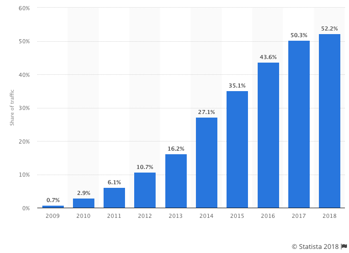
Statista reveals that mobile Internet usage has increased in 2018, with 52.2% of all website traffic coming from mobile devices compared to desktop.
Over 60% of all Google searches come from mobile devices.
But this large percentage of mobile use isn’t always reflected in web design. Bad practices in mobile form design are still around, with preference still being given to desktop users over mobile users.
Google’s aim in releasing mobile-first indexing is to change all that by helping users experience the web on their mobile devices the same way (or better than) they do on a desktop.
With that in mind, here’s how to ensure that your forms are mobile-friendly so Google’s algorithm can rank your sites accordingly.
Test Your Current Mobile-Friendliness
You may already have a mobile-friendly theme on your website, or you may not. In either case, your forms may still be underperforming on mobile devices without you knowing it.
To know where your forms stand, it’s important to run mobile-friendly tests on any landing pages that have forms, including pop-up forms.
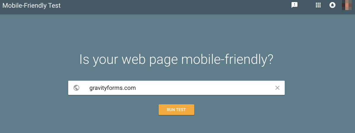
You can use Google’s own Mobile-Friendly Test to see how your site measures up.
It will tell you whether or not your site is mobile-friendly (according to Google’s standards) as well as show you any page loading issues and give recommendations for changes that could improve your site.
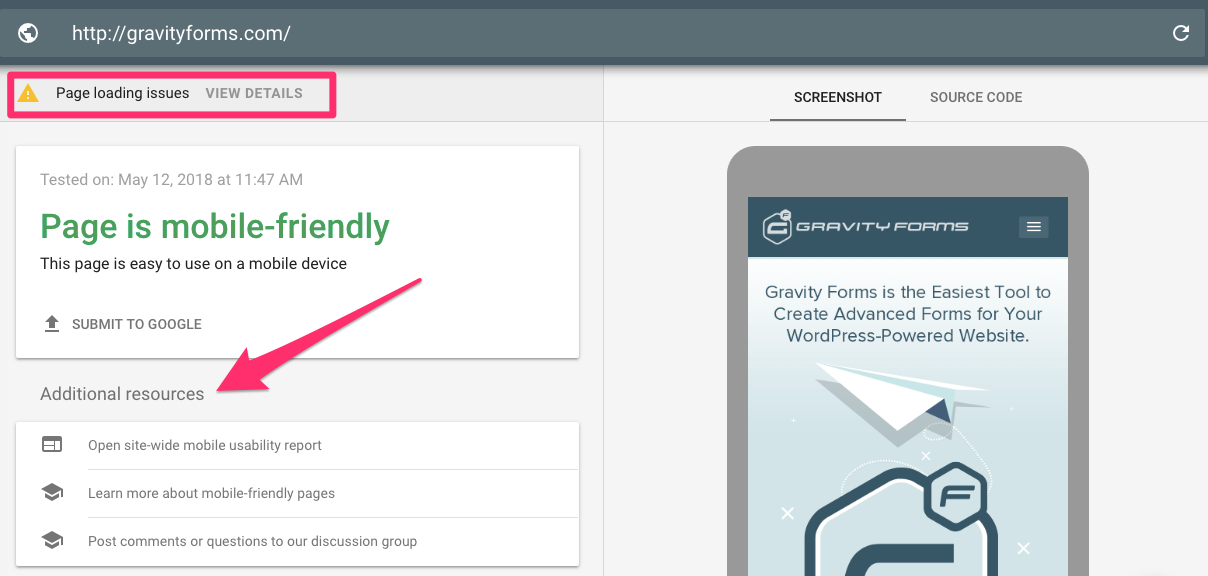
You can use this to assess both your entire site and specific landing pages (form pages).
For pop-up forms, Google has some very specific rules for which pop-up forms count as mobile-friendly and which will receive a penalty under the new algorithm update.
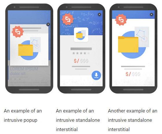
According to Google’s Webmaster Central Blog, pop-ups that cover “main content” too soon after user arrival and/or standalone interstitial pop-ups (that users have to dismiss manually) will be penalized.
If you’re using pop-ups on your mobile site, testing those pages will be essential, as well as making any necessary adjustments based on Google’s guidelines so you can improve your chances of ranking in the SERPs.
Pay Attention to Form Fields and Layout
Unlike desktop users, mobile users have a much more finite space to interact with a web page’s content.
This is especially true for multi-step checkout forms or opt-in forms that include things like drop downs, radio buttons and other less-than-mobile-friendly elements.
Adobe points out five key elements of any form that can affect mobile-friendliness:
- Structure — The number and order of form fields as well as their overall appearance on mobile screens
- Input Field Type — The types of fields included, like password fields, sliders, radio buttons, etc.
- Field Labels — The location of the label (above or to the side of) in comparison to the input field as well as any corresponding text
- Action (CTA) Button — The size, placement and color of any buttons on the form
- Feedback — The landing page or pop-up that confirms successful submission and/or any error messages
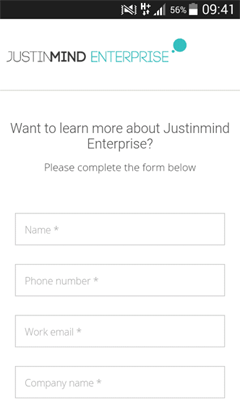
Structure and Field Labels
As a general rule for mobile forms, it’s best to limit the number of form fields as much as possible.
But even if you have to include a longer form on your mobile site, how you structure that form will make a difference between love and hate for Google’s algorithm.
Use single-column designs with form labels above form fields, or eliminate form labels altogether and simply use inline text instead.
Make sure that fonts are big enough to be viewed even on the smallest mobile screens, and that important labels stand out in a bold or colored font.
Input Field Type
Some input field types do better on mobile than others. Radio buttons and dropdowns tend to be the hardest for mobile users.
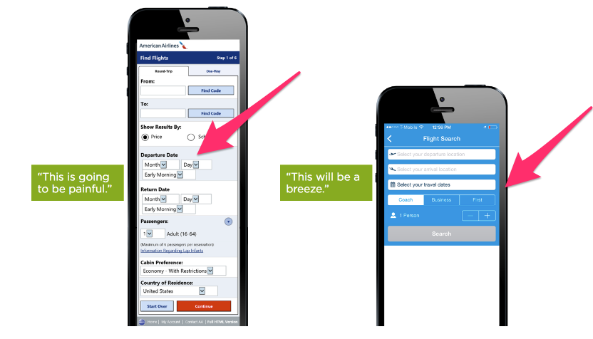
If you do require multiple-choice options in your mobile forms, consider listing them out in a way that’s scrollable rather than putting them in a dropdown. If you require radio buttons, make sure to use large buttons (that a thumb or finger could press).
Keep the mobile user in mind when you need to add complex input fields. Think small screens and finger-friendly design.
Action / CTA Buttons
Finger-friendly design also applies to your Submit button.
The average width of the index finger is 1.6 to 2 cm (16 – 20 mm) for most adults, which roughly converts to 45 – 57 pixels. Any action or CTA button should be at least that big, if not bigger.
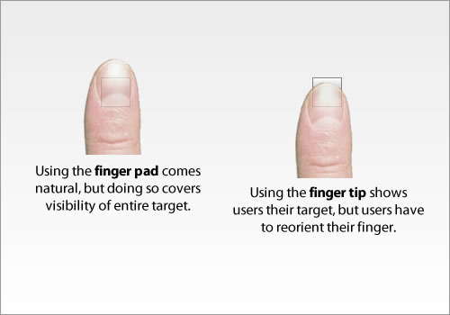
This can also apply to any other buttons your form may have, such as a button to exit out of a pop-up form, or a calendar (select date) button within the form itself.
The easier you can make it for thumbs and fingers to hit a button, the better your user experience will be. The better the user experience, the more love Google (and users!) will show you.
Feedback
Finally, the text used to give feedback — form submission notifications or error messages — needs to stand out on small screens, otherwise users may become confused about why their form isn’t submitting properly.
While desktop forms can get away with small text or even a pop-up notification, Google won’t consider your form mobile-friendly if the text isn’t readable or there’s a pop-up.
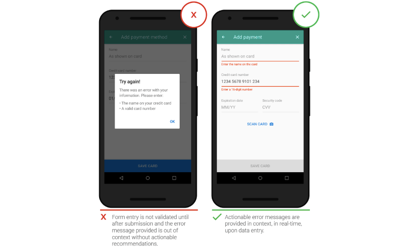
Instead, include bold, red letters for errors in a readable font that clearly spells out what’s wrong, or a simple “Thank You for submission” note at the top of your form.
This is a clear indicator to that you care about the user experience.
Final Thoughts
By keeping your forms mobile-optimized, you will boost your SEO with Google as well as the user experience with site visitors. It’s a win-win.
Just remember that Google makes a lot of updates throughout the year that may or may not impact your forms in new ways.
Be sure to check out Moz’s Google algorithm update history and subscribe to Google’s Webmaster Central blog for the latest changes.