

From building simple contact forms to advanced applications, a lot of the features in Gravity Forms focus on backend functionality.
However, as you also need your forms to look good, we’ve recently introduced a number of features to help you create beautiful forms without needing custom CSS (though you are, of course, free to do that if you like working with CSS).
In this post, we’re going to dig into how you can style Gravity Forms without needing code. You’ll be able to do this using the Gravity Forms Orbital form theme and some easy-to-use options in the block editor.
Here’s everything that we’ll cover:
- How form themes work at a high level, and what form themes are available to you in Gravity Forms
- How to style a single form using the Orbital form theme and the block editor
- How to apply your styles across multiple forms and/or with forms that you embed using the shortcode
Let’s dig in!
Gravity Forms Orbital Theme vs Gravity Forms 2.5 Theme
While we’ll get to more detailed styling options over the next few sections, it’s important to start your Gravity Forms styling journey by understanding the form themes that Gravity Forms offers.
In a nutshell, form themes offer an easy way to control the high-level look and feel of your forms.
As of Gravity Forms 2.7, Gravity Forms offers two different form themes:
- Orbital form theme – this is the new theme that was released in Gravity Forms 2.7. It offers a versatile, modern look while also giving you detailed style options to let you customize it according to your preferences without needing to use CSS.
- Gravity Forms 2.5 theme – this is the “original” theme that predates Orbital. As much as possible, the Gravity Forms 2.5 theme tries to inherit its styles directly from your WordPress theme. For customizations beyond that, you need to use custom CSS.
Let’s look at both themes in a little more detail…
Orbital Form Theme
The Orbital form theme was added in Gravity Forms 2.7, which was released in February 2023.
The goal of the Orbital form theme is to help you create beautiful forms without requiring any custom CSS or technical knowledge.
The Orbital form theme adds a simple but stylish base design for your forms. Then, it gives you the option to style key areas of your form using simple controls in the block editor (or via other methods if you’re not using the block editor).
Basically, it’s a solid foundation that you can build on with your own style choices. You’ll be able to easily customize colors, font sizes, borders, and more to create a unique design for your site.
Gravity Forms 2.5 Form Theme
Prior to Gravity Forms 2.7, all forms used the same theme, which we’ve dubbed the Gravity Forms 2.5 theme.
If you’ve been using Gravity Forms since before version 2.7.15 (which was released in October 2023), the Gravity Forms 2.5 theme will remain your default theme until you change things. However, if you started using Gravity Forms after version 2.7.15, Gravity Forms will default to the newer Orbital theme.
The idea behind the Gravity Forms 2.5 theme is that it tries to inherit as many styles as possible from your active WordPress theme.
So, rather than styling your forms yourself, the Gravity Forms 2.5 theme will just try to automatically blend in with your existing WordPress theme.
If you want to make your own tweaks beyond that, you would typically need to use custom CSS. This is different from the Orbital theme, which lets you customize your form styles without needing code.
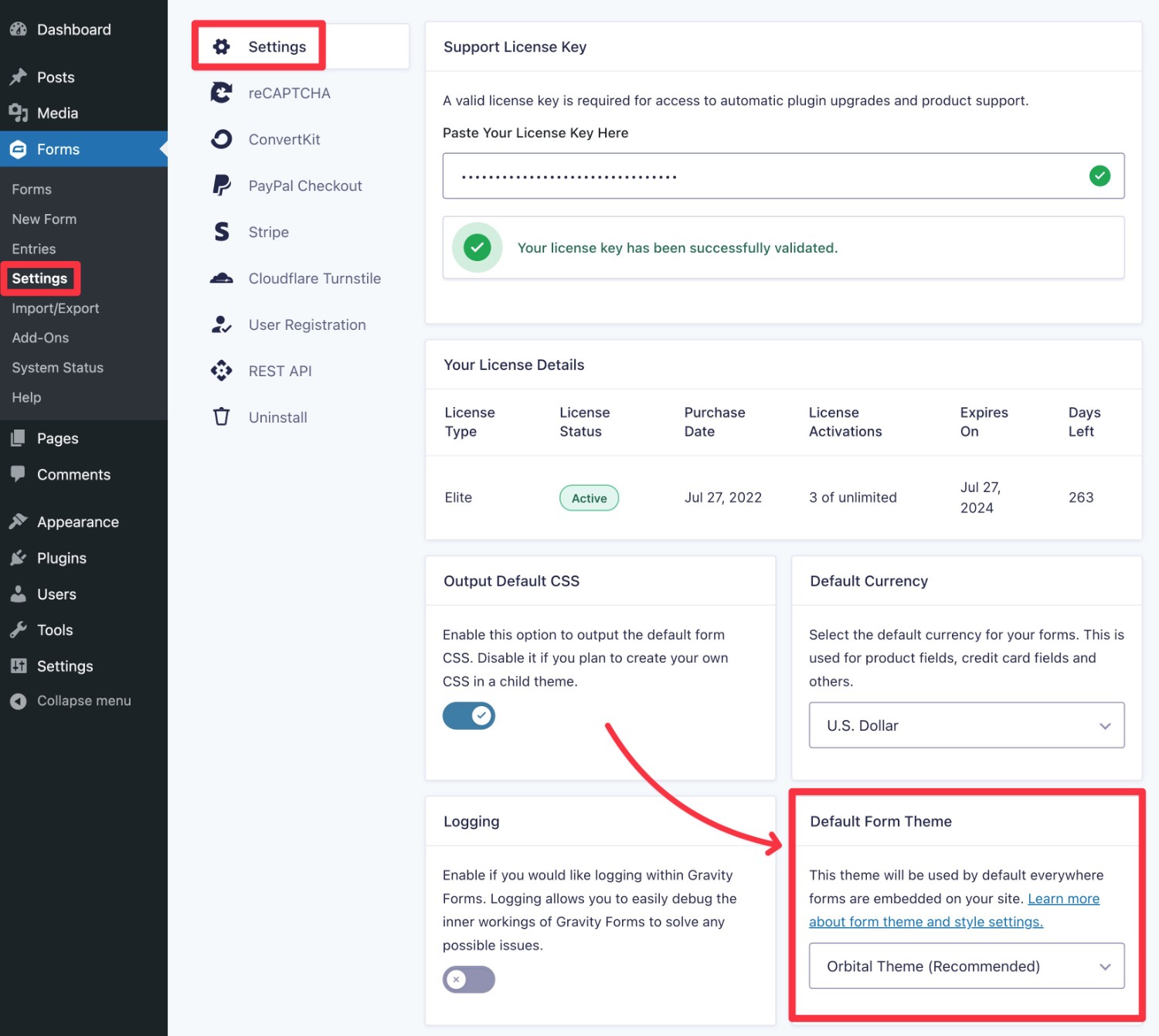
How to Choose Your Default Gravity Forms Theme
While you’re always free to choose a different theme on a form-by-form basis, Gravity Forms also lets you choose which theme you want to use as the default for your forms.
You can set this up by going to Forms → Settings and using the Default Form Theme drop-down.
How to Style Your Forms Using the Orbital Form Theme
Now that you understand the different starting points that are available to you when it comes to your form styles, let’s get into the actual step-by-step guide for how you can create beautiful forms using the Orbital form theme.
In this section, you’ll learn how to style forms that you embed via the native WordPress block editor.
In subsequent sections, we’ll cover some other important details including how to style forms with the Orbital form theme if you’re using the Gravity Forms shortcode and how to copy/paste form styles to re-use them.
1. Create Your Form
While you won’t really style your form from the form editor, you will want to have fully set up your form before you move on to styling.
If you already have a form that you want to style, you can skip ahead to the next step.
If you don’t have a form yet, go ahead and create one now.
You’ll want to add all of your form fields, set up feeds as needed, etc. Basically, do everything that you need to do to get the form ready to go on your live site.
You’ll be able to style any type of form, whether it’s a payment form, a user registration form, an email signup form, and so on.
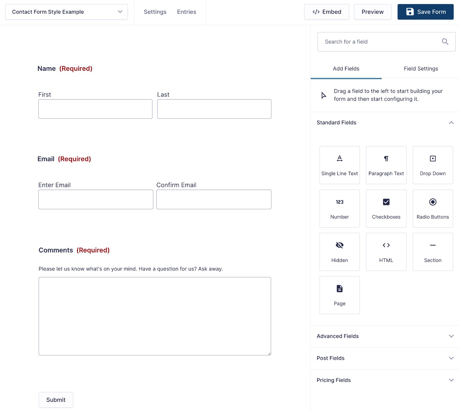
For this example, we’re just using a basic contact form using the premade Simple Contact Form template.
2. Embed Your Form Using the Gravity Forms Block
Once you’re happy with your form, make sure to save your settings. Then, you can advance to the form styling step.
Select Embed from within the form editor or open the post or page where you want to display your form and embed your form using the Gravity Forms block.
Want to use the Gravity Forms shortcode instead? Later in this post, you’ll learn how to control Orbital form theme styling using the shortcode. However, for now, we’ll assume that you’re using the block editor.
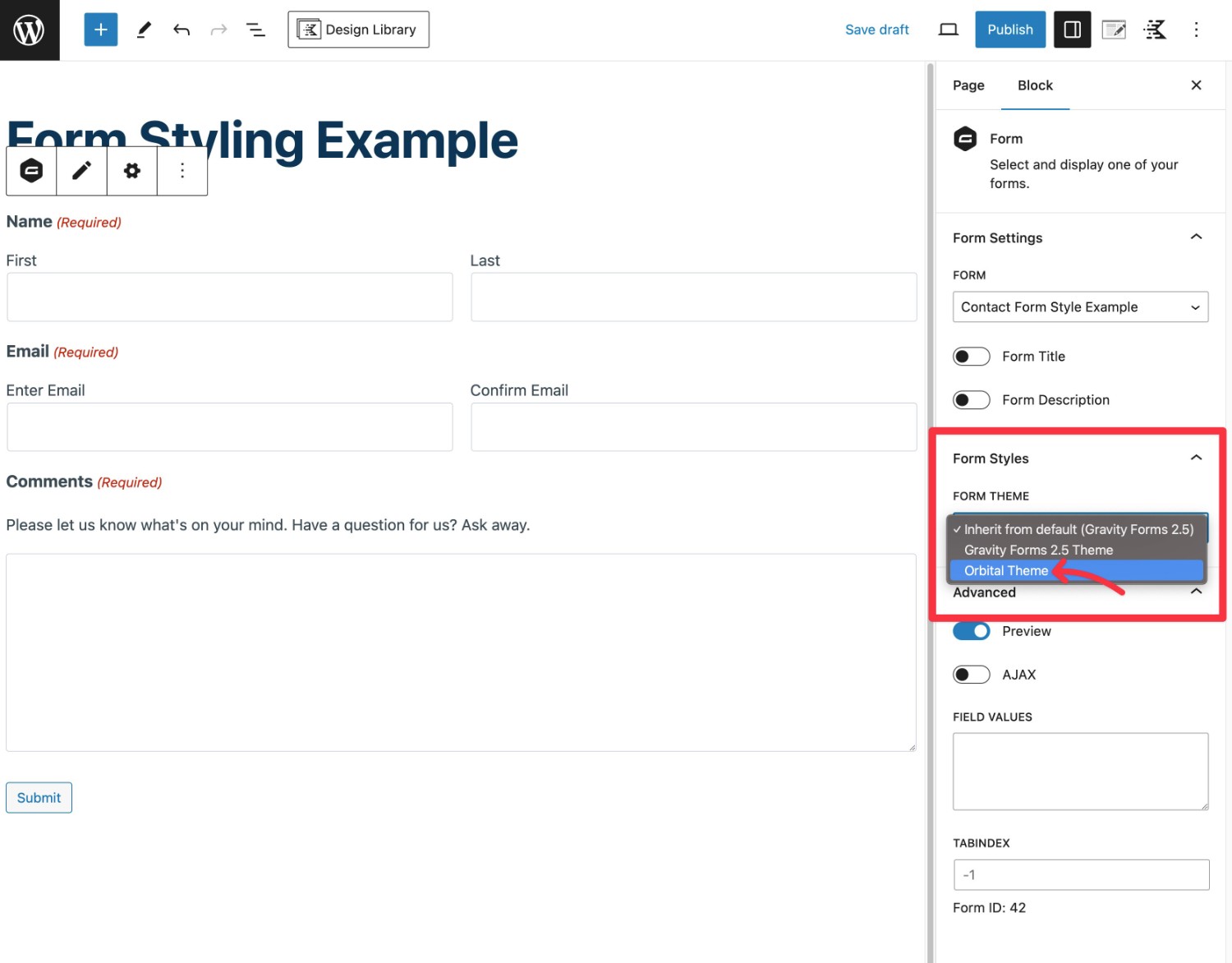
3. Choose the Orbital Form Theme
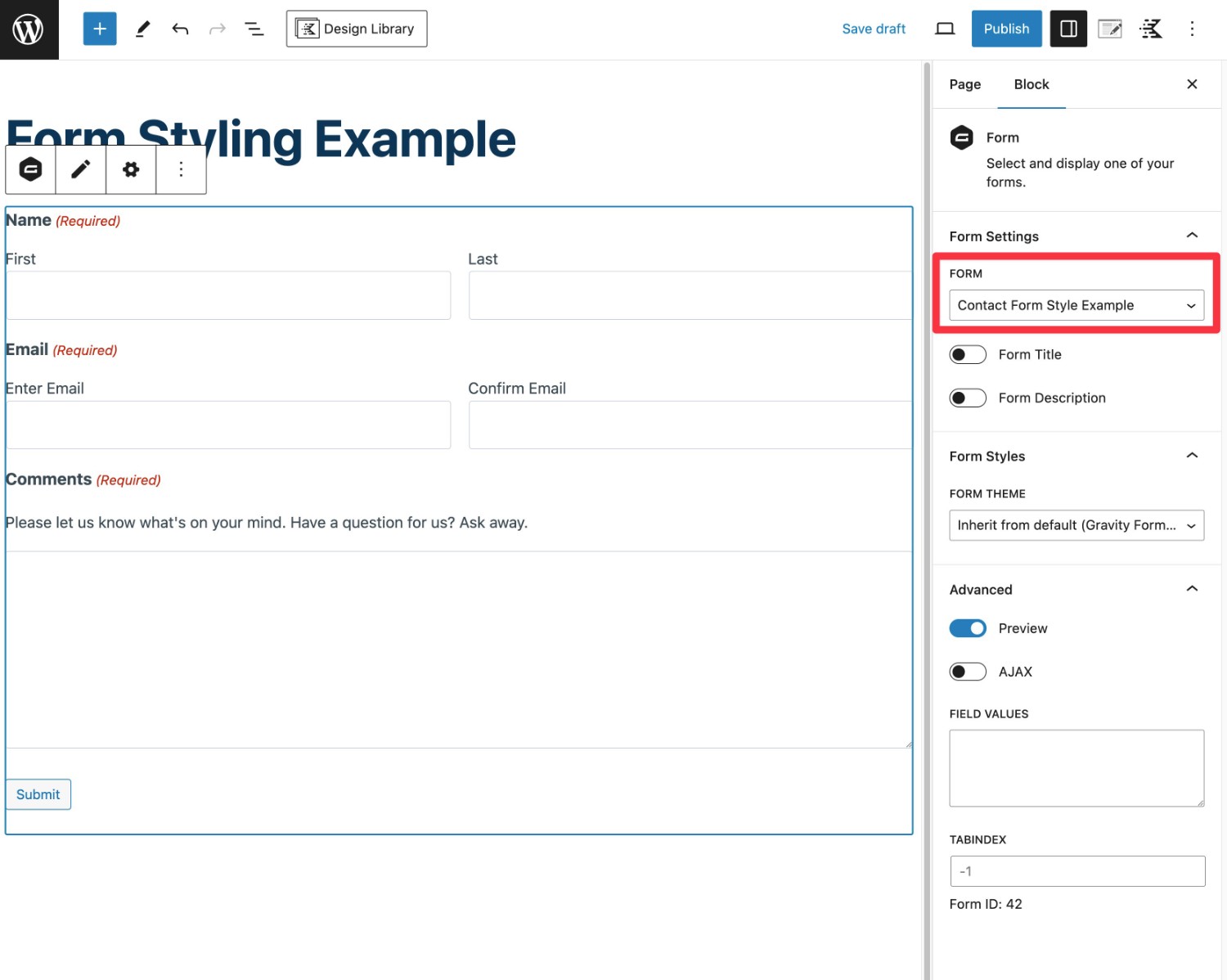
Once you’ve added the block and chosen the form that you want to use, you’ll next want to make sure that your form is using the Orbital form theme.
You can do this using the Form Theme drop-down under the Form Styles heading.
We also showed you how to set the default form theme on your site earlier in this post.
4. Use the Style Options to Customize Your Form
Once you’ve selected the Orbital form theme, you’re ready to start styling your form.
You should see a number of new style options divided into four categories:
- Input styles
- Label styles
- Description styles
- Button styles
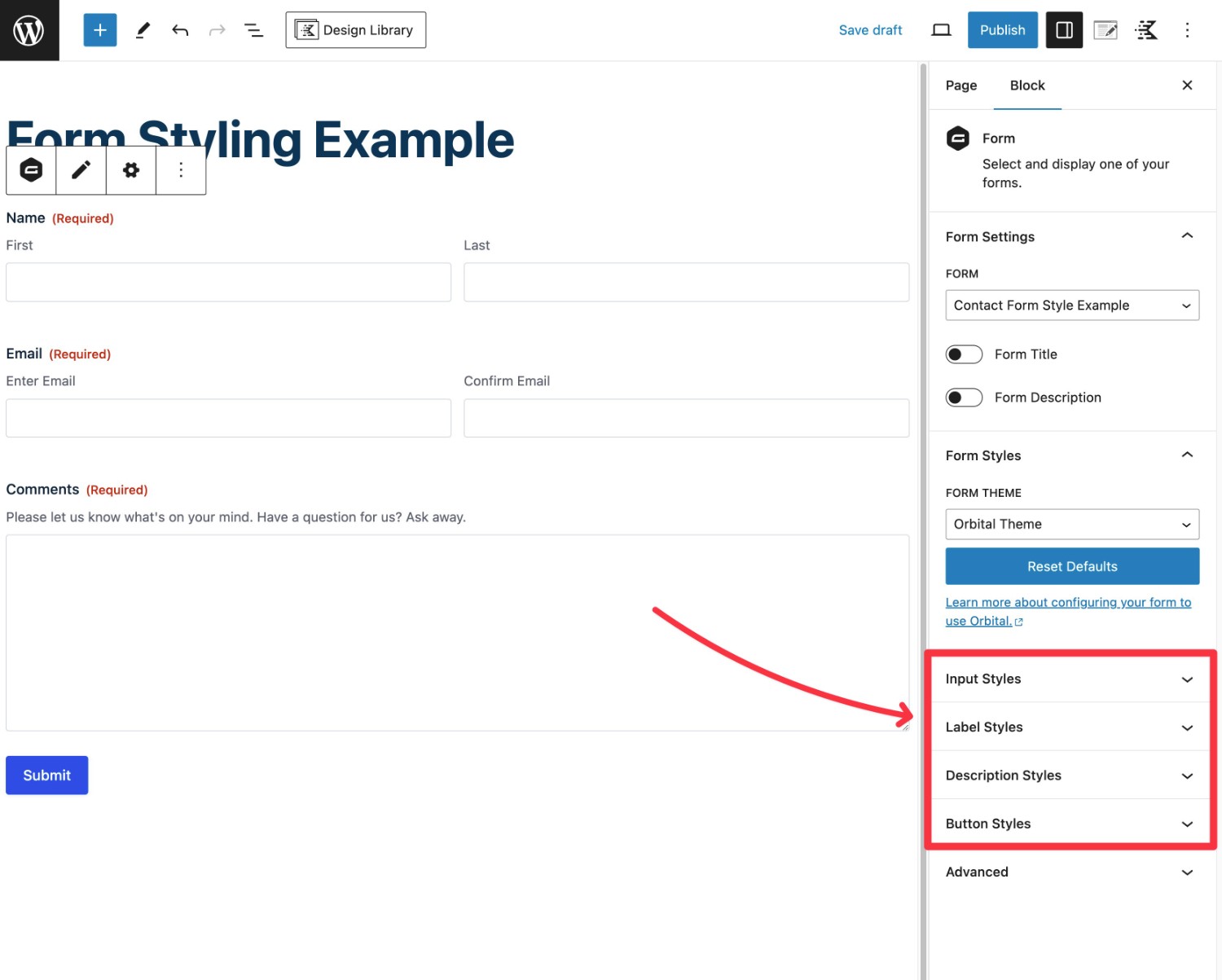
Let’s go through customizing each area…
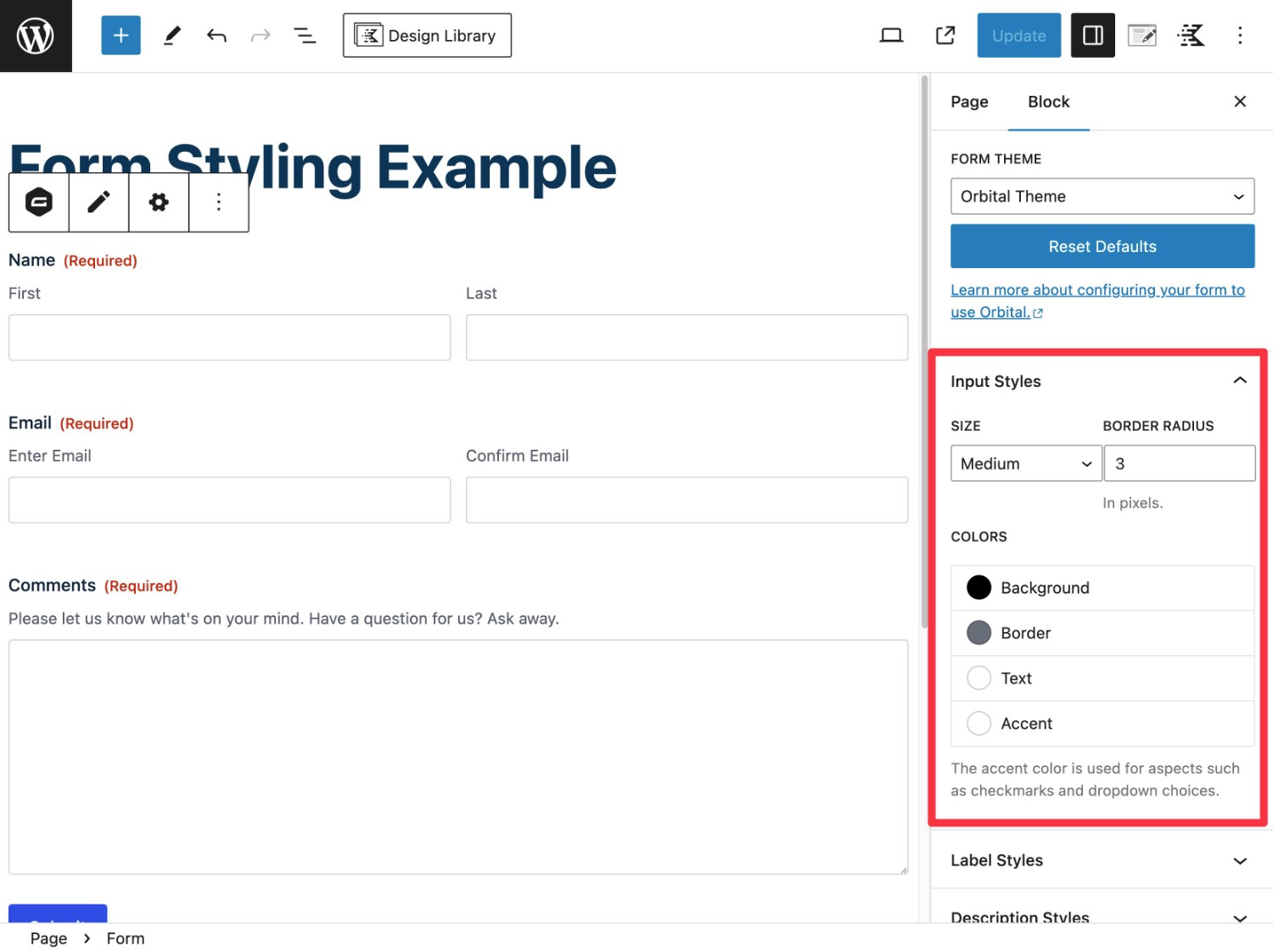
Input Styles
The Input Styles settings let you control the style of the form field input boxes, including the following:
- Size of the input fields and borders.
- Background of the input fields.
- Border of the input fields.
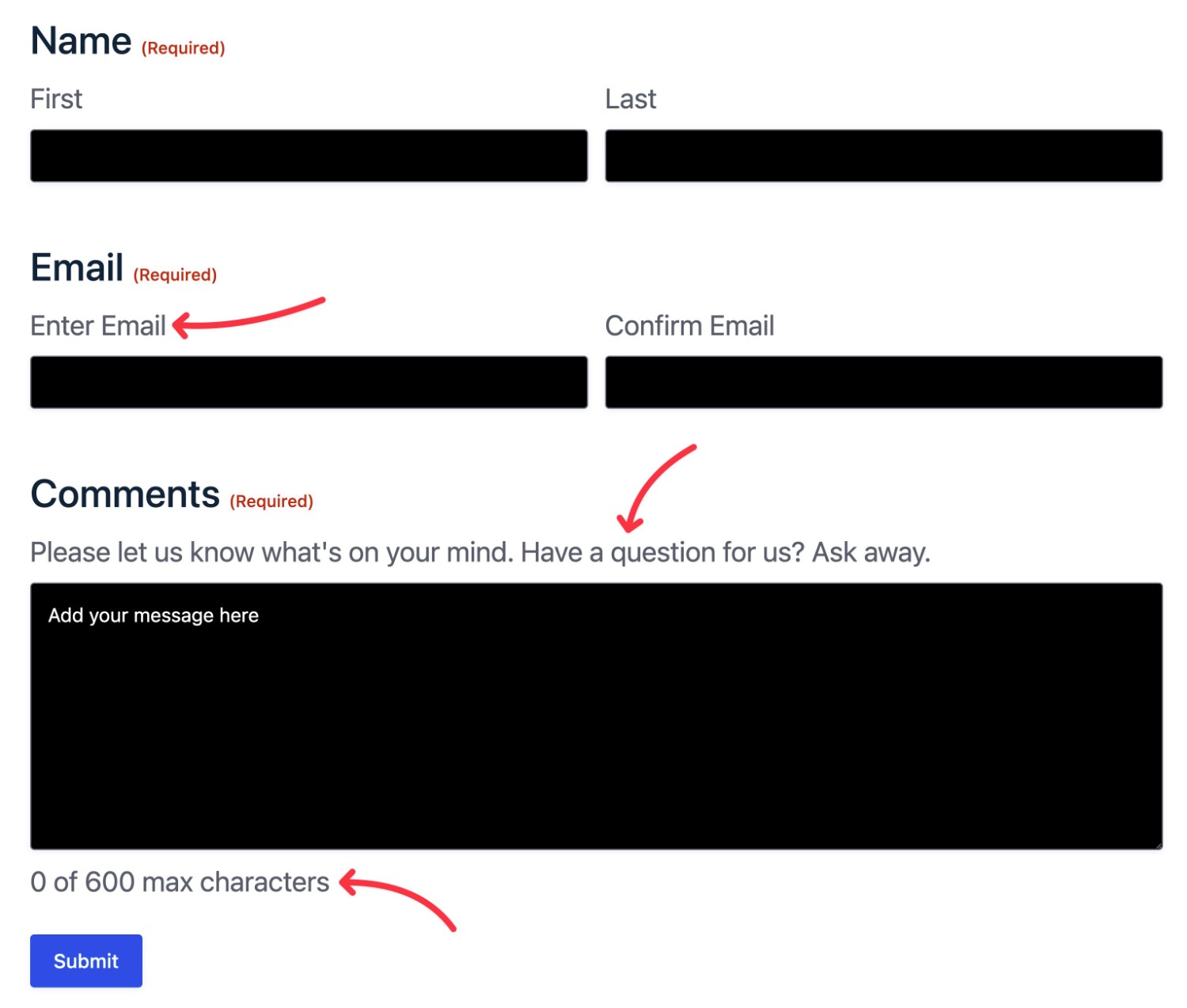
- Text color for placeholder text/choices. This will not control the text color of user-inputted text, though – you’ll use another option for that.
- Accent colors, which are used for certain input elements such as checkboxes or drop-down choices.
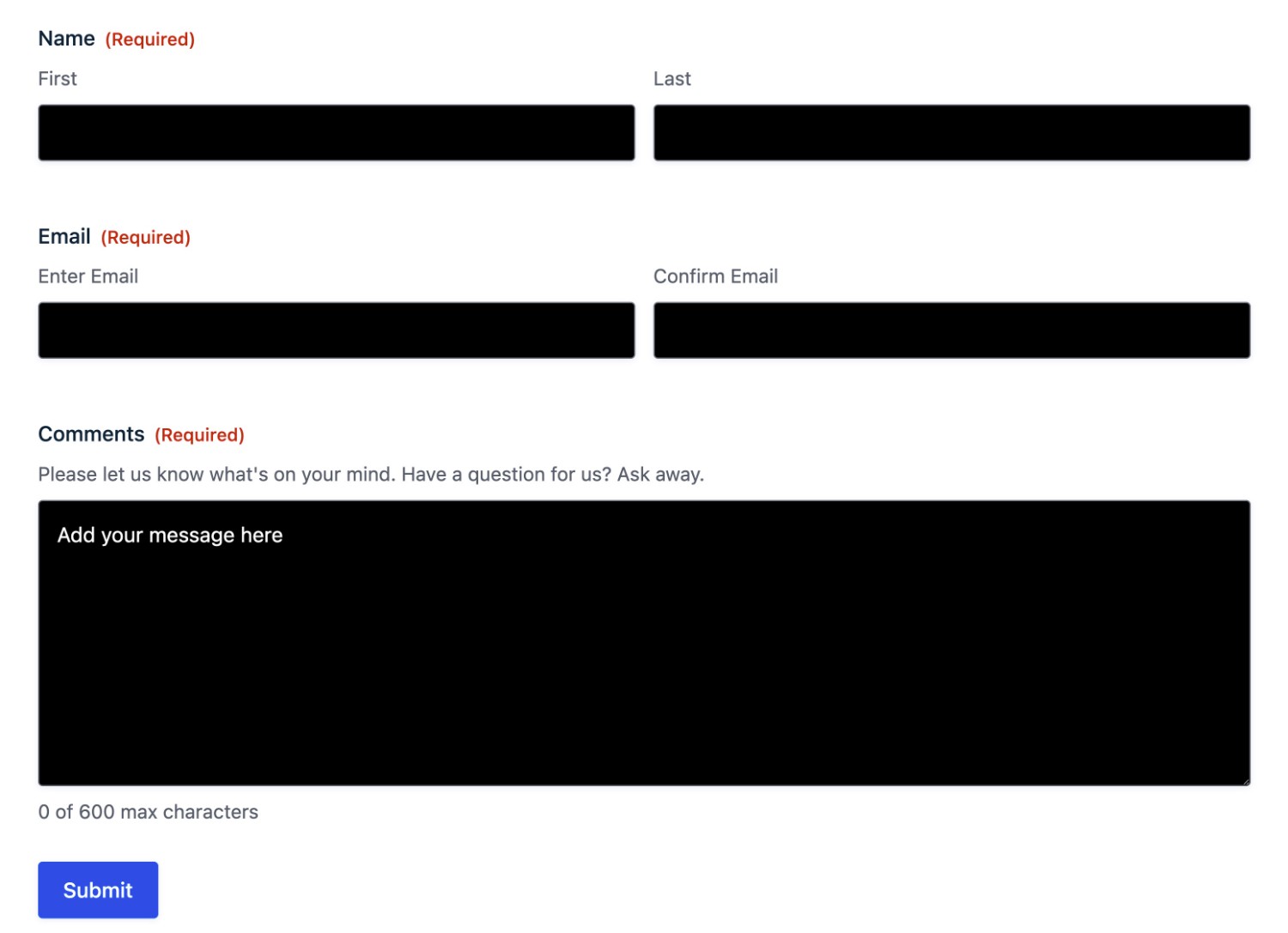
For example, if you set the input background to black and the text color to white, you can see how that affects the form:
Label Styles
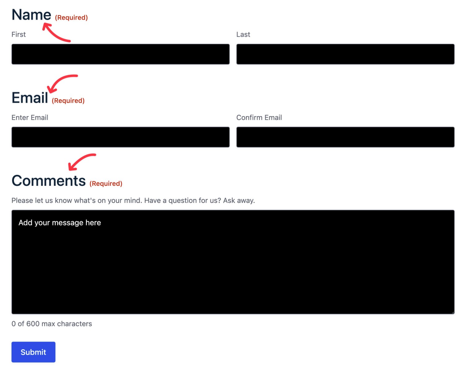
The Label Styles settings let you control the color and font size of label text on your form.
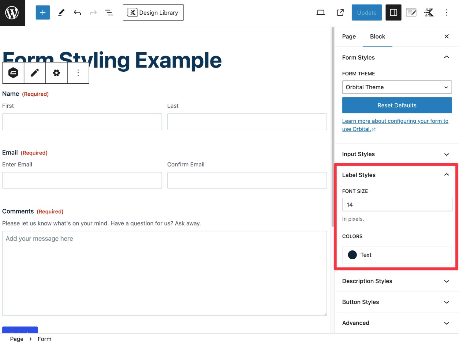
For example, if you increased the label text font size to 24 px, your form’s labels would become much larger.
Description Styles
The Description Styles settings let you control the color and font size of the description text on your form.
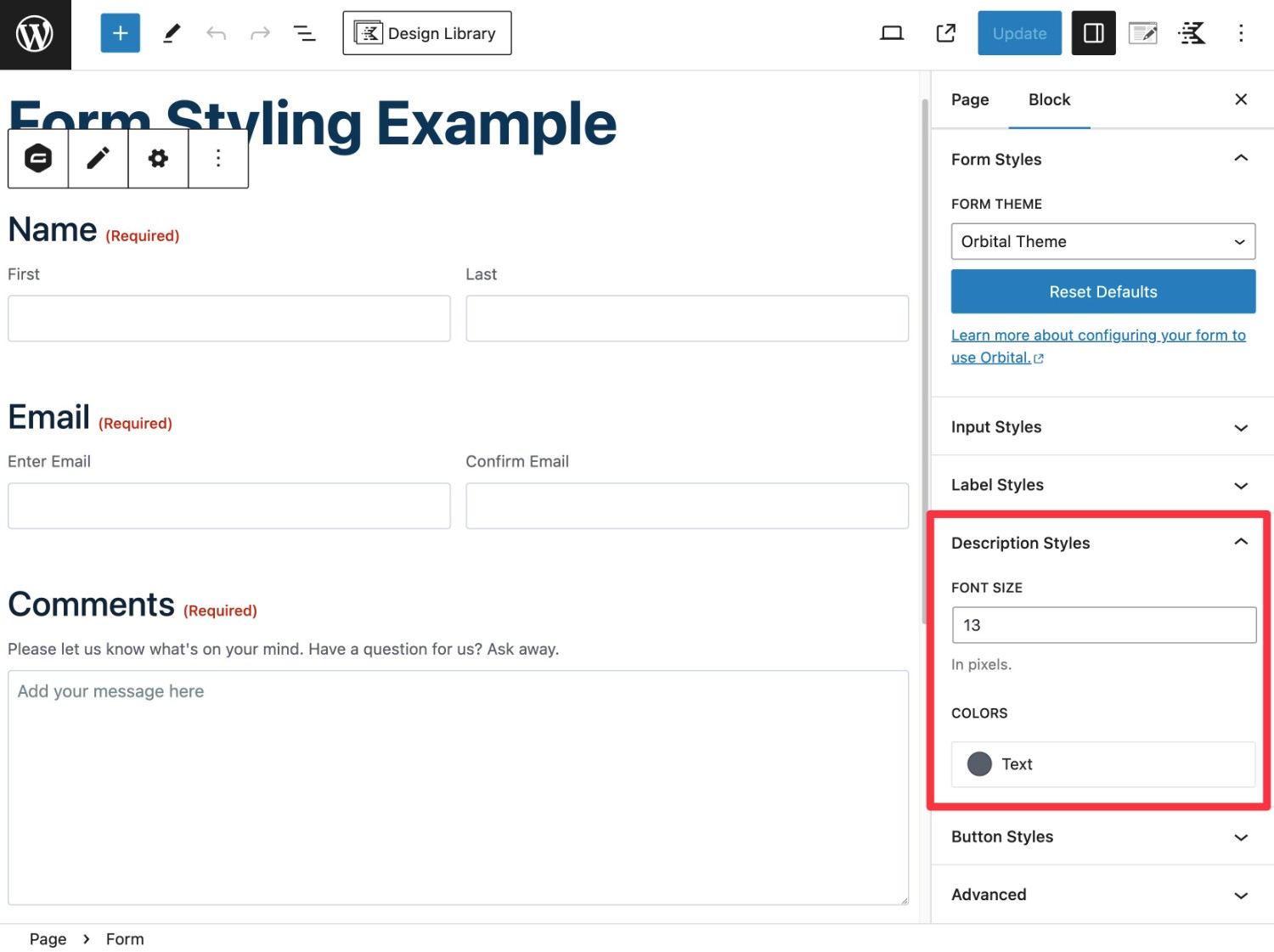
For example, if you increased the description text font size to 20 px, all of your form’s descriptions would increase in size.
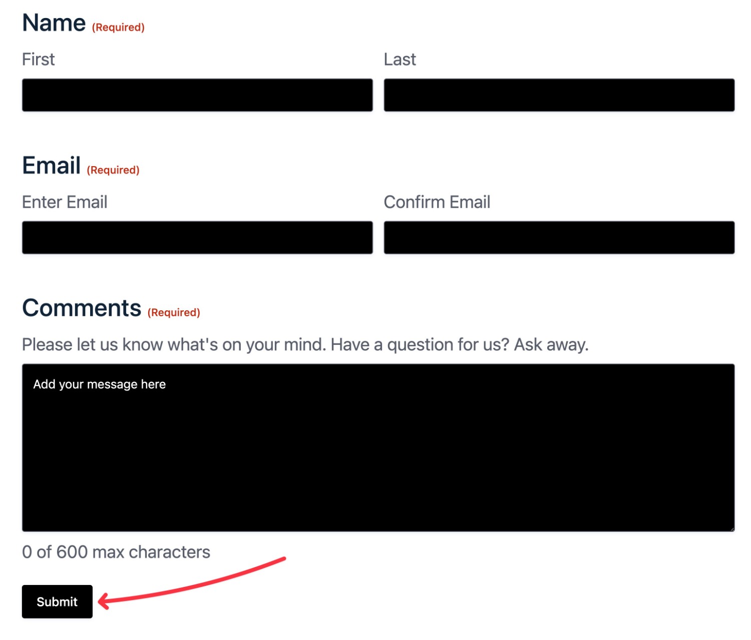
Button Styles
The Buttons Styles settings let you control the color and text color of all the buttons on your form, as well as some other elements such as progress bars.
Most notably, this lets you control the design of the form submit button.
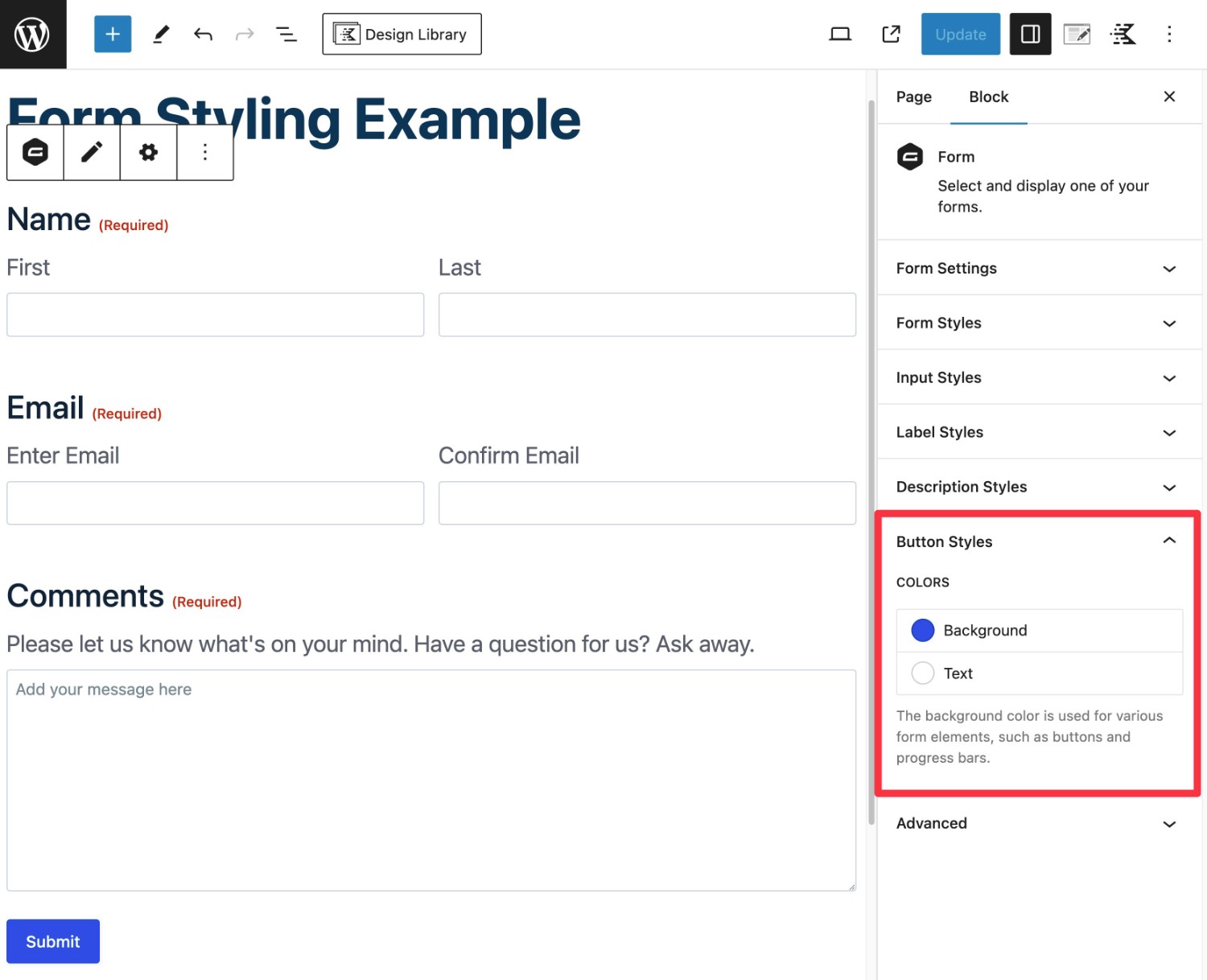
For example, if you changed the button color to black, the submit button would change from blue to black.
Any styling choices that you make will only apply to that specific form. However, you also have options to apply styles across multiple forms, which we’ll talk about in a second.
5. Use Core WordPress Blocks for Additional Styling
While the Orbital form theme lets you style your form itself, you can also use other WordPress blocks to access additional style options.
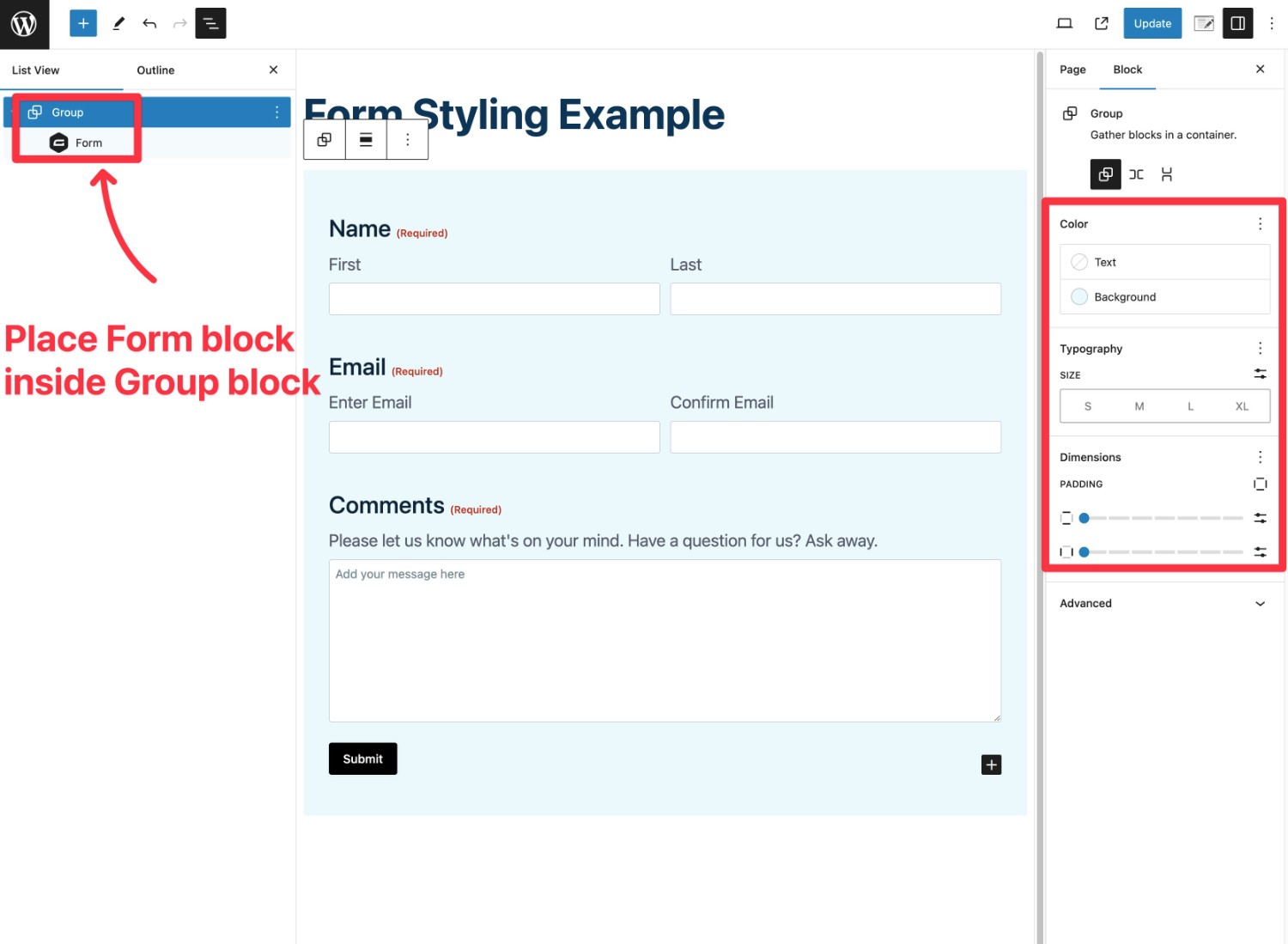
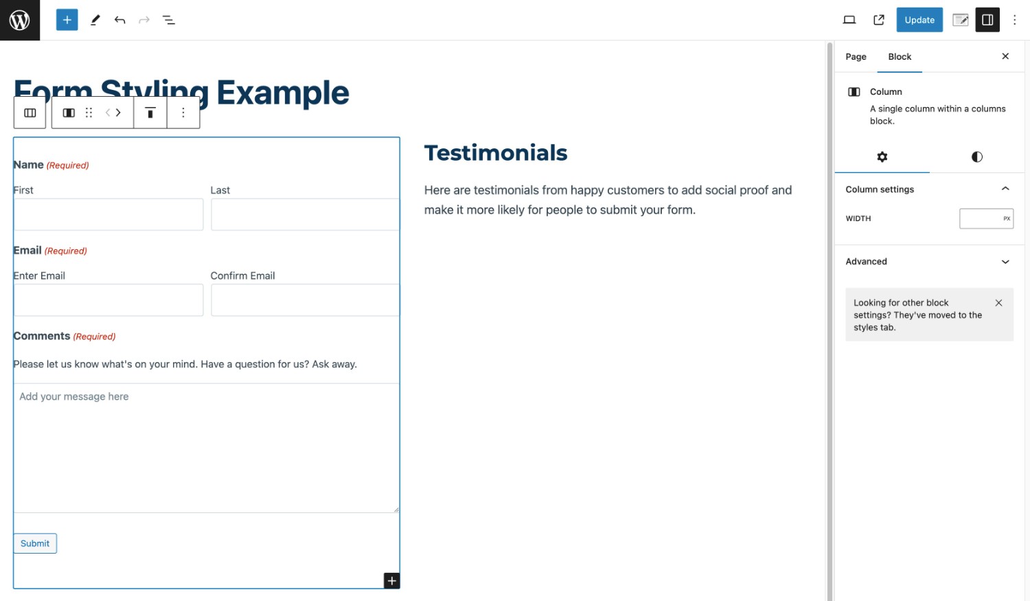
One of the most useful approaches is to place the Gravity Forms block inside the core Group block. This lets you assign a background color to the entire form (and potentially space outside of the form), along with accessing other rules for spacing and more.
For example, by placing the Form block inside a Group block, you could apply a unified background like this:
You can also play around with other core blocks. For example, if your page is wide enough, you could place the Form block inside a Columns block and then add text or design elements to the other column.
Feel free to experiment as much as you want. By combining the Orbital form theme with core WordPress blocks, you can unlock some really cool designs.
And that’s it! Once you publish/update your page or post, your form styles will be live on your site.
How to Use Orbital Form Styles Across Your Site (and With the Shortcode)
Above, you learned how to set up Orbital form theme styling for a single form.
However, there’s a good chance you might have multiple forms on your site. To help you save time, Gravity Forms offers features to quickly re-use styles between forms and/or set the default styling for the Orbital form theme on your site.
Setting up the default styling for the Orbital form theme will also let you take advantage of your custom form styles when embedding forms using the Gravity Forms shortcode.
How to Copy/Paste Form Styles (Re-Use Styles on Multiple Forms)
If you just want to quickly apply the styles from one form to another form, you can easily copy and paste styles between different forms.
You can do this for forms on the same site. Or, you’re also free to copy and paste form styles between different websites. The latter lets you quickly reuse styles even on different websites.
Here’s how it works…
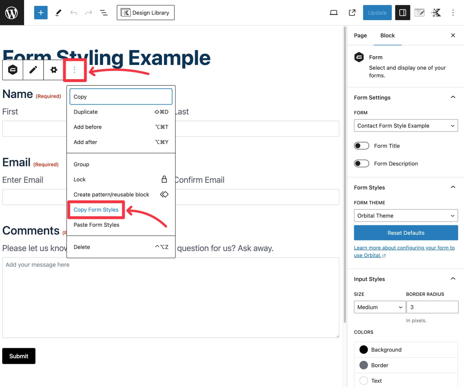
Copy Form Styles from Your Existing Form
To start, open the block editor for the post or page where you’ve added the form from which you want to copy styles.
Then, follow these instructions:
- Select the Form block that you used to embed your form.
- Click the three dots icon on the block toolbar.
- Select Copy Form Styles from the drop-down that appears.
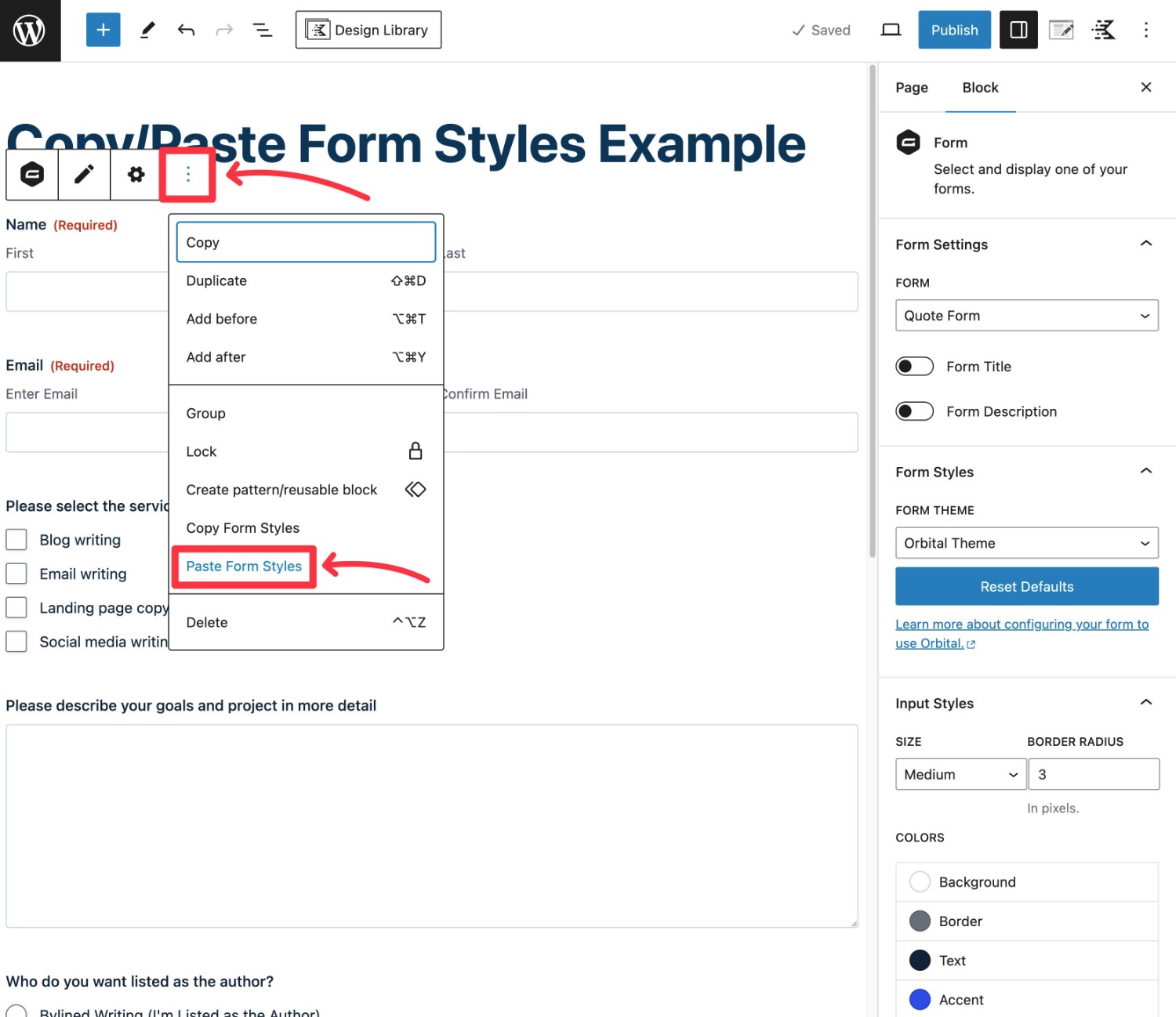
Paste Form Styles to New Form
Next, open the block editor for the form that you want to paste styles to. Or, if you haven’t embedded the form yet, add the form to the editor using the Gravity Forms block.
Make sure your form embed is using the Orbital form theme. Then, follow these instructions:
- Select the Form block that you used to embed your form.
- Click the three dots icon on the block toolbar.
- Select Paste Form Styles from the drop-down that appears.
That’s it! Your form styles will now be applied to the new form.
However, you’re still free to edit and adjust as needed.
How to Set Default Orbital Form Theme Styles (Also Works With Shortcode)
In addition to copy/pasting styles, another way to save time is to set up default styles for the Orbital form theme on your site.
This has two advantages:
- Save time in the block editor. You won’t need to duplicate your efforts on each form because the default styles will already be there. However, you’re still free to edit the styles if needed.
- Shortcode support. If you prefer to use the Gravity Forms shortcode to embed your forms, setting the default styles will let you use the Orbital form theme even when you embed forms via the shortcode.
To set up default styles, you can use the gform_default_styles filter.
Choose How to Use gform_default_styles Filter
You have two options to set up default form styles via the gform_dafault_styles filter:
- Set default styles based on the theme.json element. You must be using a block theme to use this approach, as “classic” WordPress themes don’t use theme.json.
- Copy your style choices from the Gravity Forms block. You can use the same copy method we showed you in the previous section and then just paste the styles into the filter code snippet. This works with both “classic” themes and block themes.
For this post, we’ll assume that you want to add the actual styles. If you want to use the theme.json element, you can check out the documentation here.
Copy Styles from Block
To start, you’ll want to open the block editor where you’ve embedded the form with styling that you want to set as your site’s defaults. Or, you can embed a new form and set up your default styles there.
Then, you can copy those styles using the same method that we showed you above:
- Select the Form block that you used to embed your form.
- Click the three dots icon on the block toolbar.
- Select Copy Form Styles from the drop-down that appears.
What if you want to set up the default styles because you’ve disabled the block editor and you’re planning to exclusively use the Gravity Forms embed shortcode?
If you’ve completely deactivated the block editor on your site, you could install Gravity Forms on a staging site. Or, you could spin up a free Gravity Forms demo site and style the form there.
In these cases, you can set up the styles using the block editor on that testing site and then just copy and paste them into the filter on the live site.
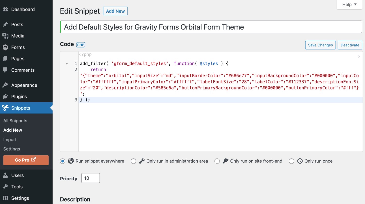
Add Copied Styles to gform_default_styles filter
Once you’ve copied the styles from the block editor, you need to add them to the filter using this code:
add_filter( 'gform_default_styles', function( $styles ) {

return 'PASTE STYLES INSIDE SINGLE QUOTE MARKS';

} );
For example, here’s what the actual code snippet might look like:
add_filter( 'gform_default_styles', function( $styles ) {

return '{"theme":"","inputSize":"md","inputBorderRadius":"20","inputBorderColor":"#0693e3","inputBackgroundColor":"#fff","inputColor":"#112337","inputPrimaryColor":"#204ce5","labelFontSize":"20","labelColor":"#112337","descriptionColor":"#585e6a","buttonPrimaryBackgroundColor":"#7700e6","buttonPrimaryColor":"#fff"}';

} );
Add Code Snippet to Your Website
Finally, you’ll want to add the code snippet above to your site using one of these methods:
- The functions.php file of your active theme – make sure to use a child theme if using this approach.
- A code management plugin like Code Snippets.
- A custom plugin.
Here’s what it looks like in the Code Snippets plugin:
How to Use Block Patterns to Save Time
In addition to the Gravity Forms-specific features, you can also use the core block pattern functionality to save time in both the block editor and the Site Editor.
For example, if you use a Group block to add extra styling on top of the Orbital form theme, you could save the entire Group block as a synced or unsynced pattern.
Then, you can easily insert that pattern whenever needed.
Synced patterns, formerly known as reusable blocks, also open up some cool opportunities. For example, you could create a synced pattern for your email opt-in form that you created with Gravity Forms and use it in all your posts.
If you ever want to update that design in the future, all you need to do is update the synced pattern once and those changes will apply to every instance of that pattern.
Here’s how to create a pattern:
- Select the block(s) that you want to include in the pattern.
- Click the three dots icon.
- Select the Create pattern option.
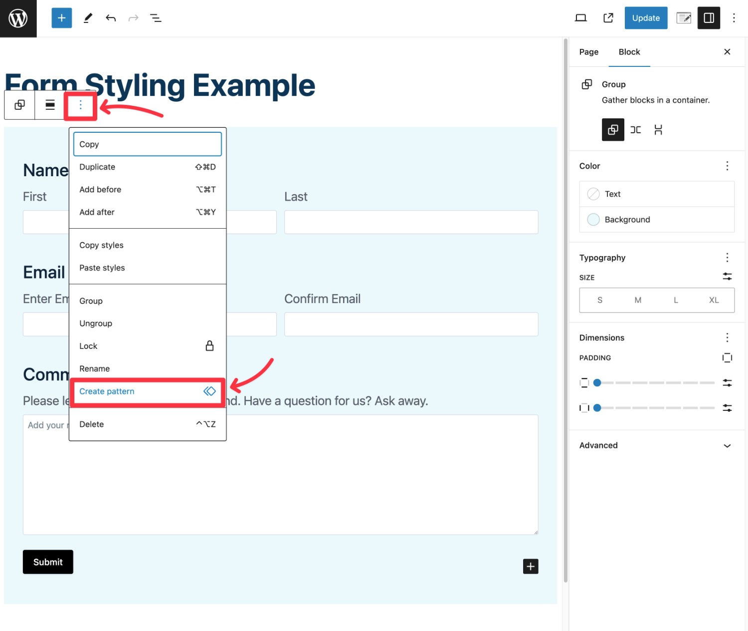
In the popup, give it a name and choose whether to make it a synced pattern (AKA reusable block) or unsynced pattern. You can also add a category to organize the pattern.
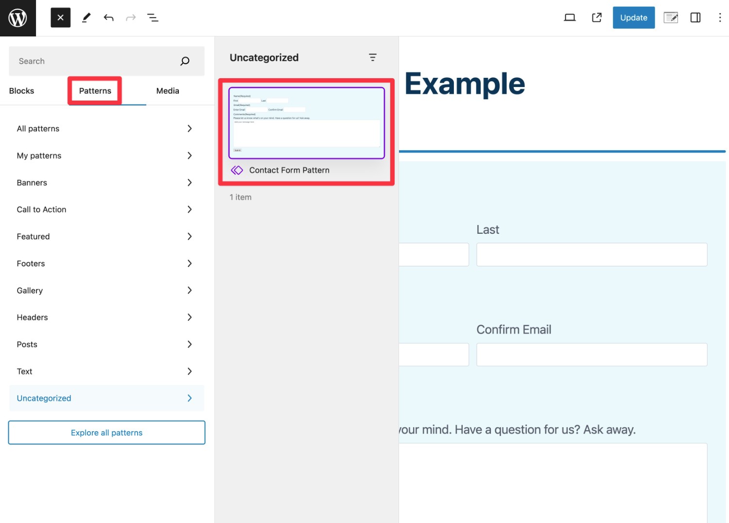
You can then insert that pattern from the Patterns tab. It will be located in the category that you selected. Or, if you didn’t select a category, you can find it in the Uncategorized area.
How to Use Orbital Form Theme With Shortcode Embeds
If you want to use the Orbital form theme with the Gravity Forms shortcode, your first step is to set up the default form styles using the gform_default_styles filter, as we showed you above.
Then, you can embed your form using the shortcode just like you normally would.
To configure your form to use the Orbital form theme, make sure to add the following parameter to your shortcode:
theme="orbital"
For example, the full embed shortcode might look something like this:
[gravityform id="9" title="true" description="true" theme="orbital"]
Other Tips for Styling Gravity Forms
Beyond the style options that you get with the Orbital form theme, there are also other official and third-party solutions that you can consider to style your forms.
Here’s a quick rundown of some other options that you can use:
- CSS ready classes – using the built-in CSS ready classes can help you style other parts of your form, such as adding highlighted callouts to your forms or confirmation messages.
- Custom CSS – for more advanced users, you can write your own custom CSS. We created a visual CSS guide to help you work more efficiently with custom CSS.
- Third-party page builder styler add-ons – if you’re building your website with page builders like Elementor, Beaver Builder, and others, you can find lots of third-party add-ons that let you style your forms directly from your page builder. For example, the Gravity Forms styler in Essential Addons for Elementor.
Start Creating Beautiful Forms Today
That wraps up our guide on how to use Gravity Forms and the Orbital form theme to create beautiful forms that match your site’s branding.
The easiest way to get started is to embed your form using the block editor, choose the Orbital form theme, and then visually style your form using the built-in options.
If you’re building multiple forms, you can also copy/paste styles between forms or set up your own default styles using the gform_default_styles filter. Using the filter also lets you customize the Orbital form theme for forms that you embed with the Gravity Forms shortcode.
The Orbital form theme and style options are available on all Gravity Forms licenses. If you’re already using Gravity Forms, start styling your forms today.
And if you’re not a Gravity Forms user yet, you can purchase your license here.
Or, you can spin up a free, fully functioning demo site to try all the style options, as well as all of the other features and add-ons that Gravity Forms offers.

If you want to keep up-to-date with what’s happening on the blog sign up for the Gravity Forms newsletter!
"*" indicates required fields