Every website needs a contact form. Even if you don’t expect visitors to use it much, you still need to give them some avenue to speak with you. And if you’re going to do something, you should do it well.
What makes a great contact form? It’s not just the fields you slap on a page. Great forms use clever design and brand-appropriate styling. They focus on the user experience so there’s as little friction as possible on the user’s end.
Great forms:
- Are easy to find on your site.
- Are free of unnecessary fields.
- Describe why you should contact the company.
- Are branded, but accessible.
- Have a clear call to action.
- Are intuitive and easy to use.
- Pair with other elements to create a better experience, like images, icons, compelling copy, or other unique features.
- Are positioned with other contact methods, like email addresses and phone numbers.
- Are near social media links so people can engage other ways.
- Redirect to thank you pages with additional information.
In this article, we’ll go through our list of awesome contact forms. You don’t have to recreate these on your site, but you can use them for inspiration when you design your next form.
1. Choice Screening
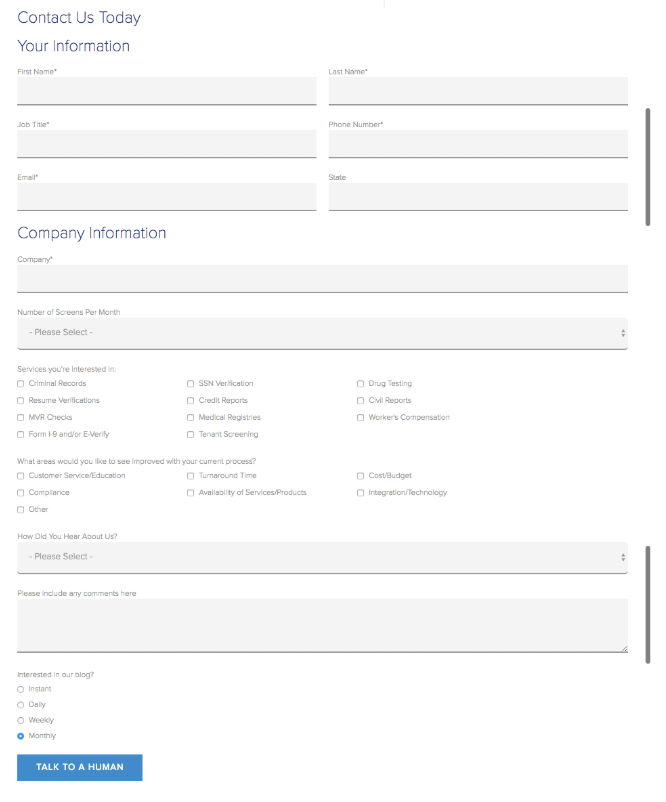
Choice Screening’s contact form is long and in-depth. It asks 13 questions. Six of those questions are required, including the phone number field.
That may seem like a lot to ask of your users, but they’re targeting people who are more likely to purchase their background check service. They probably don’t want people who aren’t serious to use this form.
We also like how this form also serves as an opt-in form. This is a great way to grow your email list and nurture leads. However, for the sake of a positive user experience and GDPR compliance, there should also be an option to opt out of the email list.
Finally, we love that call to action. It’s simple, direct, and focuses directly on what the user wants – to speak with someone. Like all good calls to action, it finishes the phrase “I want to…”
2. Pagely
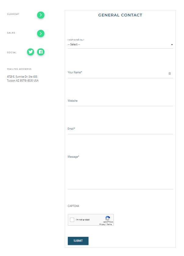
This is a fairly straightforward contact form, but we like it because of how well it fits into the brand’s identity. It uses a lot of whitespace, which matches the rest of the site’s design.
The label animation is especially clever. It’s interactive, but also functional. The label moves to a position above the field, so it’s always there to remind the user what they’re supposed to input.
We also like that Pagely has included some additional links to the left of the form. This is useful for people who have specific questions. The support link, for example, takes you to a page with support documentation so you could find your own answer more quickly than someone could reply to your submission.
Finally, the form smartly uses a reCAPTCHA to limit the number of spam entries. This can be a lifesaving feature if you have a popular website that attracts bots and spammers.
3. Sleeknote
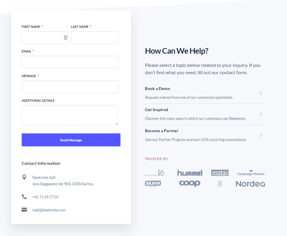
We think this is a great contact form for a few reasons:
First, it’s simple and clear. The contact form lifts off the page, drawing your eye. The call to action button stands out, but not obnoxiously so.
Second, Sleeknote refers you to other resources that might solve your problem. You might be able to find your answer faster than it takes someone to respond to you. These links also help Sleeknote by reducing the number of people who ultimately complete the form.
Third, the “trusted by” logos are a nice touch. They remind you that Sleeknote (the product) is trusted by some pretty impressive brands. This might encourage some people to follow through and contact them.
Finally, they’ve listed some additional contact information near the form. This gives you options in case you’d rather contact Sleeknote a different way.
4. Stripe
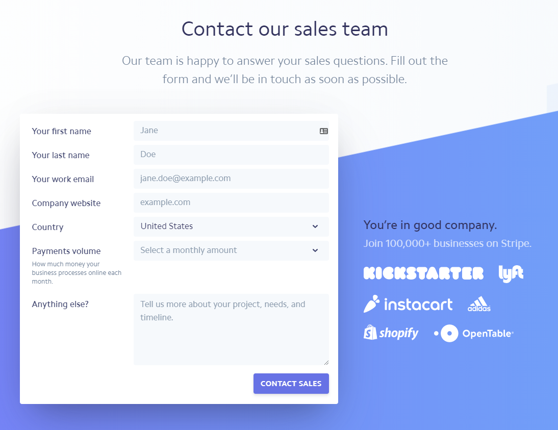
Stripe is known for their incredible website experience and their contact form is no exception.
What’s great about this form is that they have a keen understanding of their customer and that’s the only person they expect to use this form.
First of all, it’s a sales contact form. It’s for people who want to do business, not general questions, customer feedback, or press inquiries. They specifically want to know about “your project, needs, and timeline.” If you don’t have any of those things, this isn’t the right contact form for you.
Second, look at that impressive list of logos. What entrepreneur wouldn’t want to be in the company of those brands?
5. Snapchat
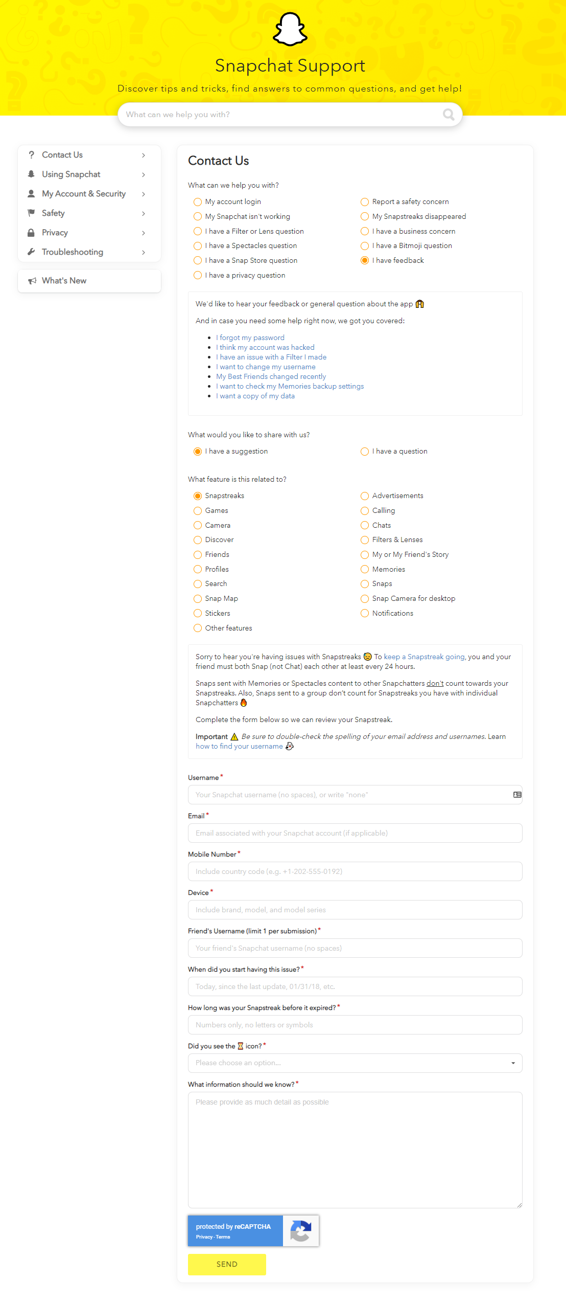
Snapchat’s contact form is impressive. It’s built into the support experience in a seamless way.
How does it work? With clever conditional logic. We expanded their form to show it in the image above, so you’ll want to click to Snapchat’s contact page to see it work.
Your first step is to choose one of the general help categories in the top row. Additional questions appear depending on your answers. The final form only appears if that’s the appropriate solution. Some options direct you to help pages or different kinds of forms.
You’ll notice the form at the bottom has more than the standard name, email, and message fields. It’s fine to ask more questions because the user is committed to the form if they’ve made it this far. Plus Snapchat is a big company who probably gets a lot of interest, so they only want to deal with people who have real problems.
This type of form works well because it forces the user to find the answer themselves before they submit something through the form, which solves their problem faster and reduces the number of submissions Snapchat has to deal with.
6. Toptal
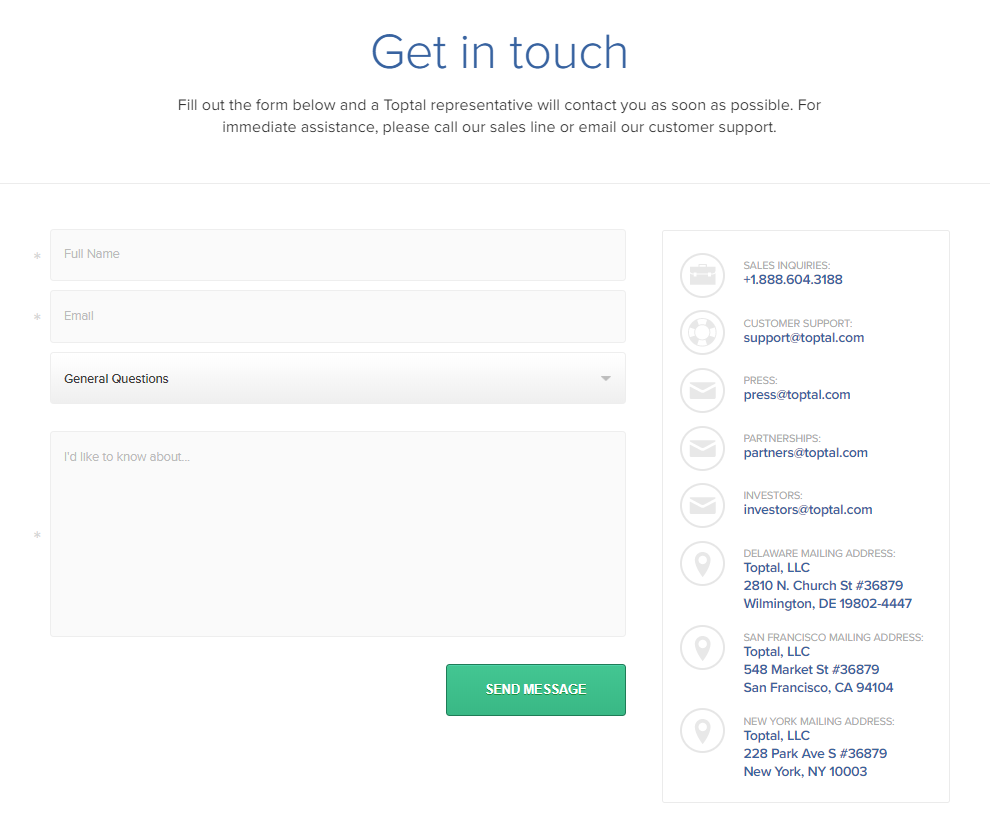
This is a fairly straightforward contact form, but what we like the most is the information listed alongside it.
The purpose of your contact form, of course, is to give people a way to reach you. But some people are frustrated by general forms that don’t take them directly to the people they need to speak with. If, for example, a user wanted to speak to someone in marketing about a partnership opportunity, they don’t want to send their message to a catch-all inbox that may not be checked every day.
Toptal smartly pairs other contact methods alongside their form. They give out email addresses for partnerships, press, investors, and customer support. If you have an issue pertaining to one of those topics, you may prefer to send a direct email.
In this case, the information next to the form may persuade people to not use it, but it ultimately facilitates the user’s end goal.
7. Compare the Market
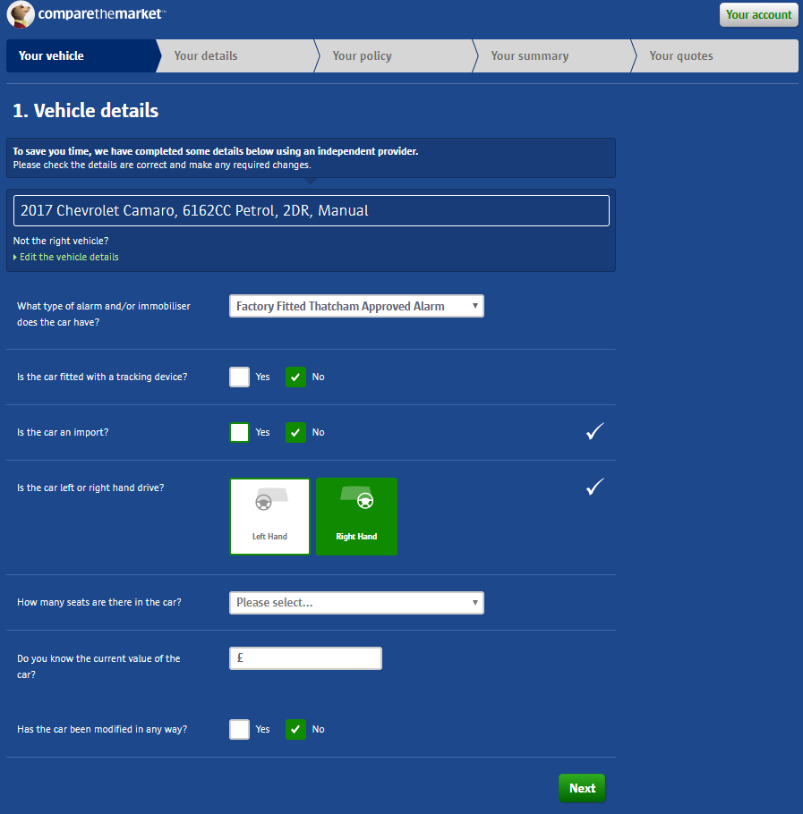
There are three powerful elements on this form that we really like.
First, we like how it’s split into multiple pages. That’s a great way to make a long and intimidating form easier for the user to handle. If all of the form’s fields were placed in one long column, users would think, “Wow, I don’t have the time/energy/attention for this.”
The multi-page format also organizes the form’s information to keep this simple in the user’s mind. For instance, on the first tab, the user only has to think about his car. On the second tab, he only has to think about his personal information.
Second, we like how they turned the two radio buttons next to “Is the car left or right handed?” into clickable images. That’s a good method if you think the user will struggle to answer the question.
Third, there’s a lot of conditional logic working behind the scenes in this form. For instance, when you select your car manufacturer, the list of models changes so you only see the ones that make sense. That’s a fantastic way of customizing the form to the user’s needs.
8. Trello
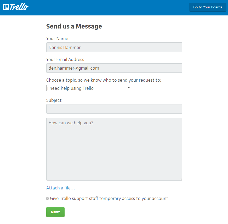
At first, Trello’s contact form looks standard, but there are three important things we like about it.
First, getting to the form requires you to pass some documentation links, like their getting started walkthrough, a video demonstration, and troubleshooting guide. These most likely solve a majority of users’ problems immediately.
Second, you’re forced to click one of two buttons. You can “ask the Trello community” for help, which bypasses the form and delivers you to their community forums, or “ask Trello support,” which is the form you see above.
Both of those paths help solve user problems without ever contacting Trello. If users can find answers without using the form, it’s almost always better for both parties to send them to those existing solutions.
The third thing we like is the drop down field on the form itself. Presumably, this field triggers some conditional logic that submits the form to the right person or team to help with that issue, rather than dumping all responses in the same general inbox. It means no one has to manually route each submission so users receive responses faster.
Going Forward
There you have it! Hopefully this list of awesome contact forms has given you inspiration to design your own elegant, effective, and meaningful forms. Place them in strategic places throughout your site to maximize the number of submissions you receive.
Whenever you build forms, always keep your customer and your purpose in mind. If you build a form that meets that balances both of your needs, you’ll create a positive experience that encourages submissions and supports your business.