Designing user-friendly forms is an important part of conversion optimization and lead generation.
If your forms aren’t easy for your users to decipher and complete, there’s a pretty good chance they’ll either run into difficulties and give up, or never bother with the form in the first place.
Modern web users are quite familiar with forms. They understand how they work and and what they’re supposed to do. Forms are a ubiquitous part of nearly every website, so you’ll have a hard time finding someone who’s never interacted with a form.
Nevertheless, forms are hard.
Forms require typing, decision-making, accuracy-checking, and error-fixing. They’re a means to an end for your user; an obstacle to overcome. In order to convince more people to complete your forms and give them a pleasant experience, it’s your job to make your forms easy to understand and complete.
You may have followed best practices when creating your forms, but that doesn’t mean they’re as user-friendly as they could be.
Here are three common reasons forms aren’t user-friendly.
Download this free guide to learn what a user-friendly form looks like.
There’s No Sense of Closure
If you think of your online presence (your website, email list, social media pages, etc.) like a conversation with your users, then a form is a way for them to contribute to the dialogue. It’s their opportunity to express interest and take the next step.
We prefer to end conversations with clear intent. We might say “I’ll talk to you tomorrow,” “I’ll let you know later today,” or “I’ll send that over in a minute.” We end our conversations deliberately. Forms are no exception.
Ben Shneiderman, an accomplished computer scientist and user design specialist, recommends organizing actions into groups with a distinct beginning, middle, and end.
When a user completes an action, it’s your job to provide them with some form of feedback that recognizes their accomplishment. This moment of closure gives them a sense of satisfaction, achievement, and relief, and prepares them for the next step.
If your form doesn’t give clear feedback at the end, your users will feel unsatisfied and lost. They won’t be sure if the form worked and what to do next.
But not all feedback is sufficient.
For instance, a simple “thank you” message doesn’t do the job because the feedback doesn’t relate to the goal. Similarly, “Thank you for your submission,” and “Thanks for signing up” speak to your goals, not the user’s.
You can add closure to your form in two ways:
First, make your call-to-action more descriptive. Instead of “Submit,” use a phrase that acknowledges their goals.
Usability expert Jared Spool says a great CTA must “compel people to click on it, and the best way to do this is by appealing to their self-interest. So make sure you clearly state exactly what your visitor will get if they click your CTA.”
Here are a few examples that speak to their goals:
- Complete Your Reservation
- Download Your Free eBook
- Register for the Webinar
- Head to Your Dashboard
Those CTAs signal the end of the form action and movement to the next phase.
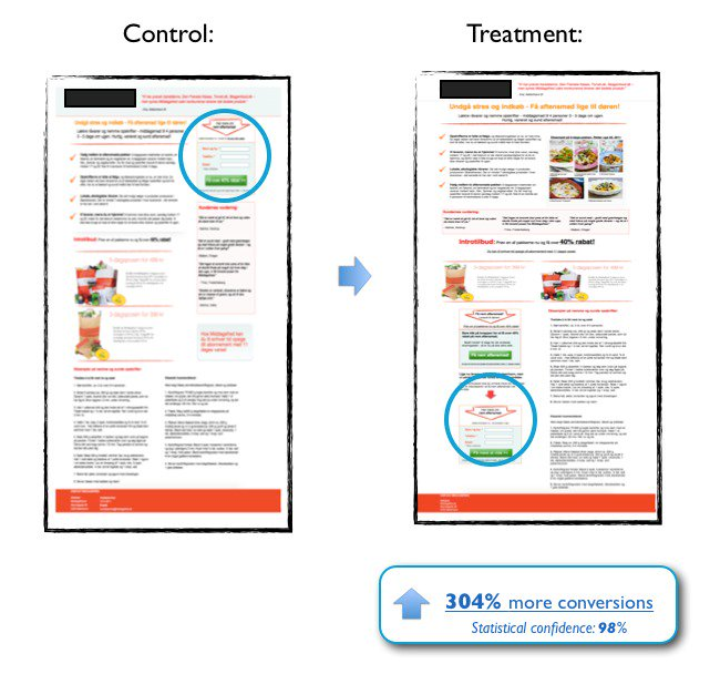
When Optimizely tested the copy of their homepage call-to-action, they increased their conversion rate by 27% by changing “Get Started” to “Test it Out.” Why did this work? Because their users want to try the product right now, not dip their toes into a long process. “Test it Out” made it clear they would get to play with the product now.
Notice the smart call-to-action on this form. They could have used the phrase “Register Now” or “Sign Up,” but they choose something that speaks to the user’s needs: a reservation.

Furthermore, it’s important to stick to one call-to-action at the end of your form. If you absolutely have to include other links (maybe you need a “print this application” or “review our privacy policy” link), don’t format them as a button. Your primary CTA should be unavoidably obvious.
The second way you can help your users feel closure is by redirecting them to a thank you page after they submit.
By reloading to a new page, you end the conversation cleanly. The form is gone because the user is beyond that point. It feels like motion.
Your thank you page is an opportunity to show gratitude for the user’s submission, gather customer feedback (with surveys or reviews), increase sales (by recommending additional products or services), and build brand awareness (by prompting them to follow you on social media, join your email list, etc.).
Most importantly, use your thank you page to explain what’s next. Should the user check their email? Do they need to click a button to download something? Will they get a phone call from you? If so, when?
By giving your form submitters closure, you’ll dissolve any lingering anxiety or uncertainty about the process and create a user-friendly experience.
You Haven’t Tested Your Forms
If you’re concerned with the performance of your forms, you’ve undoubtedly Googled around for answers. You most likely found countless articles filled with best practices, common tips, and must-do techniques.
In fact, you’ve surely seen a lot of that on this blog.
But best practices don’t tell the entire story. They’re just a starting point.
When Michael Aagaard of Unbounce tried to improve the conversion rate of his form by reducing the number of fields (a smart tactic because it’s generally effective), his conversion rate actually fell.
For whatever reason, Michael’s audience preferred a longer form. That violates the general principle of keeping forms short. But it works, and truthfully, performance is all that matters.
The single best way to improve the performance of your forms (including their user-friendliness) is to test them.
A/B testing your forms (also called split testing) is a simple principle: You send portions of your traffic to different versions of the same form. Whichever version performs best is the winner.
For instance, you could send half your traffic to a form with six fields and the other half of your traffic to a form with four fields. If the form with four fields receives a higher conversion rate, you know that shorter forms work better for your audience. You can iterate on this process by testing again, this time with a four-field form versus a three-field form.
To improve your form’s usability, you could also test…
- The location of your form on the page.
- The location and copy of the form’s labels.
- The location and copy of the form’s placeholder text.
- Call to action copy, color, and size.
- Your supporting copy (headline, privacy policy, etc.).
You Make Your Users Think
The most user-friendly forms don’t ask users to think too hard.
Ideally, your users should be able to speed through your form, effortlessly answering each question at ease. If they have to pause to consider an answer, make a calculation, or consult an external document, there’s a chance they either a) fail to find the answer and give up, or b) decide your form isn’t worth the trouble and give up.
Basic fields are rarely an issue. Your users surely know their own names and email addresses.
But other data points – like driver’s license number, credit card score, or yearly income – may not be readily available.
You can improve the user-friendliness of your forms by simply not asking questions that are difficult to answer.
This is especially important if the form is one of your user’s first interactions with your brand. New users who haven’t invested any time or money with your company are less tolerant of your requests, whereas a repeat/regular user will be more willing to follow through because they’re already invested.
If you simply must ask a difficult question, give the user options to reduce their need to think.
“Providing users with options instead of asking your users to type answers on their own will benefit both you and your users,” says Michael Silverman, digital marketing consultant and CEO of Duo. “When you leave an open text field for users to fill out it requires effort, creativity and decision-making on their part as they decide how to enter their information.”
For instance, if you ask your users to input a figure for their company size, they may have to stop and count or consult a document. Instead, give them a few options to select from a dropdown (1-5, 5-25, 25-100, etc.) so they can answer the question quickly without giving it much thought.
Another way to prevent your users from thinking too hard is to apply conditional logic to your form. This technique lets you hide complex questions until your users answer more basic questions.
As an example, instead of serving a half dozen questions about team size and makeup, it makes more sense to first ask, “Do you lead a team?” That way people who don’t lead teams won’t be confused by the additional questions.
User Friendly Forms Require Thought
You may think about forms a lot, but your users don’t. And they probably don’t want to.
It’s your job to craft your forms carefully. Slapping together a few questions isn’t enough. Is your form effortless? Is it fast?
If you build your forms thoughtfully, your users will resist the temptation to abandon them and follow through with the process.