Form layout is a crucial element of form design that many designers and website managers neglect. They fret over the landing page on which the form resides, but fail to think about the physical structure of the form itself.
In today’s article, we’d like to go over some simple-to-make form layout changes that will have a positive impact on conversions.
1. Don’t Duplicate Paper Forms
If you’re transposing a paper form to a web page, you might be tempted to duplicate its layout, but people use paper forms and web forms differently. If you simply convert a paper form without any changes, you’ll probably reduce your conversions.
When you design a paper form, you’re constrained by space. You have to fit everything on to the page. The result is usually a cramped, cluttered mess that fits, but doesn’t consider usability. It’s often hard to tell which field the form labels align with.
When you design web forms, don’t be afraid to use space. Build whitespace between fields. Use separators, background colors, conditional logical, and multiple pages to create logical divisions and comfortable usability.
2. Group the Form in its Own Container
Free floating forms are messy and hard to decipher. Users may not be sure where the form begins or ends, or whether the copy and images above and below the form are relevant.
Place your form inside its own container and separate it from the rest of your content. Keep it nearby, but use borders, colors, and positioning so users know what’s part of the form and what isn’t, like this:

3. Reduce Mouse Usage
Forms should be easy to complete. Your users should be able to move through your form seamlessly and intuitively without using their mouse.
Use each form yourself before you publish it on a page. Ensure that you can navigate it smoothly and swiftly without touching your mouse (other than setting your cursor in the first field). If you’re forced to reach for your mouse to complete a field or move between fields, consider redesigning the form.
Consider drop-down menus and radio buttons, for instance. To use a drop-down menu, the user has to click the field, scroll to the correct option, then click the option. That’s three mouse motions. If you used a radio button instead, the user would only have to click once.
If possible, use a method that doesn’t require the user to leave the keyboard at all.
4. Remove Unnecessary Fields
One of the first rules of form design (especially when you’re talking about conversions) is to reduce the number of fields as much as possible. This rule applies to form layout as well. Each field you add reduces the number of people who will complete the form.
Removing unnecessary fields makes determining your form layout pretty simple. In most cases, a majority of forms can be reduced to simple name and email fields. It’s easy to layout a form with only two fields!
It’s also important to consider the amount of effort you demand from the user to input data. Typing has a high cost to your users because it’s time-consuming and error prone (especially on mobile). You may be able to simplify the user experience with radio buttons or dropdowns, even if they add a little complexity to your form layout.
5. Match Fields to the Input
In a form usability study, Baymard Institute learned that users doubt their understanding of the form label when a field is longer or shorter than their data. This is especially true when users come across a field with a technical label (like a CVV – credit verification value) or data they don’t normally input into forms.
You can improve usability and tighten your form layout by reducing your fields to the size of data you expect. A CVV field would only have space for three digits. A zip code field would only have space for six digits. You may not know how long a user’s address will be, but it probably won’t be 75 characters.
6. Standardize Your Labeling
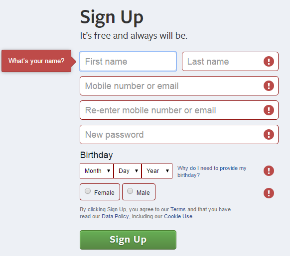
Users use field labels to understand what you expect them to do for each field. To prevent confusing your users, it’s important to use labels the same way for every field. It’s always best to place field labels just above the input. Anywhere else is unintuitive.
Top-aligned labels help users scan the form quickly (to help them understand it). It also requires less horizontal space as compared to placing the labels to the left of the field. This means you can make your fields longer and more easily accessible on smaller screens.
Some form designers use the placeholder text (text inside the field) as labels. This is fine for simple forms, but it becomes a problem with complex or irregular fields.
For instance, it’s okay to use placeholder text to ask for an email address, but you shouldn’t use it to ask a question like “What brought you to our store today?” The placeholder text disappears when the user starts typing, which means they may forget what you asked.
7. Get Rid of the Reset Button
It used to be standard to include a reset button at the bottom of the form, usually next to the submit button. Reset buttons have fallen out of style, but they still pop up every once in a while.
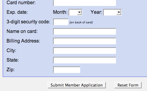
Reset buttons distract users from the primary call-to-action – the submit button. They also present an opportunity for the user to accidentally clear their own form when they didn’t intend to. Few people used reset buttons, anyway, regardless of form length.
8. Plan for User Errors
No matter how simple your forms are, some people will make mistakes, which means you’ll have to make them aware of their errors. According to Usability Heuristics, error messages should be graceful, actionable, and clear.
Error messages should stand out from the rest of the form. Use icons, text, colors, backgrounds, or other design elements to draw the user’s attention to the problem. Place error messages right next to the fields with the error, rather than generically at the top or bottom of the form. Validate the forms in real time so the user knows there’s an error before they hit the submit button.
9. Best Form Layout: Single Column
It’s tempting to use multiple columns for your forms so the user can see the entire form without scrolling, but this isn’t necessary anymore. People don’t mind scrolling.
Using forms with multiple columns can be confusing for your users. Some will expect to finish one column before addressing the other. Other users will expect to progress horizontally before dropping to the next line.
Single column forms, however, are simple and easy to understand. There’s only one way to go, so the user doesn’t experience any type of confusion.
Single column form layout is another way to reduce mouse usage, as well. Multiple columns often require mouse usage, especially if the tabindex (the other way they can tab through fields) isn’t set in a way they expect. Fortunately, setting the tabindex is simple in Gravity Forms.
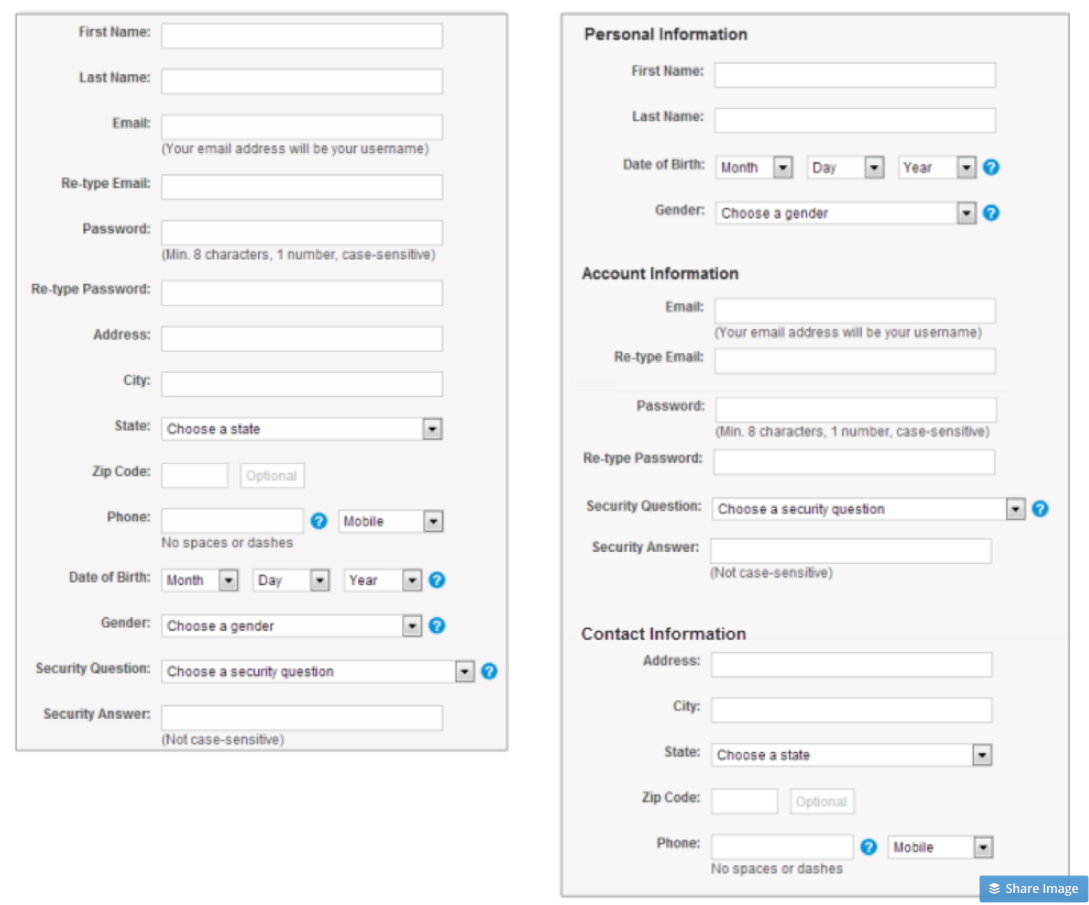
10. Order the Form Logically
Think of a form like a conversation between you and the user. Your job is to ask questions and they provide the answers. Just like a conversation, the questions on your form should flow naturally.
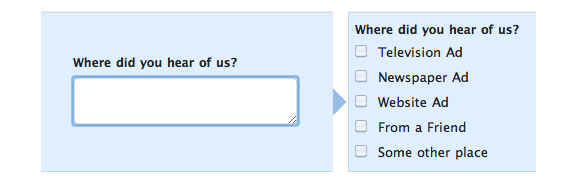
Ask your questions according to a logical flow from the users’ perspective and group them with similar questions. For instance, it makes sense to ask for the user’s name and email address first. Shipping address is usually four or more fields, so ask for that data at the same time as well.
Take a look at the form below. The form on the right is a reorganized version of the form on the left. Both forms have the same number of fields, but the right form is more pleasant to scan and use because fields have been collected into logical groups.
Experiment with Form Layout
Hopefully you test the copy, colors, and position of your forms to optimize them for conversions. Don’t forget to experiment with form layout as well. Use these practical recommendations to refine your forms, improve usability, and drive more signups.