What to Do About Your High Form Abandonment Rate

Form abandonment is often lumped into the big category of conversion optimization. Many people just accept it as a natural part of lead generation. However, form abandonment is actually a unique problem you can take steps to prevent.
What is form abandonment? It’s when a user begins to fill out a form, but for whatever reason decides not to finish. They might navigate elsewhere on the site or to another site.
The assumption here is that someone who abandons a form wasn’t ready to take the next step, but we disagree. Engaging with a form is an indicator that the user is somewhat interested in the next step, but either 1) wasn’t about to overcome their doubt, or 2) hit an obstacle.
Since your goal is to get the customer to complete the form, it’s smart to prevent form abandonment however you can. Fewer abandoned forms means more conversions, which means more fans and customers for you.
While there’s no magic trick to stop form abandonment, here are some important steps to take to boost your conversion rate.
Gather Abandonment Data
If you feel like people abandon your forms, the first thing you should do is gather as much information as possible. For that, you need to integrate your forms with Google Analytics (you’re probably using Google Analytics for other things anyway) and set up event tracking.
If you use Gravity Forms, the best way to make this connection is with a plugin like Gravity Forms Google Analytics Event Tracking. It takes a few minutes to set up, but it will help you identify the specific places people abandon their forms, which will give you some insight into why.
Here’s a video to show you how to set up the plugin with event tracking:
For more information on how to set up events in Google Analytics (in case the video didn’t explain it well for you – Google Analytics is complex), read this guide: Track Form Abandonment with Google Tag Manager.
Log Partial Entries
Partial entries are when users fill out one or more fields, then decide to abandon the form. The user is somewhat interested in the form (because they started it), but for some reason choose to stop.
These leads aren’t as “hot” as those who complete the form and hit the submit button, but they might offer some value to your business, so they’re worth having. Your form abandonment rate won’t change, but you may be able to reach out to these people to uncover why they didn’t commit or offer further persuasion.
Typically you only gather the data from a form when a user clicks the submit button, but now it’s possible to track partial entries with the Gravity Forms Partial Entries Add-On. (This doesn’t apply to all form data. Credit card field data, for instance, cannot be stored as a partial entry.)
Partial entries are stored like any other Gravity Forms entry in your WordPress dashboard, but they’ll lack whichever fields the user neglected to complete. Green checkmarks signify if the user submitted the complete form.
Once you have partial entries, you can…
- See where people stopped filling out fields. Perhaps they objected to one specific field.
- Send them a coupon or discount to make them feel comfortable with the transaction.
- Send those people a quick email to ask what was wrong and what you can do it to make it right.
Obviously, you’ll need their email address to do most of that, so ask for it early in the form.
Be Transparent and Clear
In the Ecommerce Survey 2014, Visual Website Optimizer learned that 28% of online shoppers abandon their carts if they’re confronted with unexpected shipping costs.
You may not be in the ecommerce business, but this data shows that users don’t appreciate unexpected information, especially when it costs them money.
Avoid asking for information that make your users say “Hmm, why do they need that?” If they feel like you’re asking for something you don’t need, there’s a good chance they’ll abandon the form. For instance, it’s a bad idea to ask for their home address in exchange for a digital product.
Stick to information that make sense; stuff your users expect you to ask. If you need something special, make sure your copy and imagery elsewhere on the page creates a connection. For example, if you want to ask for the user’s company name, be very clear that your form is business related.
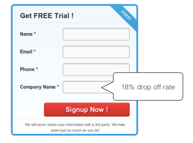
Knowlarity, a cloud telephone company, had tracking data that showed an 18% drop off rate when users got to the final field on their form – “company name.” They decided their users weren’t comfortable giving away that data point at this form’s point in the relationship. When they eliminated the field, conversions increased by 11%.
Fix Any Technical Issues
People are savvy web users these days, which means we don’t tolerate broken websites. If an element doesn’t work properly – or doesn’t work as expected – most of us won’t try to troubleshoot it. We’ll just move on.
So if your forms are broken or don’t work precisely how your users expect, it’s important to eliminate the bugs. If broken forms prevent users from submitting their information, you won’t just lose sales – you’ll damage your own brand.
Consider browser and device compatibility. Does your form work properly in every browser and device? Does the design match your intentions (no unusual spacing or broken styling)? If the form doesn’t look right, users may abandon it, even if it functions properly.
That said, does it function properly? Can users read the instructions? Can they read their inputs? Is there enough space to select each field with a finger? Are the fields hard to complete (drop down menus are notoriously tough on mobile devices)?
Complete your own forms on different devices and browsers to make sure they work. A tool like Browserling or PowerMapper will help.
Improve Your Design
Long, cluttered forms with lots of questions feel exhausting. Many people will skim your form, decide it’s too long, and bounce off the page. Some will start completing the fields only to grow irritated and change their mind.
So to minimize form abandonment, it’s important to optimize the overall user experience. That means…
Minimize the Number of Fields
There’s plenty of data that shows that people like shorter forms. They resist long forms, even if most of the fields aren’t required. If you don’t need a piece of information, don’t ask for it.
(Phone numbers are the biggest offender. People don’t like giving it out if it’s not necessary.)
You can also simplify your forms by using conditional logic so you only ask questions to the right people in the right circumstances. Read more here: Quick Guide to Using Conditional Logic for Smarter Forms
Match the Form to Your Site
Whether we like it or not, we judge things based on their appearance. Ugly, jumbled forms that don’t match the site’s design affect conversions. People just don’t trust forms that look like they don’t belong.
If your forms don’t match your site, dive into your CSS for some basic styling.
Avoid “Halt” Words
A halt word is a word or phrase that makes users stop and reconsider their decisions, rather than forging ahead with their form. Anything that slows users down can increase abandonment, so it’s important to avoid copy that breaks their rhythm.
Conversion specialist Giles Thomas discovered that using the word “spam” on a form increased abandonment, even though he used it in a positive context (he was trying to reassure people).
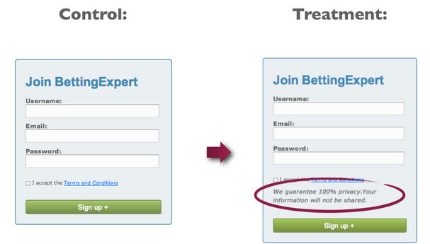
He replaced “We will never spam you” with “Your information will not be shared” and increased conversions by 19.47%.
Your Results May Vary
We’ve given you some strategies to reduce your form abandonment rate, but they may not all apply to you. The key is to measure the results of your forms (individually, depending on their purpose) to find ways to make them more effective. Even a small conversion increase could mean more money in your pocket, so fight form abandonment right away.