You built your business. You built your website. And you built that clever form to entice your audience to engage. But as we all know, refreshing your inbox doesn’t always make those form submissions appear any faster.
Fortunately, there’s more you can do to tweak your forms and encourage a higher rate of completion. Read on for five simple tips to increase form conversion rates…
Trusted by millions of sites, find out why Gravity Forms is the #1 choice for businesses.
No credit card needed!
 hbspt.cta.load(4148022, ’76c814b1-2a48-41cf-8aaa-4d9494bdd6fe’, {“useNewLoader”:”true”,”region”:”na1″});
1 – K.I.S.S. — Keep It Short and Simple
See? Our new acronym doesn’t even insult your intelligence. Show your audience you respect their time, too, by asking for only the most important information. The shorter the form, the higher the conversion rate.
Even eliminating one form field can improve submissions by a mind-blowing 50%. Although it’s tempting to add optional fields in the hopes that you’ll get more data, those harmless little boxes can stand in the way of your submission dreams.
Making your form clear and easy to complete will also help your users get all the way to the coveted submit button. Be sure to clearly label each field, which improves usability for everyone and contributes to better accessibility for those who use screen readers and assistive technology.
For any fields that might need some additional clarification, you can add descriptions or instructional text. And as an added safety net, be sure to include customized error messages that point the user in the right direction to correct any mistakes.
2 – Make Long Forms More Approachable with Multi-Page Forms
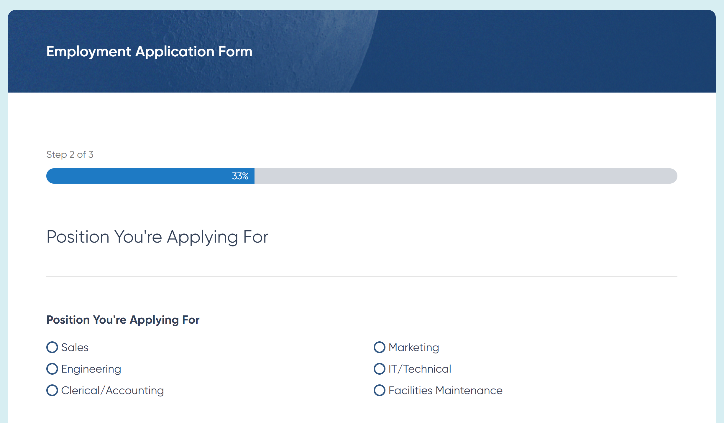
If you just caught yourself rolling your eyes to tip #1, we have good news for you. Sometimes complex forms really are critical. In those cases, dividing your form into logical sections on separate pages can make the task less intimidating to your users.
Some types of forms are really well-suited to the multi-page form experience. Think about forms like:
- Billing and Payments
- Employment Application
- Event Registrations
- User Registrations
- Surveys
Just as brevity and clarity can improve accessibility, so can multi-page forms. The W3C recommends organizing your form into intuitive sections or steps in a process. For example, an eCommerce form might keep billing information on a separate page from shipping information. An employment application would keep education on one page, followed by professional experience fields on the next.
A tool like Gravity Forms makes it easy to follow multi-page best practices, such as including instructions on each page and using a progress bar or progress steps to help users track their progress toward completion. These visual indicators help reduce frustration and improve the overall user experience for your forms.
3 – Get Personal with Conditional Logic
Using conditional logic helps make forms smarter by showing users only the fields that are relevant to them. Simply put, conditional logic is the technology that modifies your form fields based on the user’s input in a prior step. With Gravity Forms, that tech is already at your fingertips, with conditional logic included with every license.
Say for example that you want to offer your event attendees a complimentary swag gift. You include a dropdown to let the user choose between a water bottle, a hat, or a t-shirt. Water bottles and hats might not need any more information, so the user can get straight to the “Register” button. But with conditional logic, you can choose to include a new “t-shirt size” field for anyone who selects “t-shirt.” One size definitely does not fit all — and now your forms don’t have to either.
You can also use Gravity Forms conditional logic to customize your form confirmations and auto-replies. If you’re creating a donation form, you might need to direct users to different confirmation pages depending on their contribution amount. Or maybe you want to send a separate confirmation email depending on which facility a customer books on your reservation form. All of this customization (and much more) can be facilitated using conditional logic.
4 – Let Your Users Press Pause
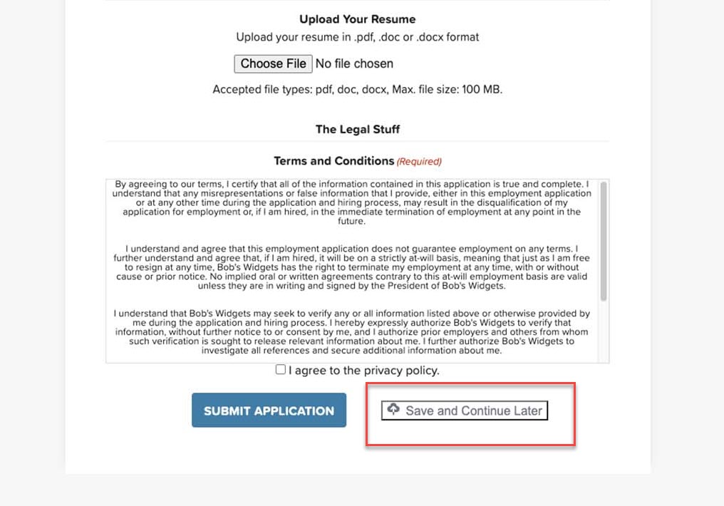
It might seem counterintuitive to let your users step away for a bit, but especially on those longer forms, it can make a world of difference. By enabling a Save and Continue option, you can easily let your users save their progress and continue filling out your form at time that’s more convenient. This helps ensure they don’t completely pull the plug when a distraction comes their way.
Save and Continue is a great feature for longer forms, particularly ones where your users might need to go gather additional documents or information. Remember the last time you did a job application? You might need to go verify your employment dates or look up a reference’s contact information. Or maybe you need to dig out that obscure certification you got on the internet five years ago and proudly posted on your LinkedIn page. With a Save and Continue option, you can generate a custom link and even email it to your user so they can come back when they’re ready to proceed.
5 – Make the Ask with a Clear CTA on the Submit Button
Remember that a strong user experience is always focused on the user’s goals. And believe it or not, no user set out to “submit a form” today. They probably did set out to get in touch with someone at your company, sign up for your newsletter, register for your event, purchase an item, or reserve some tickets. By steering clear of the default “submit” label on your final form button, you can customize the language to speak directly to the user’s goal.
Let’s take a look at some examples:
- Sign Me Up
- Register Now
- Subscribe Today
- Join Us
- Create My Account
- Get a Free Quote
- Claim Your Free E-Book
- Get the Guide
- Get Your Free Demo
- Start Your Free Trial
- Try It Now
- Order Now
- Buy Now
- Get Pro Now
A clear, strategic call to action will ultimately remind your users why they’re filling out the form in the first place and encourage them to complete the action. Be sure that your form tool gives you the flexibility to customize this language and style the button so you can grab your audience’s attention and get them to commit.
Sign Up for the Gravity Forms Demo!
Ready to take your forms to the next level? Take a test flight with Gravity Forms and see how easy it is to follow each of these tips without even trying. You’ll be boosting those form submissions in no time.
Already in love? Purchase our premium WordPress form plugin today!
Newsletter
If you want to keep up-to-date with what’s happening on the blog sign up for the Gravity Forms newsletter!
"*" indicates required fields