Registration forms serve many purposes. You might use them to register people for a webinar or live event. You might use them to capture email addresses for your newsletter. Or maybe you want users to sign up for your SaaS product or an ecommerce account.
However you use registration forms, they’re important to your business, so it’s important to optimize them for conversions.
Let’s talk about some ways you can minimize registration form friction (the likelihood users will ignore the form or abandon it mid-way) and capture more sign ups.
1. Guide Users Through Each Field
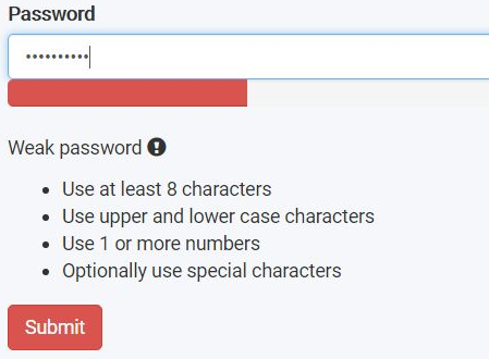
Have you ever completed a field only to receive an error message because your input didn’t meet requirements you didn’t know existed?
This often happens with password fields. You input your go-to password but the form fails because it didn’t have the right capital letters, special characters, numbers, or whatever.
If one of your fields has special requirements, explain them to your registrants on the form so they know before they enter their information. If your requirements are simple, you can place them in the placeholder text.
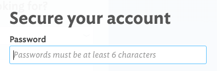
But if your requirements are complex (maybe you have three or four), place them somewhere on the form so they’re visible even when the user is typing.
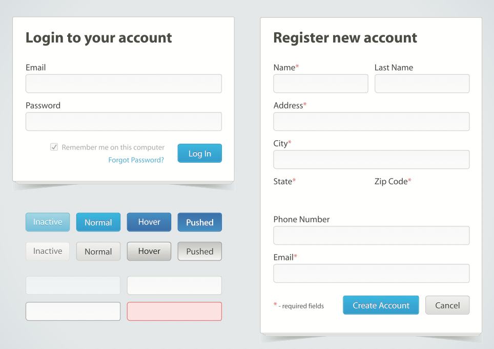
2. Make Your Form Simple and Scannable
The physical design of the form is an important component of optimization. Users tend to scan over forms before they complete them. They do this to identify reasons not to invest time into it.
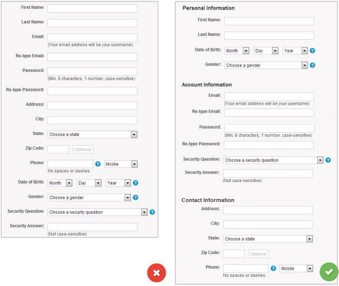
First, keep your forms to one column. Eye tracking studies show that single columns work best because they create a simple workflow. Your users won’t be confused about what they’re supposed to do next. (This is default in Gravity Forms).
Second, group similar information together. For instance, ask for personal information all at once before moving to a new category.
Here’s how one form was redesigned to create a smoother workflow. It may be physically longer on the page, but it’s actually an easier experience for users.
3. Talk About Benefits, Not Features
Throughout your marketing, it’s always important to speak about benefits, not features. Your registration forms are no exception.
Why do your users complete your registration forms? Is it because they really want to open an account, reserve a webinar seat, or attend your event?
No, of course not. They want the benefits that come from doing those things.
ContentVerve increased conversions by 31% on this Betting Expert registration form simply by changing the copy to focus on the benefits of signing up.

Think about what your users get by signing up. Will they learn tactics to grow their business? Will they receive help from someone who can solve their problems? Then use that language in your form title and call to action button.
4. Put the Form on the Right Side of the Page
This seems like a silly optimization technique, but it actually works. Forms on the right side of the page convert 24.6% more users than forms on the left side of the page.
What causes this effect?
When we view a web page, we generally read it from left to right in an F-shaped pattern. This means it’s smart to put the form’s title at the top, supporting copy on the left, and the form on the right. If you use benefits-based language, the user consumes the benefits of the registration form before they’re asked to complete it.
Here’s a webinar landing page that places their form well:

It’s worth pointing out that this doesn’t apply to general contact forms. Those should be placed on the left side of the page because the user is usually primed to complete the form before they arrive on the page.
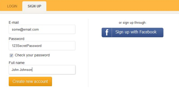
5. Don’t Ask for the Password Twice
The “Retype password” field is so ubiquitous you might assume it’s a necessary part of form design, but that couldn’t be farther from the truth.
Repetitive fields are annoying and off-putting. Why do websites do it? To prevent users from mistyping their password and failing to enter their account.
That begs the question: Why are users likely to mistype their password? Because sites hide the password content behind a row of asterisks as if hackers are standing over their shoulders.
A better solution is to offer your users a small checkbox that allows them to hide or display their password field content. This gives them control over how they complete your form and lets you eliminate an unnecessary field.
6. Remove Superfluous Fields
Take a look at this form. What’s the first thing you think about?
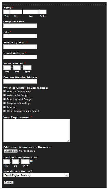
That’s an awful form. It looks like a homework assignment. No one wants to complete that, even if there’s something super valuable at the end.
First, get rid of all of your non-required fields. If you don’t really need it, don’t ask for it. In some cases, people don’t even look at non-required fields. You can always get that information at another time once they’re on your email list.
When Expedia removed the “company” field from their registration form, they saw an increase of $12 million in yearly profit.
Next, look at your required fields and ask if they’re really required. Each additional field makes you lose a certain number of conversions, so you have to ask yourself if each field is worth losing people.
Do you really need their phone or fax number? Do you really need their address? What value do you get from knowing their “suffix”?
In the form above, you can see they ask for a lot of information that isn’t pertinent at the time the lead completes the form. The address, services, requirements, file upload, completion date, and “how did you find us?” fields are irrelevant. A salesperson can ask those questions once they reach out to the prospect.
Registration Forms = Gateways to Leads
The registration form is the point when a user decides if they’ll take the next step with your company. If they’re at your form, it means you’ve already demonstrated your value, built trust, and overcome their objectives.
All of that will be wasted if you don’t optimize your registration form to capture the lead. Use these tips to design powerful registration forms that drive conversions.