Contact forms are powerful tools to make connections with your users and potential customers. Adding them thoughtfully throughout your site will increase conversions and improve the user experience. But where are the best places to put a contact form?
Forms can serve many purposes, so to get the most value out of them, ask yourself what function you expect them to fill. For instance, you might create contact forms where users can…
- Opt-in to receive lead magnets or content upgrades.
- Request wholesale or special pricing.
- Schedule consultations or product demonstrations.
- Register for a webinar or other event.
- Send you their thoughts and opinions privately.
- Request product updates or notifications.
- Engage with customer support or a representative from your company.
Forms can serve many purposes, so to get the most value out them, ask yourself what function you expect them to fill.
Understanding what you want your forms to do narrows down your potential locations considerably. For instance, a support form for users who need help would logically reside on your help page. A wholesale pricing request form would sit on your wholesale page.
10 Places to Put a Contact Form on Your Site
Here are the ten best places to place a contact form your website. Play around with these spots to find the ones that maximize your conversions.
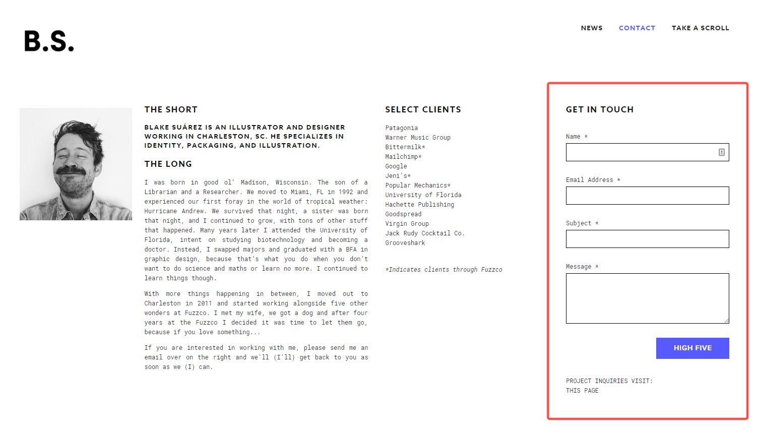
1. On Your Contact Page
Your contact page is the most obvious place to put your contact form. It’s the top spot users expect to find it. They won’t forgive you if they can’t find it there.
But don’t just drop your form on the page by itself. Use the space as an opportunity to…
- Explain why your users should contact you. What benefit do they gain?
- Tell them when they can expect to hear back from you.
- Offer other methods to contact you in case they prefer those.
- List your social media accounts so they can connect with you other ways.

2. On Your About Page
Website users visit your About Page to learn about you and/or your business. They might have some questions or concerns for you after reading this page, so it makes sense to give them a direct line of communication with a contact form.
What should go alongside your About Page contact form?
- Your personal/brand story. How did you get to this point in your journey?
- Who works on your team and how to get a hold of them.
- What other people say about you and your company.
3. In Your Footer
Web users know to look to a website’s footer for important information. This is where they expect to find social media links, links to important pages, maps, disclaimers, and – of course – contact information.
Rather than making your users click to a new page to contact you, consider placing the form right in your footer. The simplicity may be what convinces a user to contact you rather than simply leave your website.

It’s also smart to include your other contact information in your footer, such as your phone number, email address, and mailing address.
4. Inside or Beneath Your Blog Posts
If you create blog content, your readers may have questions or comments about the content or your business in general. So it makes sense to give them an easy way to contact you while they’re reading one of your articles, or right after.
Place a contact form in your website’s template file so it appears at the bottom of every post just beneath your author bio or after a certain number of paragraphs. This way it will appear on every new post.

For best results, place a form that captures leads in exchange for a lead magnet. Since the reader has already consumed some of your content, there’s a good chance they’ll want more of it.
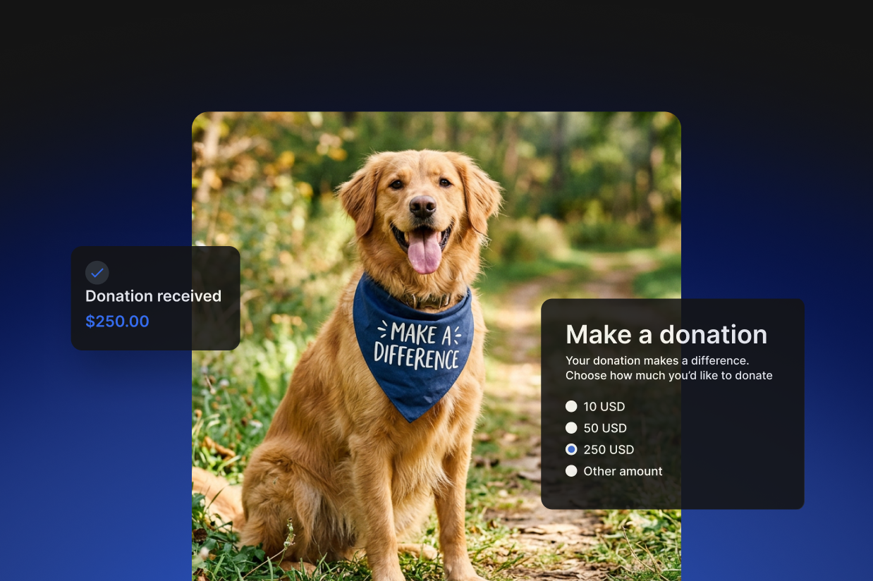
5. On the Top of Your Home Page
Sometimes you want your users to use your contact form right away. This is great for niche websites that get highly targeted traffic or businesses that require a salesperson/representative to chat with potential customers.

If you put a form this early on your page, make sure to spell out exactly why the user should contact you and what happens next.
6. On the Bottom of Your Homepage
In many cases, it’s best to place your contact form at the bottom of your homepage. This is a logical place if you expect your users to read the page’s content before contacting you. It serves as a final call-to-action for the page.

7. In Your Sidebar
Sidebar contact forms are great when you want your forms visible at all times on nearly every page (depending on the configuration of your widgets). This way your users will have a way to contact you from every page.

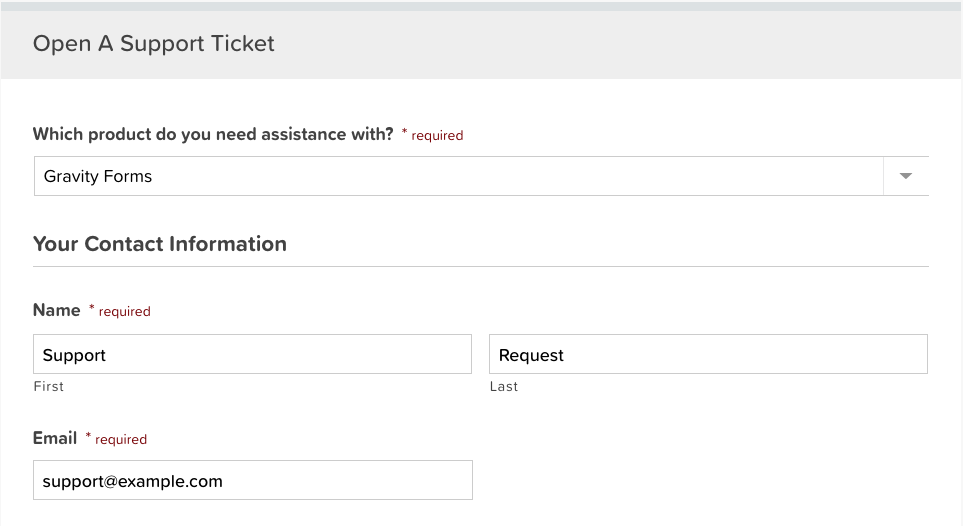
8. On Your Support Page
If your users are on a page specifically designed to help them use your product or service, you know they’re already dealing with a problem. If your pages can’t provide the answers they need, they’ll look for a way to contact you.
So it makes sense to include a contact form right on your support page. This way your users get their answers one way or another.
9. In a Lightbox
A lightbox is a pop up element that appears when a user interacts with an element on the page. For instance, the user may press a “contact us” link to make the box appear with a form inside.
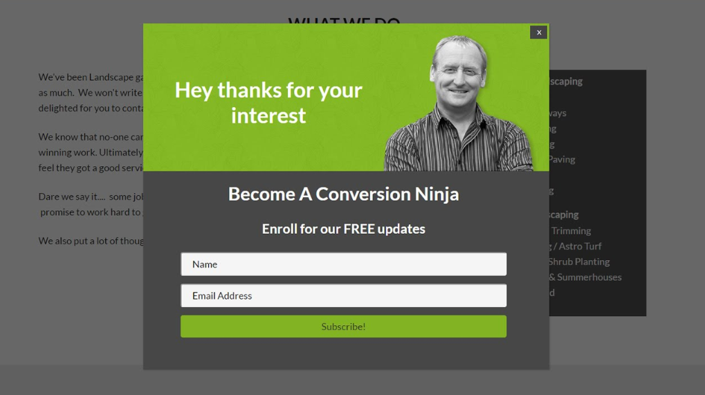
Lightboxes are useful because they don’t clutter your design, but they keep the form accessible at all times. Plus if people aren’t willing to ready to contact you, they won’t feel pressured by the form.
10. On a Landing Page
Your landing page is another obvious location for a contact form. Landing page design is a big topic, so where you place your form on the page can vary.
Generally speaking, brands have the best luck putting their forms at the top of the page on the right hand side so they’re visible immediately. Place your title, subheading, and other copy to the left of the form.

But that doesn’t mean you can’t put your form in a different location. Plenty of brands do.

Changing the Locations of Your Forms
If you use Gravity Forms, swapping your forms to new locations is simple.
Gravity Forms use shortcodes to install forms on pages, posts, sidebars, and widgets. Find the form’s ID number on your list for forms…
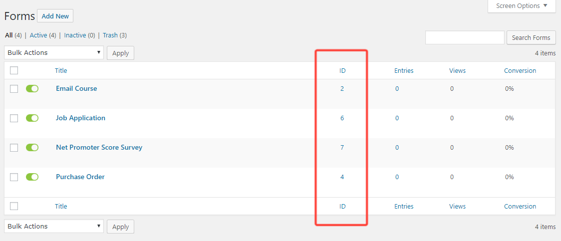
…and use IT to create a shortcode wherever you want the form to appear. Here’s the format:
Oops! We could not locate your form.
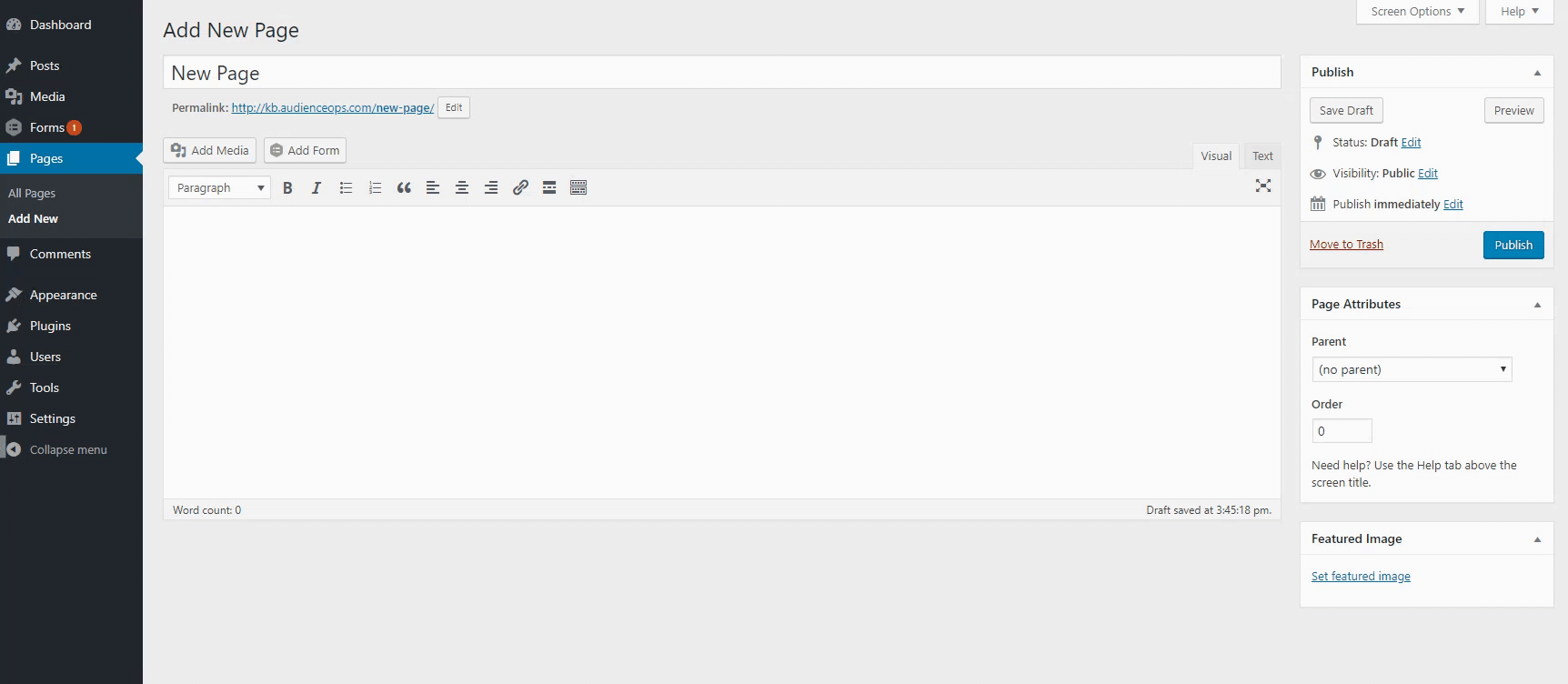
Alternatively, you can use the “Add Form” button just above the editor on any page or post. Simply select the form you want to include and Gravity Forms will paste in the shortcode.
Get Creative to Find the Right Location
There’s evidence that content above the fold (before people have to scroll) gets seen 102% more often than content below the fold. However, you could make an argument that people who scroll have more interest in your brand because they’re willing to learn more about your company. In one case, moving a form below the fold created 20% more conversions.
How do you tell which is right for you? Testing! Run A/B tests to compare your contact forms against one another to find the spots that maximize your conversions.
We’ve offered some of the top places to put a contact form on your website, but don’t be afraid to try unique locations. You never know what might boost your conversions until you measure.