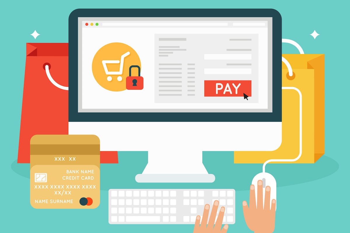
What makes a customer abandon their online cart?
The answer to that question can be complicated. There are many reasons that someone might stop in the middle of the checkout process and never come back.
Some of those reasons are outside of your control.
Things like not having enough shipping options (or no free shipping) or product prices being too high can send a customer packing before they hit “Confirm Order.”
But in some cases, the issue isn’t with the product at all. It’s entirely with the checkout process itself.
The Biggest Customer Fears Around the Checkout Process
Customers are essentially looking at two things when they get to the end of their product search: cost and convenience.
Anything that gets in the way of a fair price or an easy checkout experience will more often than not lead to an abandoned cart.
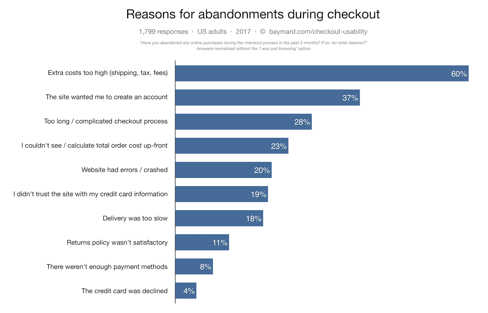
Things like extra or unexpected shipping fees, checkout forms that are too long (forced sign-in, multi-step forms, etc.) and website errors can all contribute to the problem.
While offering free shipping can be a helpful way to reduce costs, it’s not always an option for every store.
The easiest and most universal solution is to simplify the checkout process.
Studies show that even though 1 out of 4 shoppers will abandon carts if the checkout process is too long, a 20-60% reduction in the number of form elements can change this.
In fact, the Baymard Institute’s e-commerce checkout usability research found that the average site can increase conversions by 35.26% just by simplifying the checkout process.
So how do you simplify the checkout process?
Here are a few ways you can ensure that customers aren’t worried about convenience or costs when it comes time to purchase from your online store.
1. Don’t Force Sign-Ins
A simplified checkout process will eliminate as many obstacles as possible to the final purchase.
According to checkout usability expert Christian Holst, 30% of customers will abandon their cart if they’re asked to register before checking out.
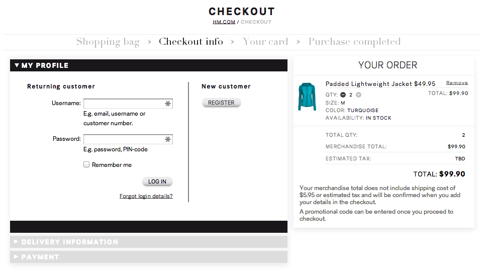
While having an account can be a positive thing for customers in the long run — they can return to view their purchases, track order history, and so on — it’s another hoop they have to jump through when filling out a form.
If a user wants to purchase a product first before committing to the brand, having forced registration can make users feel pressured.
Forced registration is not only an obstacle, but a psychological barrier to a quick checkout.
The better solution is to provide a guest checkout option that allows people to purchase a product or complete the checkout process without having to formally create an account.
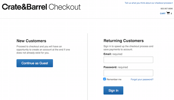
A guest checkout option gives shoppers the ability to make a purchase without saving any information in your database. Their information is applied to only one order.
When Asos introduced a guest checkout option in their checkout process, they cut their abandoned cart rates by 50%.
Here’s how to add custom checkout options to Gravity Forms.
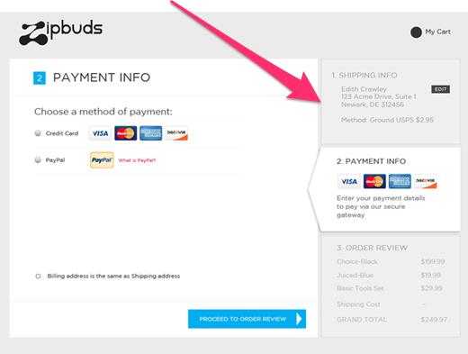
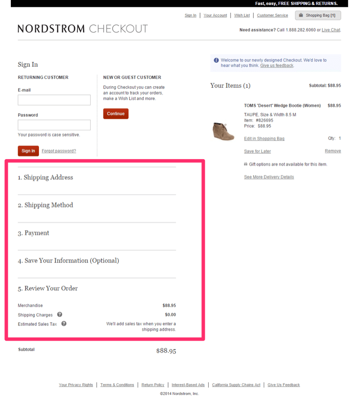
2. Add a Progress Bar
When it comes to conversions, the best checkout processes are short.
Research by Baymard Institute indicates that the average checkout has 14.88 form fields, which is twice as many as necessary.
But the average checkout process has roughly 6 steps. So sometimes you need to have longer checkout forms and there’s no way around it. What then?
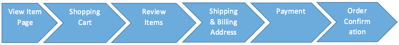
For those that still require longer forms, adding a progress bar to the page can help ease the customer’s fears around time constraints.
If they know there’s only 3 short sections, for instance, they might be less hesitant to finish the checkout process.
If they didn’t know how long the process would take, or they knew they had to fill out more fields than truly necessary, it might give them time to think about all the information they’re sharing or whether or not they to finish.
The solution is to add a progress bar to the form in some way or another.
It might look something like this:
Or like this:
Or like this:
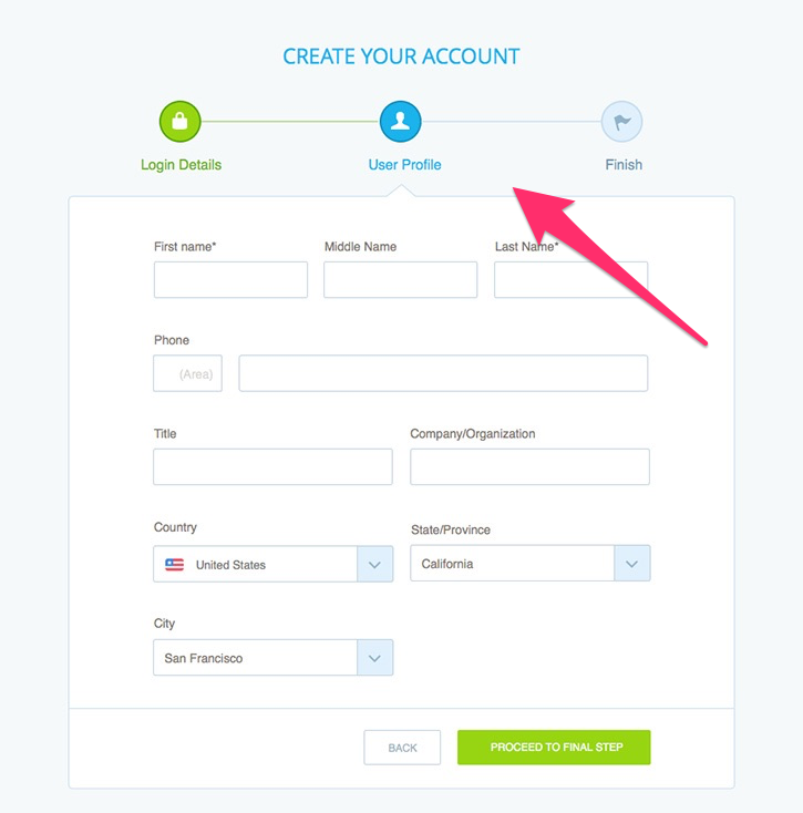
Whatever the case, adding a progress bar can help users see that the checkout process isn’t as long or complicated as they think it is.
It gives them peace of mind that they’re not wasting time.
Here’s how to add progress bars to Gravity Forms.
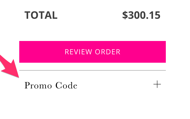
3. Hide Your Coupon Code Link
Another area that’s often overlooked when it comes to reasons for abandoned carts is the coupon code section.
When customers see a box for a coupon on promo code, they can easily think, “Was there a coupon I missed?”
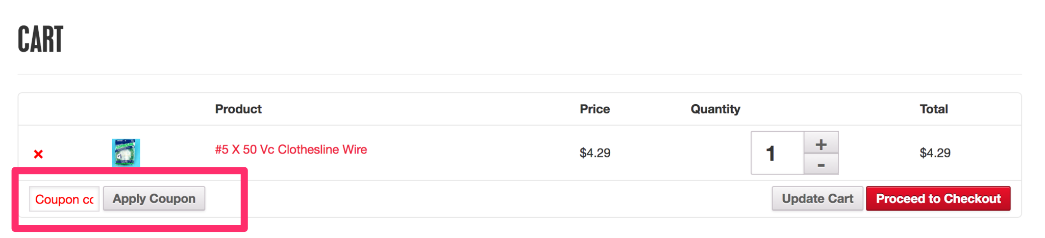
In some cases, they might leave the site to find a coupon code and never finish checking out.
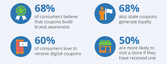
Of course, this doesn’t mean that you should eliminate the ability for users to find or use promo codes or coupons. Coupons can be an excellent way to create brand awareness as well as build customer loyalty.
But you do need a way to stop customers from leaving your site in order to find and/or use coupons.
One of the ways you can do this is by redesigning the box so that it’s somewhat less noticeable.
When Baymard Institute conducted eye-tracking studies of checkout processes, they found that users almost always paid closer attention to form fields while ignoring graphics.
If you can hide your coupon code field behind a link, visitors will be less distracted by the fact that the box is empty and they have no code.
This can prevent “coupon hunting” from happening during the last steps of the checkout process.
Here’s how to hide coupon code fields in Gravity Forms using conditional logic.
4. Show Form Errors Clearly
Another reason for abandoned carts is unresolved form errors.
Errors will inevitably occur, but the way the form is set up to handle errors can make a difference for the customer.
If customers can clearly see where the error was made and how to fix it, they’re more likely to finish the checkout process. To do this, include errors in a bold color and indicate which fields the errors occurred in.
Here’s an example from Baymard Institute on clarifying what the “Address Line 2” means for customers that fail to fill it out:
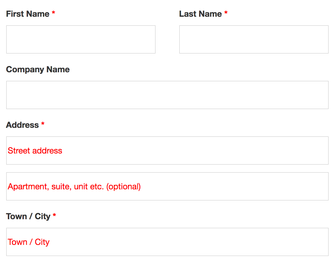
Baymard recommends adding field label descriptions to forms to prevent errors, but highlighting them in a bold color so that users aren’t confused if they fail to fill something out correctly.
Here’s how to style field label descriptions in Gravity Forms.
Another thing that might help make the process smoother is to alert users when the error occurs, rather than having them wait until the end after they’ve submitted the form to be notified that something went wrong.
This can be done through a pop-up or directly above the form fields themselves.
Giving users feedback right away when errors happen can save time, as well as keep them moving through the checkout flow without interruption.
Here’s how to display errors in Gravity Forms and, if necessary, create pop-ups to display errors in real time.
5. Offer Live Chat
When things go wrong that an error pop-up can’t fix, then you need to provide a way for customers to connect with you right away.
If issues aren’t resolved in a timely manner, customers may not return to finish the checkout process due to frustration.
One of the ways to help customers when errors occur is by adding live chat features to the checkout process, like Zappos does.
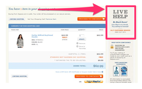
Studies show that 76% of those who use live chat do so because they experience errors during the checkout process.
In one case study, a company increased their conversions by 31% when they added live chat to their checkout process.
While not exactly a forms issue, it is a part of the checkout process that can help mitigate fears when something goes wrong.
Here are some live chat options for your checkout process.
Final Thoughts
There are many reasons that customers will run away from the checkout process, and yes, some of them are outside of your control.
But some of the reasons for abandoned carts are within your power to fix.
To create the most positive checkout experience possible, do things that eliminate fears about costs and make it easy to finish the checkout process.
This includes allowing users to checkout as guests, adding progress bars for longer forms, hiding the coupon code field (so they don’t run off coupon hunting), showing errors clearly and adding help where needed.
When you make the process easy for customers, you reduce fears and encourage purchases both now and in the future.