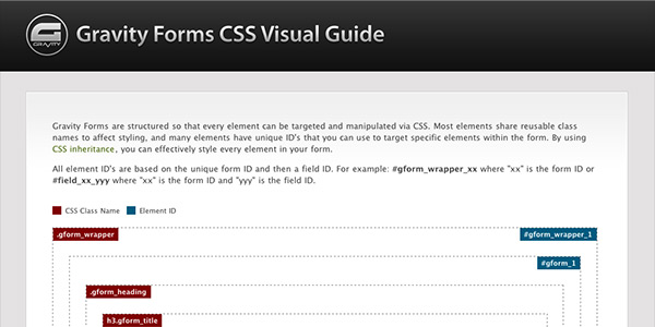
View Guide (HTML Version) | Download Guide (png)
We’ve put together a simple visual guide to help illustrate the structure of a form and the CSS class relationship.
Basic Structure
Gravity Forms are structured so that every element can be targeted and manipulated via CSS. Most elements share reusable class names to affect styling, and many elements have unique ID’s that you can use to target specific elements within the form. By using CSS inheritance, you can effectively style every element in your form.
All element ID’s are based on the unique form ID and then a field ID. For example: #gform_wrapper_xx where “xx” is the form ID or #field_xx_yyy where “xx” is the form ID and “yyy” is the field ID.
Configurable Classes
There are 3 label classes that are applied based on the individual form settings, .top_label, .left_label and .right_label. Other elements change positions, widths, etc. based on inheritance from these label classes. Only the “top_label” class is represented in this example. Additionally, for many of the individual fields, there are classes of .small, .medium and .large which are also defined in the form admin.
Finally, for most of the fields, the user can define additional class names in order to apply additional custom styles or to target elements for other types of manipulation.


