Forms are designed to be filled out.
Whether it’s a simple contact form or a complicated checkout process, forms should convert.
According to MarketingSherpa, ecommerce conversion rates should fall around 5% (here’s how to measure your form conversion rates) and landing page conversion rates should be around 13.28% for B2B and 9.97% for B2C forms.
Are your forms hitting those numbers?
If not, it could be the result of a some common mistakes that are keeping users from doing what they need to do. Here are a few of the biggest form mistakes that could be hurting your conversions.
Mistake #1: You’re Not A/B Testing the Number of Form Fields
There’s some debate around whether or not a form should be long or short to maximize conversions.
Ultimately, ideal form length depends on a number of factors, like your target audience, the type of form (pop-up? Landing page?) and what the form is designed to do (gather credit card information for checkout? Collect emails?).
In many cases, short forms tend to outperform longer forms.
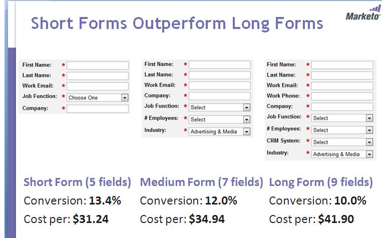
But some checkout forms can include several sections (pages) and still convert, whereas a short email-gathering form may fall by the wayside.
When Michael Aagaard of Unbounce conducted his own research on form field length, for example, he found that when he removed a third of the fields from a “beast of a form” he was testing, his conversion rates actually dropped 14%.
“I removed all the fields that people actually want to interact with and only left the crappy ones they don’t want to interact with,” he said, which he adds was “kinda stupid” in retrospect.
As a general principle, forms should only include as many form fields as necessary for the form type and audience, but there’s no universal rule for how many that should be.
For example, a B2B form might ask questions about a user’s occupation in order to segment the email list. But occupation questions on a basic contact form would be unnecessary, and might harm conversions.
The key is to A/B test your forms for the ideal field length.
As Michael says, “It’s very difficult to solve a problem you don’t understand. Vice versa, it’s pretty easy to solve a problem you do understand. That’s what research does. It helps you understand problems.”
Mistake #2: You’re Not Using Smart CAPTCHA
Not all forms require CAPTCHA, and for the most part you shouldn’t include it in forms unless absolutely necessary.
But for forms that do require some level of human verification, it’s important to make the process as smooth as possible for users.
This means using something like reCAPTCHA instead of a traditional CAPTCHA button.
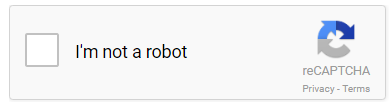
ReCAPTCHA is a one-click verification process.
Rather than having users spend additional time assessing images for shapes, patterns, numbers or letters and entering in a code, they can simply click a button to prove they’re not a robot.
Last year Google announced they would release Invisible ReCAPTCHA as another alternative, which would allow forms to separate human users from bots without users having to check a box at all.
Considering that CAPTCHA and even reCAPTCHA have been shown to be conversion killers, eliminating as many steps in the process as possible for users is essential to better form performance.
Mistake #3: You’re Not Using Conditional Logic to Simplify Forms
Occam’s Razor is a problem-solving principle describing how people give precedence to simplicity when presented with complicated choices. The principle can also be applied to form conversions.
If you have a form that requires multiple steps, like a checkout form or survey form, for example, Occam’s Razor dictates that people will always choose the easiest way through the form.
For some people, that might mean skipping all form fields that aren’t mandatory. For others, it might mean not filling out the form at all (which isn’t what you want).
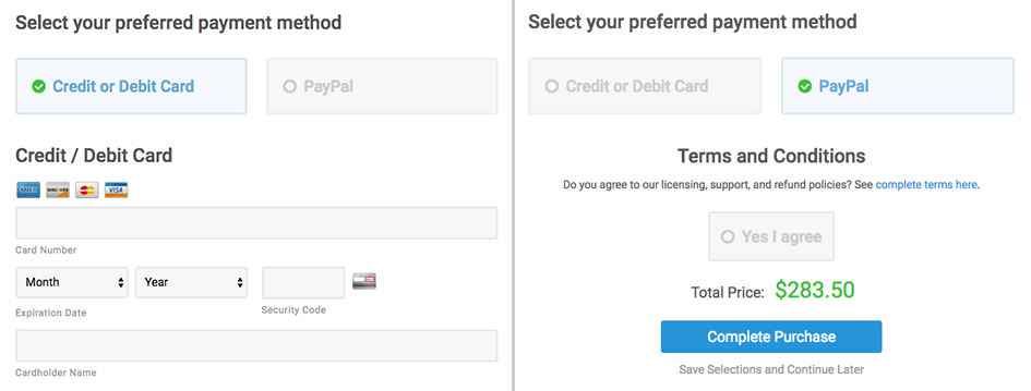
In order to simplify the process, use conditional logic to hide fields that aren’t necessary to most users, or to only show them information that applies specifically to them.
You can use conditional logic on ecommerce forms to show or hide fields for credit card payment information or PayPal information, for example.
By eliminating choices for the majority of users, you reduce the time spent filling out the form, make it more relevant to the individual users, and increase your chances of the form being completed.
The easier you make it for people to complete, the more likely they will be to complete it.
Mistake #4: Your Form CTA is Not Compelling
Another part of your form that you might have overlooked when it comes to conversion optimization is your Submit button.
While the phrase “Submit” is clear and fairly universal, it’s not always helpful for conversions.
According to Crazy Egg, CTA buttons are not just about telling a user what to do, they should also convey some type of benefit if you want them to convert. That can be hard to do when you have a limited amount of space.
The solution is to use shorter phrases that convey more meaning, like:
- “Get my Free [Thing]”
- “Proceed to Checkout”
- “Complete My Order”
- “Test It Out” (free demo)
- “Check It Out”
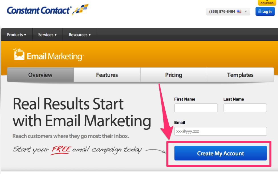
- “Create My Account”
- “Sign Me Up”
Additionally, form CTA buttons with personalization (“Send Me My Free Download”) have been shown to increase conversions over CTAs without personal references (“Download the Report”).
Surrounding CTA buttons with additional text, like “Click this button to start your free trial,” can also increase click-through rates.
If your forms aren’t converting the way you want, A/B test your CTA buttons to see if there’s a noticeable difference.
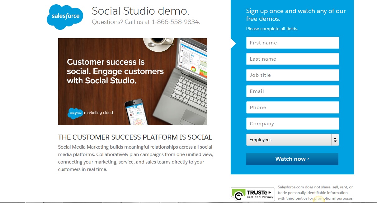
Mistake #5: Your Form Landing Pages are Subpar or Spammy
If users can’t trust your landing pages, they won’t trust your forms.
Your landing page designs can make or break conversions. If there’s not enough text to explain the benefits of filling out your forms, for example, users might not trust what’s on the other side of the Submit button.
On the flip side, if users find your landing pages to be overwhelming or cluttered — containing too much information without showing any real benefit and otherwise being hard to navigate — they may leave the page without filling out the form at all.
For ecommerce forms, not including key information, like shipping costs, order FAQs and checkout support information on your form landing pages might mean that customers don’t complete the checkout process at all.
At the very least, form landing pages should be clean, uncluttered and easy to read.
Other “spammy” elements, like too many pop-ups or an overabundance of display ads and animations, might cause users to leave the page without ever looking at your form.
Studies show that you have around 3 seconds to make a good enough impression with site visitors to get them to convert.
If your forms aren’t converting quickly enough, it could be because your landing page design is suffering.
Fix your landing page design, fix your conversion rates.
Final Thoughts
The best thing you can do when trying to improve form conversion rates is research.
Don’t assume that one type of form will work the same for you as it does for another company or competitor, or that certain elements on your form should be added or removed based on what everyone else is doing.
Your audience is unique. Your forms should also be unique. A/B test your forms to make sure that the right elements are there for the right audience.
Be sure to test out technical elements, like conditional logic and CAPTCHA, as well as design elements like landing page design, CTA button copy and form length.