We find popups on almost every site these days. From a user perspective, they’re rude and annoying. Most of us let out a brief snort when a new window appears in our face, interrupting our experience.
But as an entrepreneur and marketer, popups make sense. They grab the user’s attention in a way they can’t possibly miss. A popup might explain important information, link the user to a new page, and prompt them to complete a form.
Aggressive marketers can overuse popups and frustrate users. But if you don’t use popups, aren’t you leaving leads and sales on the table? In this article, we’re going to discuss the advantages and disadvantages of popups so you can decide whether this controversial tactic is right for your website.
Advantages of Popups
Your website has a purpose. Maybe that purpose is to collect leads on to an email list. Maybe it’s for customers to schedule services. Or maybe you sell products and services directly. Your website, therefore, is a tool to achieve a goal. Popups help you achieve your goals in a few ways:
- They appear for everyone. It doesn’t matter how your visitors got to your site or which pages they view, they’ll see the popup that encourages them to take action.
- They offer value. Well-made popups give something to the reader, like a discount or free premium content. (“Get notified about new posts” has value, but not much.)
- They can’t be ignored. This one seems less-than-ethical, but marketers have been using interruptive messaging to make people aware of their offerings for ages. Even the popcorn vendor at the stadium knows he has to shout “Popcorn!” to make sales.
Do they work? Absolutely. As much as people complain about popups all over the web, they can boost your conversions.
In one experiment, AWeber found that a form in a popup converted 1375%1 better than traditional forms. WP Beginner increased their email subscriptions by 600%2 with popups. And according to Sumo3, the top performing 10% of pop-up forms convert at 9.3%. Imagine adding an additional 9.3% conversion rate to your website.
It’s obvious why marketers find them so tempting!
Disadvantages of Popups
Conversions are great, but there are some downsides to popups you should consider:
1. There’s a Lot of Bad History
Popups in the early days of the internet were especially frustrating. They opened new windows, were hard to close, and typically advertised seedy businesses.
As a result, today popups are the most hated form of advertising, according to Nielsen Norman Group4. People like them less than autoplay videos and deceptive links. You may not want that kind of response associated with your brand.
It’s important to think about the long-term disadvantages that are hard to quantify. Will users avoid your website because they know they’ll have to deal with interruptive popups? Will you build a reputation as “just another company that wants my email address”?
2. They Can Disrupt Your Funnel
Poorly placed and timed popups can take the user off your intended path. Imagine a user is exploring your landing page, getting ready to fill out your lead generation form, but they’re suddenly distracted by a popup that convinces them to explore another page. That’s actually a lost conversion.
3. They’re Problematic on Mobile
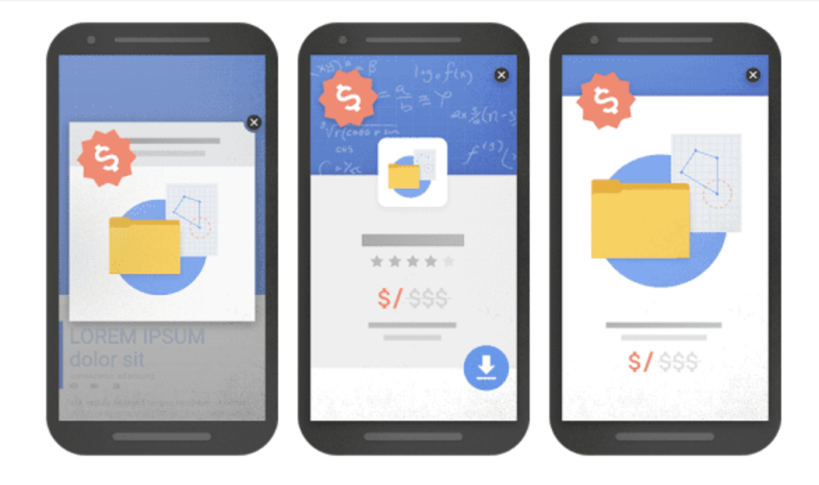
You have to be very careful with how you use popups on mobile devices. A simple slide-out popup that doesn’t block much of a desktop screen can completely cover a mobile screen.
Google is particularly serious5 about popups on mobile. In 2017, Google began penalizing websites that use “intrusive interstitials,” which is a fancy way of saying “elements that block the screen” (with exceptions for legal agreements, private content websites, and popups that are small enough to be ignored). It doesn’t like:
- When you show a popup that covers the page’s content, either immediately or after some delay.
- When you show a popup that has to be manually dismissed.
- When you show a popup that appears above-the-fold and pushes the main content downward (these are called welcome mats).

The Middle Ground
Just because popups come with some disadvantages doesn’t mean you can’t use them at all. But that also doesn’t mean you should set multiple popups to appear on every page. Your best bet is to implement a strategy somewhere in the middle.
We aren’t advocating that you completely erode the user experience to squeak out an extra 1% conversion rate. But it’s important to view the user experience as another tool to serve your website’s goals.
A good user experience means more people find and use your website, which helps that website fulfill its purpose. But the user experience is not the end goal. It only supports your goal of getting more leads, bookings, sales, etc.
This means it’s fine to sacrifice some of the user experience if you think it will help your overall goal. Yes, a small percentage of would-be customers may feel so strongly about your popups that they abandon your website, but properly made and well-timed popups can create enough extra conversions to cover that loss.
For instance, you might:
- Only use popups when you have an attractive offer, like a big sale, an event coming up, a special piece of content, or open enrollment for your course.
- Only display content that’s relevant to the page so visitors aren’t annoyed by something that doesn’t relate to them at all.
- Make your popups apparent, but small enough so they don’t distract the visitor from your content.
And like all marketing tactics, it’s important to measure. Watch your analytics to gauge the effects of your popups. If it looks like your popups are causing too much damage to the user experience, back off a little bit.
Besides, it’s important to keep in mind that users have options to disregard popups entirely. 200 million daily active users6 use an ad blocker when they surf the web. These tools block nearly all popups without alerting the user.
Popups in Gravity Forms
A popup is nothing more than an editable HTML element that displays based on pre-set parameters. You can put anything you like in it.
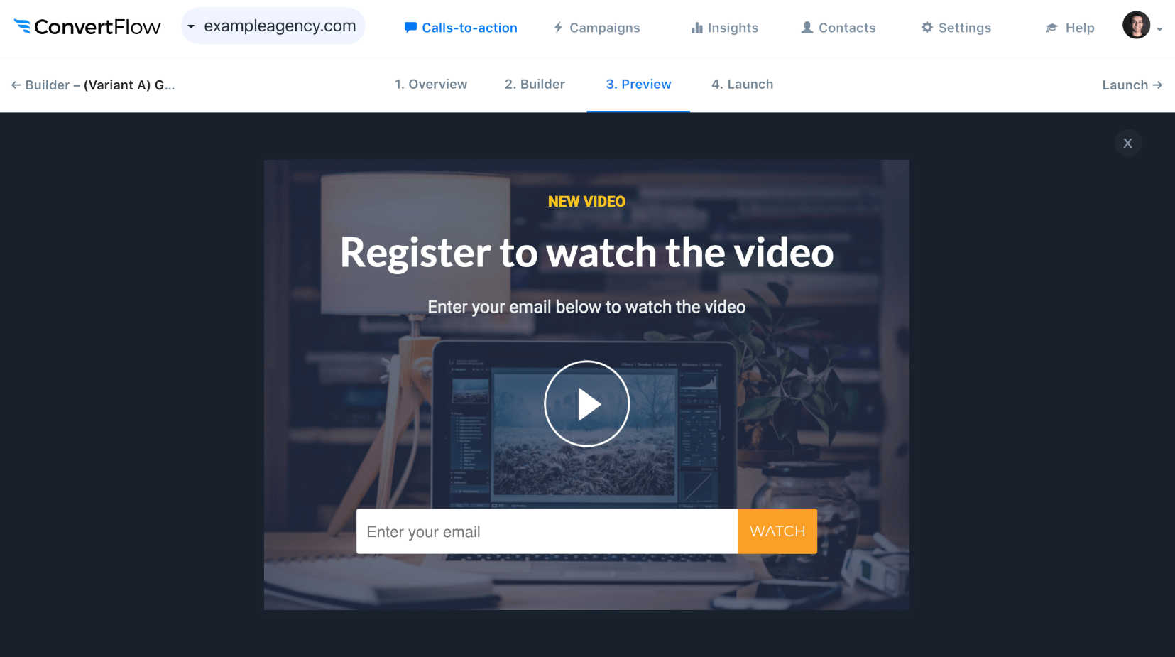
If you decide to add a popup to your website, we recommend filling it with a lead generation form. This gives users the opportunity to complete the form without navigating to a new page. You can use a simple form with a single field…

…or a more complex form with multiple fields.

The easiest way to add a Gravity Form to a popup is with the form’s shortcode. A shortcode is a little snippet of code that tells WordPress where to load special elements.
Here’s the basic syntax for a Gravity Forms shortcode: ![]()
Just paste that code in your popup editor wherever you want the form to display. Replace the number one in that example with the number of your form ID number. You can find your form’s ID number on your list of forms.

There are a lot of ways to customize your form’s appearance with the right shortcode syntax. Check out our full guide on creating shortcodes to learn more.
The Key Takeaway
So are popups valuable tools or annoying distractions? The truth is that they can be either depending on how you use them. We’ve laid out the advantages and disadvantages, and explained how to take a middle-of-the-road approach, so you’ll have to decide which is right for your business. As always, measure your results!
Sources

If you want to keep up-to-date with what’s happening on the blog sign up for the Gravity Forms newsletter!
"*" indicates required fields


