Tutorials -
 By
Published June 11, 2018
By
Published June 11, 2018
Mastering the Multi-Page Form With Gravity Forms
 All forms are not created equal.
Each form has a distinct purpose and intended use, which means that form design plays an important role in how well forms convert.
Short email opt-in forms — that only ask for a name and email, or just an email — are often higher converting than longer forms, for example. But in some cases, longer forms are actually preferable.
That’s where the multi-page (also known as the multi-step) form comes in.
When more information is needed, a multi-page form can improve conversion rates while still allowing you to ask as many questions as needed.
Here’s why multi-page forms work so well and how you can use them to your advantage.
All forms are not created equal.
Each form has a distinct purpose and intended use, which means that form design plays an important role in how well forms convert.
Short email opt-in forms — that only ask for a name and email, or just an email — are often higher converting than longer forms, for example. But in some cases, longer forms are actually preferable.
That’s where the multi-page (also known as the multi-step) form comes in.
When more information is needed, a multi-page form can improve conversion rates while still allowing you to ask as many questions as needed.
Here’s why multi-page forms work so well and how you can use them to your advantage.
Why Multi-Page Forms Work for Conversions
Multi-page forms are forms with multiple questions (more than 2) that are broken up by separate pages or sections. Here’s an example of a simple, two-step form for Quickbase’s free trial sign-up:
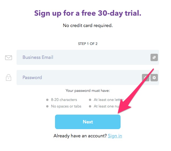
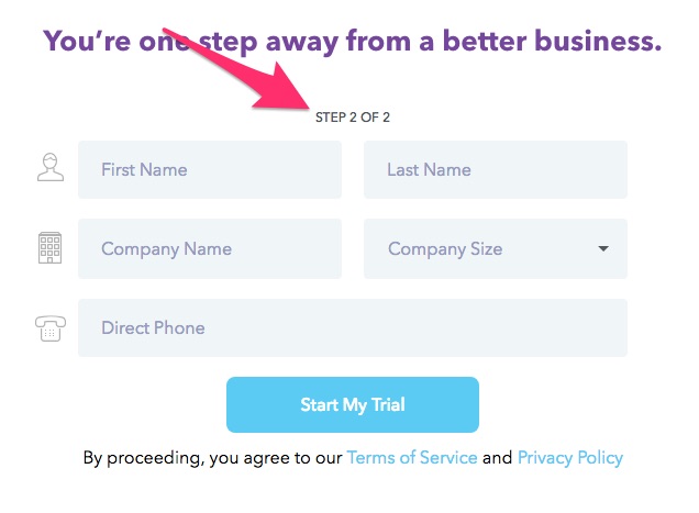 The purpose of a multi-page form is to quickly and easily collect additional information outside of of a name and email.
While multi-page forms are most often seen for things like online checkout processes, they can also be used for opt-ins (like Quickbase’s free trial), surveys, or other types of forms.
According to Instapage Founder & CEO Tyson Quick, breaking down longer forms into multiple steps reduces “psychological friction and [encourages users] to engage more with your brand.”
Beyond that, multi-page forms can also be great for conversions compared to one-step forms.
In one case study of an astroturf company’s single-page versus multi-page form, their multi-page form saw 214% uplift in leads when they broke down their form into multiple sections.
They reduce the first impression of long forms, as well as allow you to ask sensitive questions (email addresses, payment information, etc.) closer to the end of the form rather than at the beginning.
This reduces overwhelm for users, making them more likely to complete the form, which results in higher conversion rates.
In situations where you need more information from your users without overwhelming them, multi-page forms are the perfect solution.
That is, if you design them correctly.
The purpose of a multi-page form is to quickly and easily collect additional information outside of of a name and email.
While multi-page forms are most often seen for things like online checkout processes, they can also be used for opt-ins (like Quickbase’s free trial), surveys, or other types of forms.
According to Instapage Founder & CEO Tyson Quick, breaking down longer forms into multiple steps reduces “psychological friction and [encourages users] to engage more with your brand.”
Beyond that, multi-page forms can also be great for conversions compared to one-step forms.
In one case study of an astroturf company’s single-page versus multi-page form, their multi-page form saw 214% uplift in leads when they broke down their form into multiple sections.
They reduce the first impression of long forms, as well as allow you to ask sensitive questions (email addresses, payment information, etc.) closer to the end of the form rather than at the beginning.
This reduces overwhelm for users, making them more likely to complete the form, which results in higher conversion rates.
In situations where you need more information from your users without overwhelming them, multi-page forms are the perfect solution.
That is, if you design them correctly.
How to Design High Converting Multi-Page Forms
Designing a high-converting, multi-page form comes down to understanding how form elements work together to create a user-friendly experience. There are typically three or four “steps” to any multi-page form:- The initial page — This is where you gather basic information, such as name and/or email address.
- The second page — This is where you add additional questions to collect more information such as a phone number, educational or career details, age, gender, etc.
- The payment page (optional) — This is where payment and shipping information is included, if applicable.
- The confirmation page — This page signals to the user that the form was accepted and can also be used to give out further instructions or provide clarification.
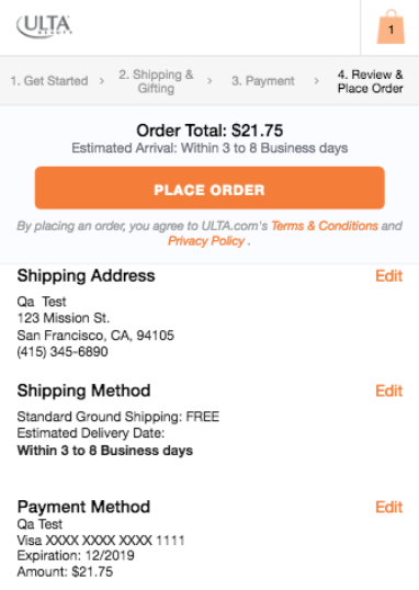 This form does a few things right when it comes to multi-page form design:
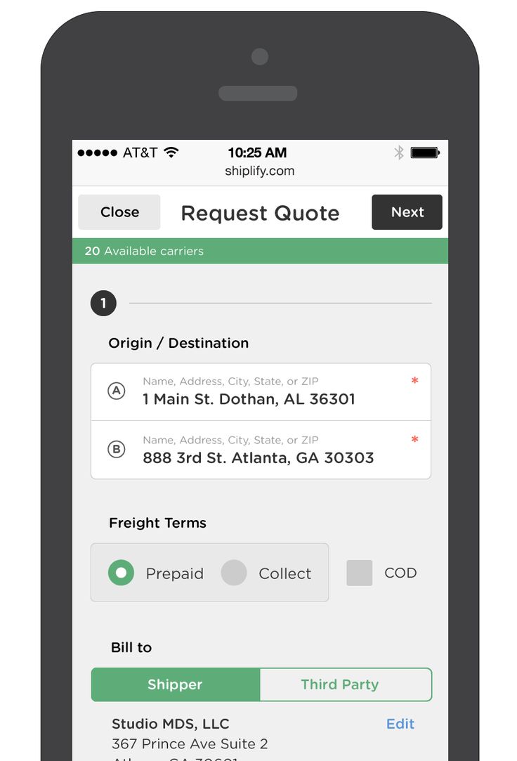
- It segments sections logically — basic contact questions are first, followed by increasingly sensitive information (shipping address, payment details, etc.)
- It includes a final review page so users can see their progress with links back to previous sections (in case edits are needed)
- It includes a progress bar at the top so users don’t get lost
1. Use as many pages as necessary to keep it “simple”
Because multi-page forms often contain more form fields than other types of forms, it’s important to segment those fields logically. Related questions should be grouped together in a way that provides clarity. With the example above, contact information was separated from payment information, even though some of those details are inevitably the same. You can also group content in other ways, like this example of an account creation form: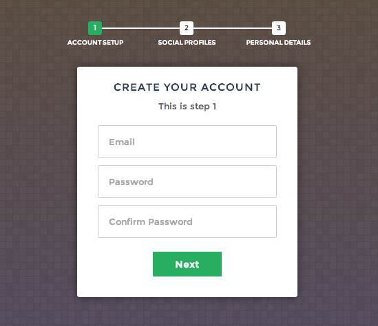 Consider how your form fields relate to one another when breaking things into sections.
This may mean adding as many sections, pages or tabs as needed to keep the design clutter-free while still collecting all the necessary information.
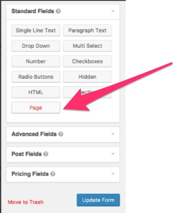
To add pages or sections to your forms in Gravity Forms, select “Page” from the Standard Fields section in the form editor after you’ve added all of your form fields (full guide here).
Consider how your form fields relate to one another when breaking things into sections.
This may mean adding as many sections, pages or tabs as needed to keep the design clutter-free while still collecting all the necessary information.
To add pages or sections to your forms in Gravity Forms, select “Page” from the Standard Fields section in the form editor after you’ve added all of your form fields (full guide here).
 This will allow you to segment your form into different steps or pages.
2. Add a progress indicator
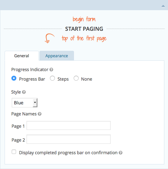
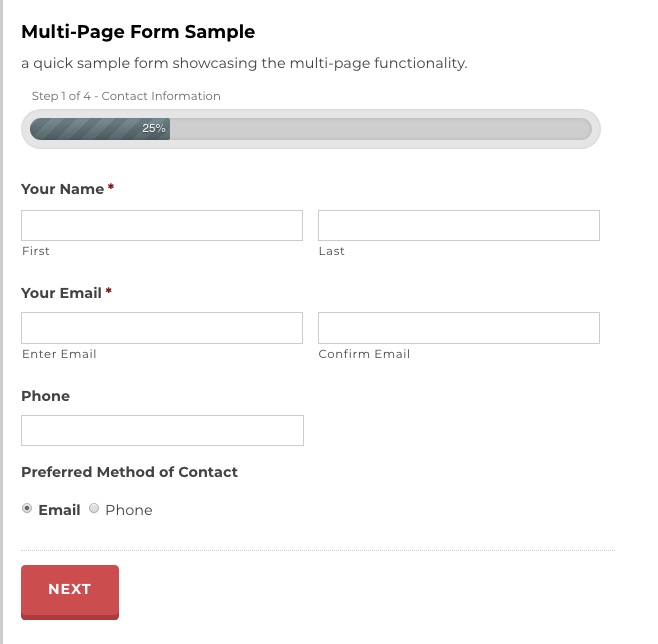
Multi-page forms can easily become overwhelming for users if they don’t know when the form will end. Including a progress indicator at the top of your form will reassure users that they’re almost done. You see progress indicators most often on checkout forms, but they can (and should) be used on any multi-page form.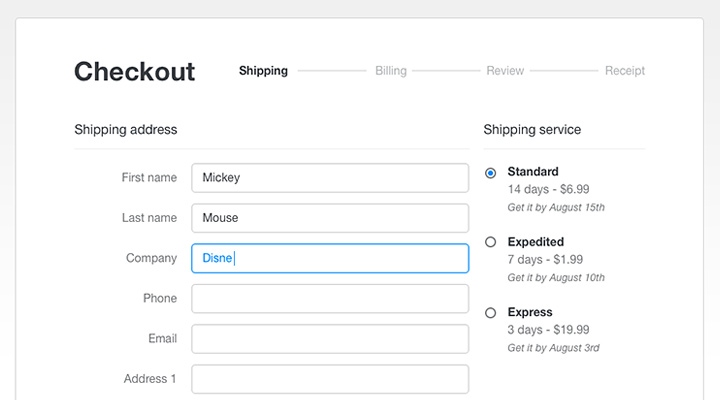 In Gravity Forms, you have multiple options for adding a progress indicator, including progress bar, steps, or nothing. You can see what the progress bar looks like using our Demo Page.
 You can also use plugins to adjust the style and display of your progress bars or steps as needed.
3. Use UX best practices for form design
Multi-page forms still require good user-experience (UX). This means that the way you design each individual page still matters. Including mobile-friendly design elements, like single-column form fields, form labels on top of each field, and clear CTA buttons is immensely important. This will help keep your forms user-friendly on any device, further incentivizing users to complete them.Designing Multi-Page Forms for Mobile
UX is particularly important for multi-page forms on mobile. For example, while tabs can be good for desktop multi-page forms, they’re not good for mobile users. Tabbed multi-page forms are often the most confusing for mobile users since it can be harder to tell which tabs are submitted when hitting the CTA button.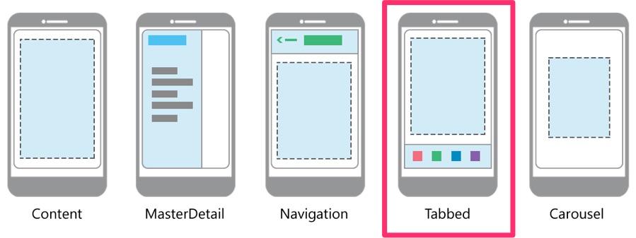 Will the button ‘Next’ fill all the form fields, or only the ones under a specific tab?
In one case study, conversions fell after test subjects became confused by three different tab options on a mobile form and were uncertain how the CTA buttons were related to each field.
Another issue with tabbed forms is that it can sometimes be hard to know if you’re entering information into the right tab if sections are not clearly defined.
Will the button ‘Next’ fill all the form fields, or only the ones under a specific tab?
In one case study, conversions fell after test subjects became confused by three different tab options on a mobile form and were uncertain how the CTA buttons were related to each field.
Another issue with tabbed forms is that it can sometimes be hard to know if you’re entering information into the right tab if sections are not clearly defined.
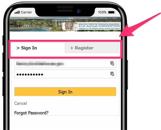 One best practice for multi-page mobile form UX is to break down sections clearly. This often will look more like a “segmented” single-page form rather than a true multi-page form, but the overall idea is the same.
Here’s a good example of a single-page mobile multi-step form:
One best practice for multi-page mobile form UX is to break down sections clearly. This often will look more like a “segmented” single-page form rather than a true multi-page form, but the overall idea is the same.
Here’s a good example of a single-page mobile multi-step form:
 There are ways to do true multi-page forms on mobile, too, as long as the UX and design are clear enough for the user.
Take this example of Noom’s multi-page sign-up form:
There are ways to do true multi-page forms on mobile, too, as long as the UX and design are clear enough for the user.
Take this example of Noom’s multi-page sign-up form:
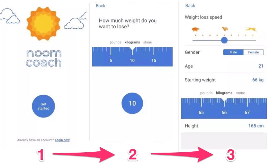 The first step is a simple button, followed by a slider step (that cleverly looks like a tape measure) on a new page, and additional information on a third page (with more sliders).
It also follows another important UX multi-page rule: one type of question per page.
Some multi-page forms will only have one or two questions per page, but even for those that need to include more form fields per page, the rule is “one idea per page.”
Though they replace traditional text boxes with more advanced features, like sliders, the basic principles are still the same: Pages are logically ordered based on information needed, and the design is clear and simple.
The only thing missing is a progress indicator, but in this case, it’s not a deal breaker.
Overall, this form succeeds as a mobile-friendly, multi-page form that’s easy for users to follow.
The first step is a simple button, followed by a slider step (that cleverly looks like a tape measure) on a new page, and additional information on a third page (with more sliders).
It also follows another important UX multi-page rule: one type of question per page.
Some multi-page forms will only have one or two questions per page, but even for those that need to include more form fields per page, the rule is “one idea per page.”
Though they replace traditional text boxes with more advanced features, like sliders, the basic principles are still the same: Pages are logically ordered based on information needed, and the design is clear and simple.
The only thing missing is a progress indicator, but in this case, it’s not a deal breaker.
Overall, this form succeeds as a mobile-friendly, multi-page form that’s easy for users to follow.