CSS Ready Classes for Gravity Forms
 By Colin Newcomer
Published February 6, 2023
By Colin Newcomer
Published February 6, 2023

Gravity Forms CSS Ready Classes are a handy feature that let you tweak and adjust your forms using pre-defined styles – no special technical knowledge needed.
In this post, we’re going to dig into Ready Classes in detail so that you understand exactly what they are, how they can benefit you, and how you can start using Ready Classes to adjust the forms that you’ve created with Gravity Forms.
Ready to learn more? Let’s dig in!
What Are Gravity Forms CSS Ready Classes? How Do They Help?
Gravity Forms CSS Ready Classes help give you additional control over a form’s style and layout beyond what the options in the Gravity Forms editor allow.
On a slightly more technical level, Ready Classes are pre-defined CSS styles that are included in the default form stylesheet.
Rather than needing to write your own CSS from scratch, all you need to do is add the relevant class name to the parent element and you can apply those styles to a field in your form.
The Gravity Forms editor already gives you a good amount of control over your form’s design. More on that in a second.
But with Ready Classes, you get even more options for controlling your forms.
So – what can you do with Gravity Forms CSS Ready Classes?
We’re going to dig into that in a lot more detail below, but here’s a rapid-fire list of some of the adjustments that you can make with Ready Classes:
- Change the style/layout of list items that appear in field types such as Checkboxes and Radio Buttons. For example, showing list items in multiple columns instead of one long list.
- Change text styling of form fields or confirmation messages. For example, you can add banners/alerts to draw attention to important information.
- Change how text displays. For example, you can display long text in a fixed height scroll box (great for terms of service).
- Hide fields. Most importantly, this works even when there are no Visibility settings for the field in the editor.
This is not a complete list. Below, we’ll go through everything in a lot more detail with plenty of real examples.
What You Can Do WITHOUT CSS Ready Classes
While CSS Ready Classes can give you access to some new layout options, it’s important to note that you can also access a lot of layout options directly in the Gravity Forms editor without needing to use Ready Classes. This is especially true since we released the new editor in version 2.5.
For example, in the past (prior to Gravity Forms version 2.5), you needed to use Ready Classes to create multi-column form layouts.
However, that’s now no longer the case because you can easily create multi-column layouts directly from the editor. All you need to do is drag a form field next to another one and the editor will create a multi-column layout for you.
You can do this for two-column layouts or layouts with more than two columns.
You’ll also get additional options in the field settings to customize the relative width of those columns. For example, you could make a two-column layout 50/50 or 30/70.
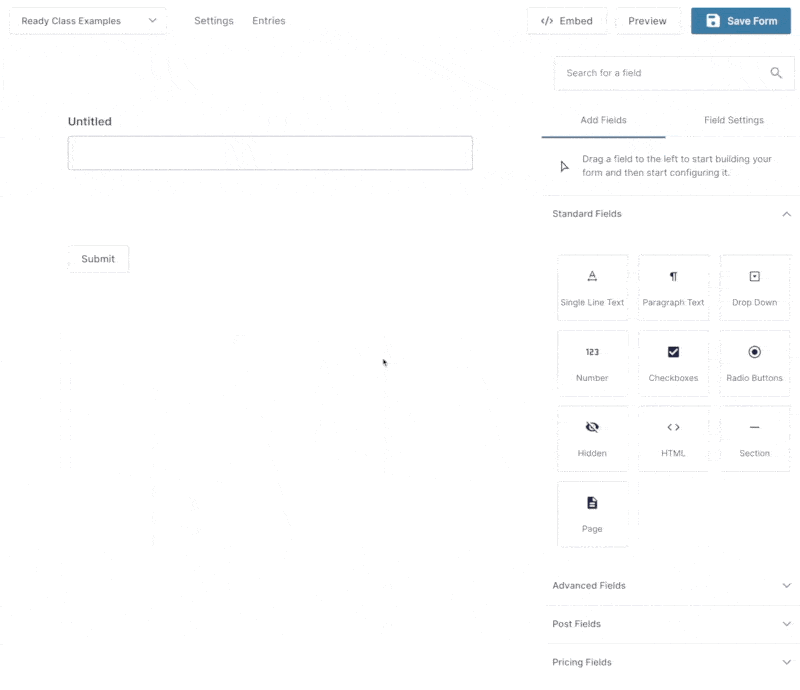
Beyond setting up multi-column designs, you also get lots of options in the Appearance settings of an individual field. Here, you can change the label visibility, description placement, and so on:
Some other field settings areas also might have useful options.
For form-wide settings, you can find options in the Form Layout section of the Form Settings area:
If you want even more control than what these options offer, you can turn to Ready Classes.
How to Use Gravity Forms CSS Ready Classes
Now that you know what Ready Classes are and how they can help you work with your forms, let’s dig into how to actually use Ready Classes when editing a form.
We’ll start with a general overview of how to add any Ready Class to a form. Then, we’ll dig into some specific examples of how to use some of the most popular Ready Classes.
Where to Add a Ready Class in Gravity Forms
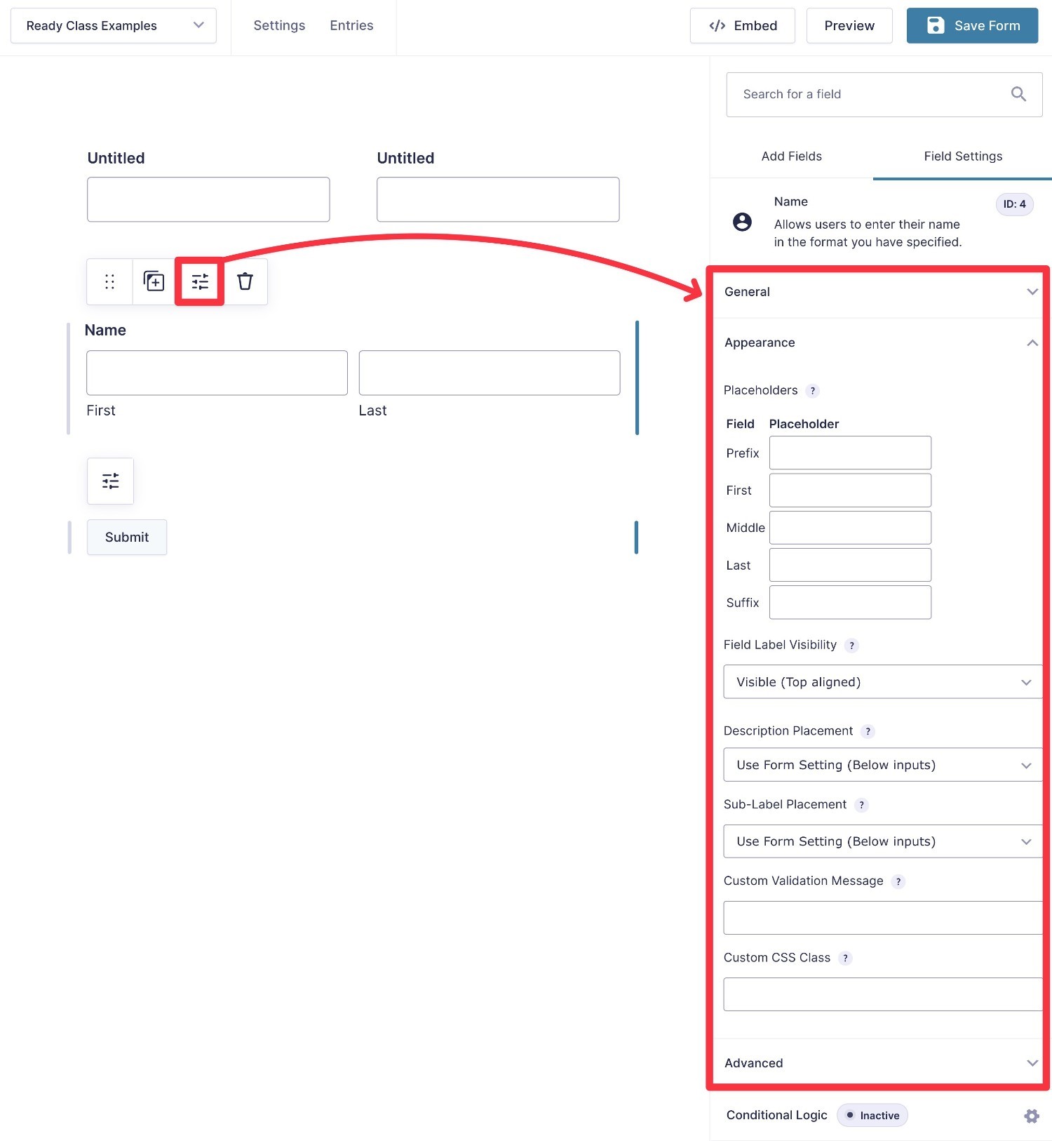
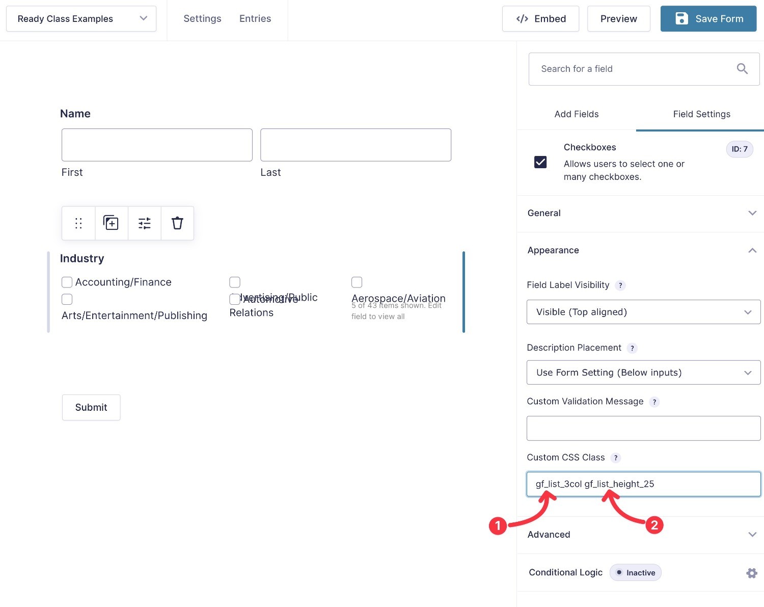
To add a Ready Class to an individual form field, you can use the Custom CSS Class field in the Appearance tab of a field’s settings:
- Click to open a field’s settings in the Gravity Forms editor.
- Expand the Appearance accordion section.
- Enter the relevant Ready Class in the Custom CSS Class field.
If needed, you can add multiple Ready Classes to a single form field.
To do this, add each class to the Custom CSS Class field, separated by a space.
Here’s an example:
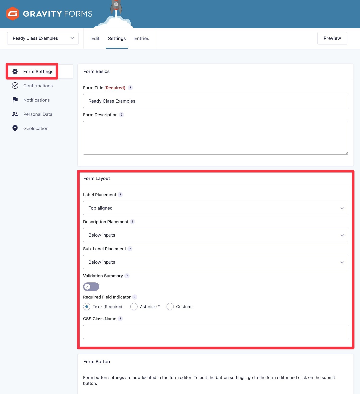
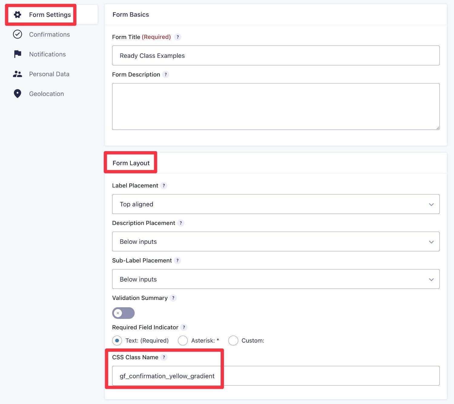
In a few cases, you might add the Ready Class at the form level, rather than at the field level. For example, you’ll do this if you want to customize the style of the confirmation message.
In these cases, you can add the Ready Class(es) to the CSS Class Name box in the Form Layout section of the Form Settings area:
- While in the form editor, expand the Settings dropdown menu and select Form Settings.
- Scroll down to the Form Layout section.
- Enter the relevant Ready Class in the CSS Class Name field.
How to Preview the Design of Ready Classes
It’s important to note that Ready Classes will not show the full design in the editor.
So, when you first add a Ready Class to your form, you might not see any changes or you might see some changes that don’t look quite right.
For example, in the screenshots above, you can see that the styling for the checkboxes looks a little weird in the editor, despite it working perfectly fine on the real form.
Here’s how to see what your Ready Classes will look like on your live form:
- Save the form by clicking the Save Form button in the top-right corner.
- Click the Preview button to the left of the Save Form button.
This will open a new tab that contains a basic preview of your form, complete with any relevant styling from the Ready Classes.
Next, let’s get into some specific tutorials for using Ready Classes to adjust your forms.
How to Adjust List Items With Ready Classes
One of the most helpful uses of Ready Classes is to adjust the formatting of list items in fields with multiple options, such as Checkboxes and Radio Buttons.
This can be especially helpful if the visitor has lots of items to select from, as you can group items into multiple columns and otherwise adjust their spacing.
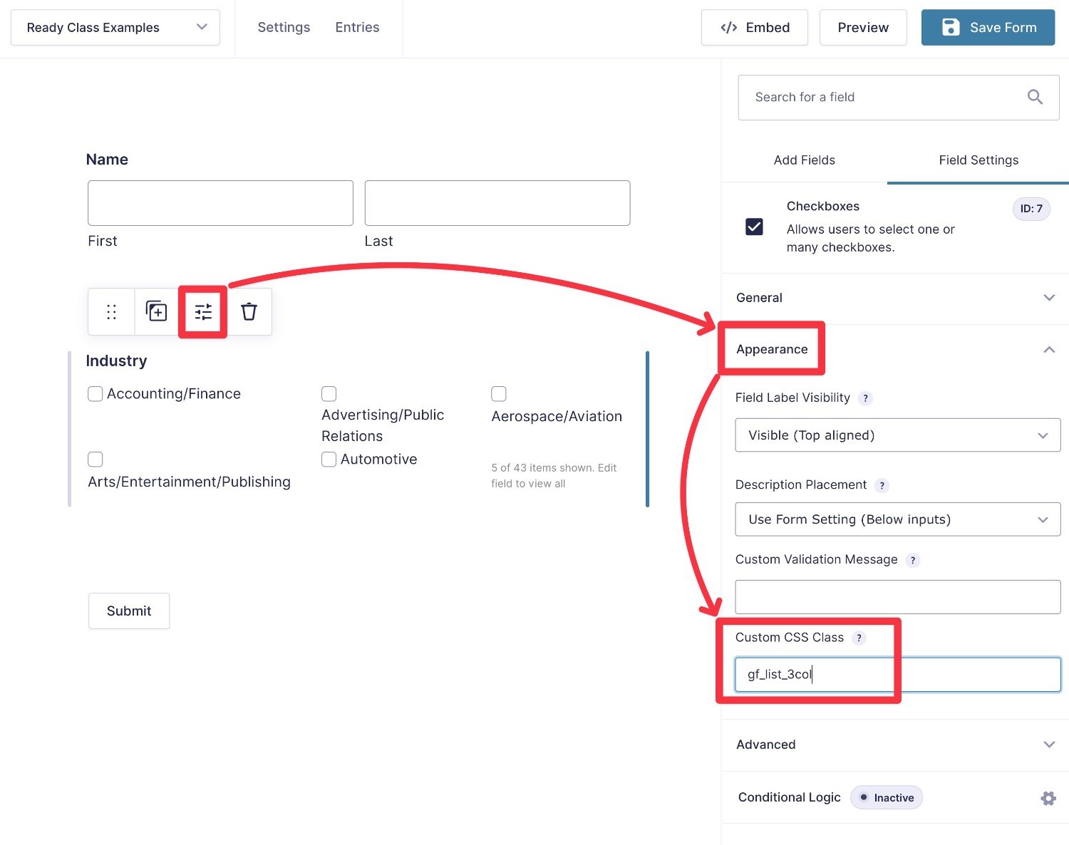
How to Separate Gravity Forms Lists Into Multiple Columns
To separate the list items in fields like Checkboxes and Radio Buttons into multiple columns, you get eight different Ready Classes:
gf_list_2colgf_list_3colgf_list_4colgf_list_5colgf_list_2col_verticalgf_list_3col_verticalgf_list_4col_verticalgf_list_5col_vertical
Both sets of Ready Classes divide your list items into multiple columns (anywhere from two to five columns, depending on the number). The only difference is in how your form fills the list items into those columns.
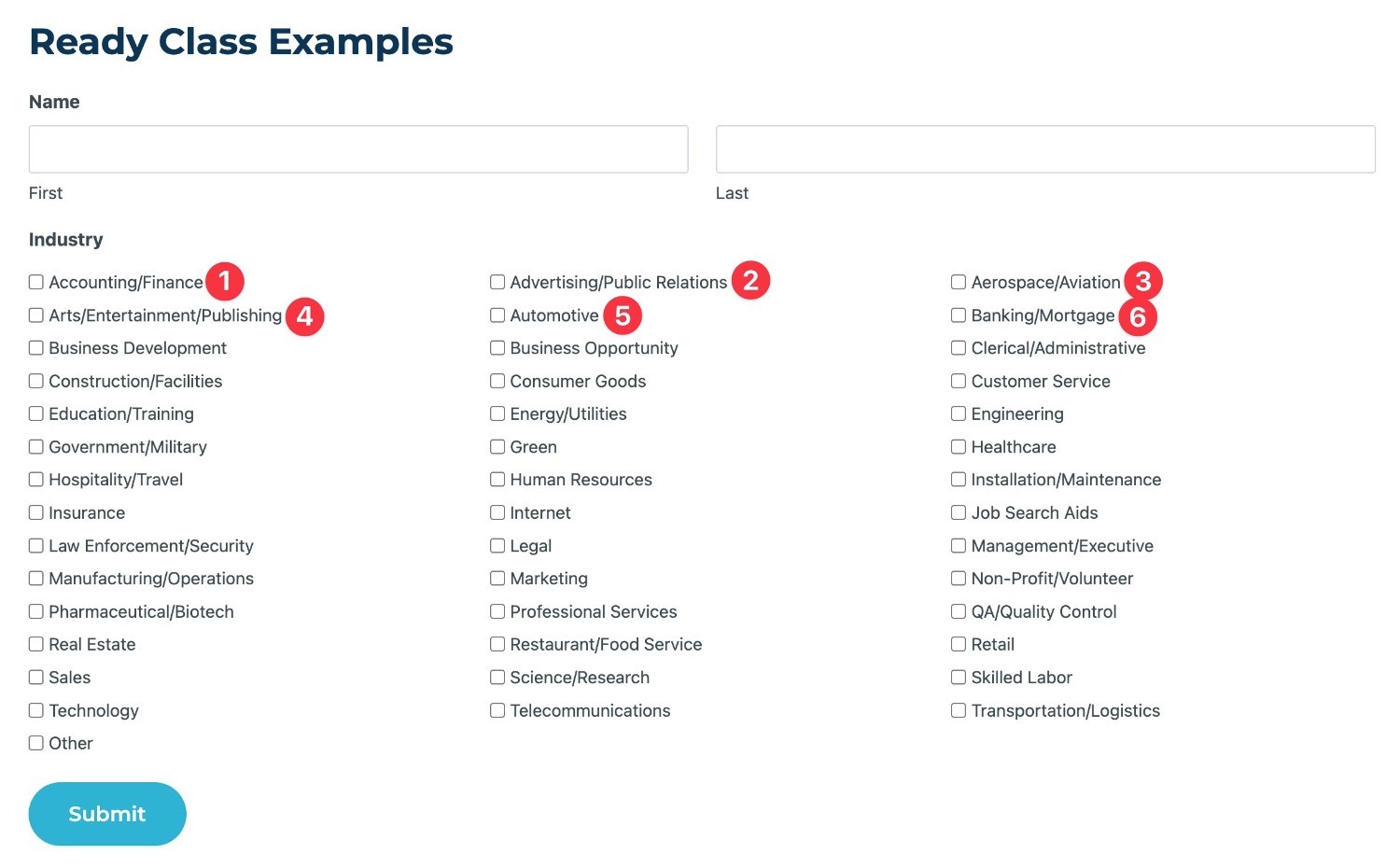
The first four Ready Classes will fill a list from left to right across the relevant number of columns. Then, it will fill descending in rows until the list is exhausted. Example below.
If you add the _vertical modifier, the form will fill from top to bottom in the left column first and then continue across the columns until the list is exhausted. It will also try to divide the items evenly across the columns as much as possible.
To make that a little clearer, let’s look at an example.
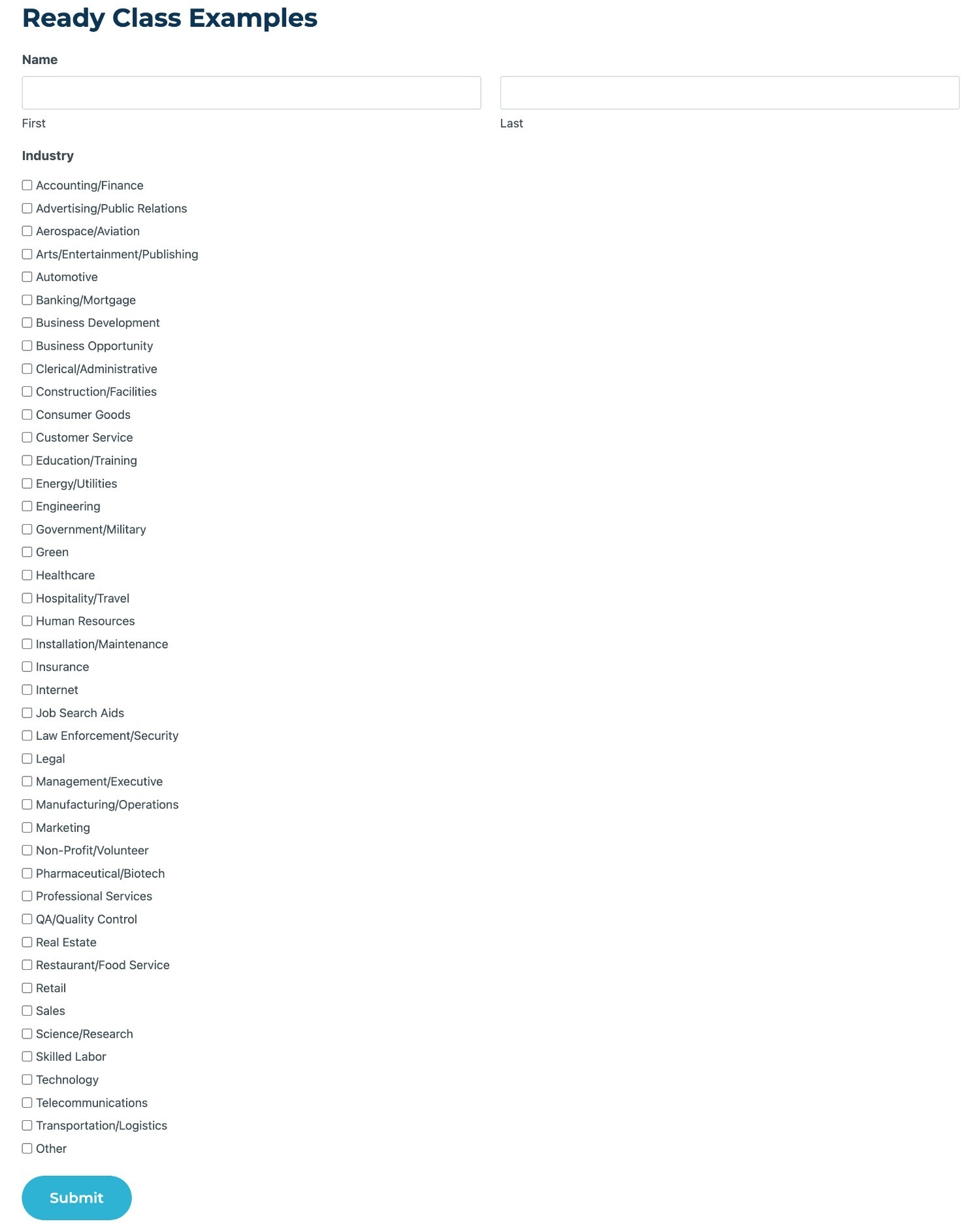
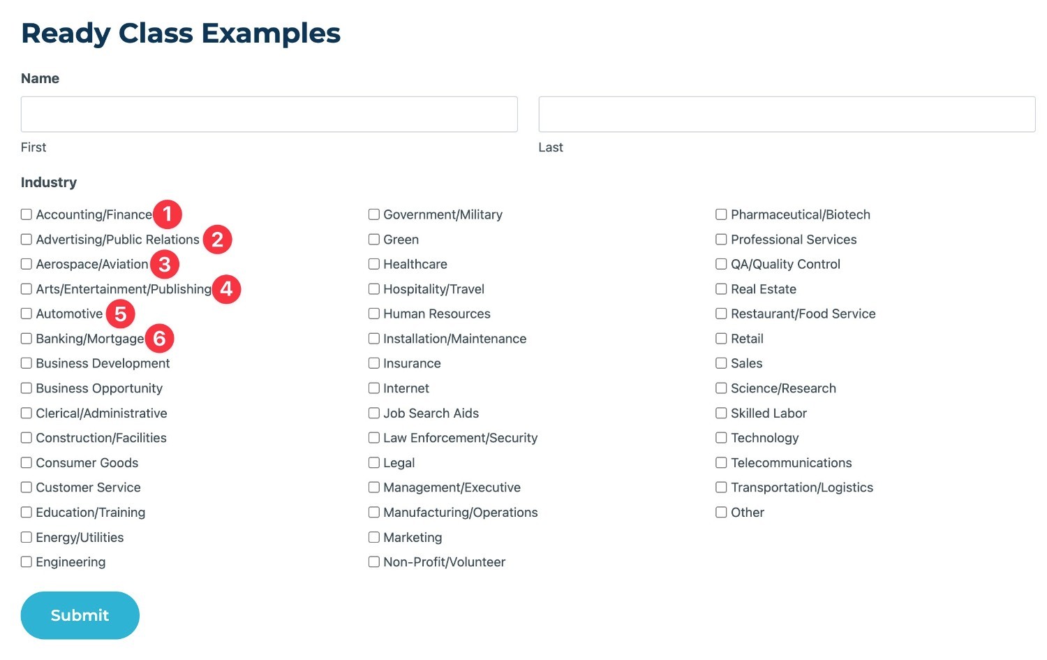
Here’s our basic form with 43 different options in a Checkboxes field:
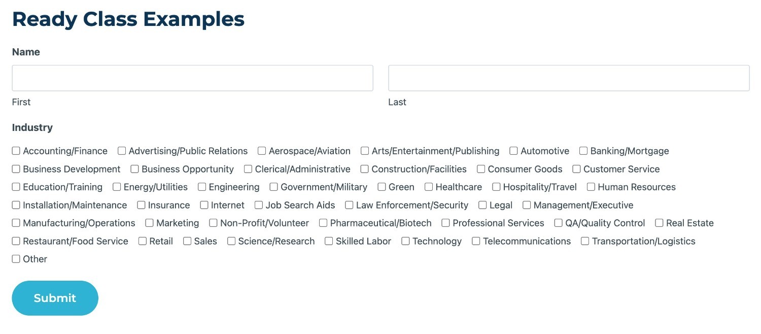
If you add the gf_list_3col Ready Class, the list items will fill the columns like this:
If you add the gf_list_3col_vertical Ready Class, the list items will fill the columns like this:
Use an Inline List Instead of Distinct Columns
For another option to separate list items, you can also display them as an inline list using the gf_list_inline Ready Class.
With an inline list, your items will not display in evenly spaced columns like the previous Ready Classes. Instead, they will fill the space as much as possible and then wrap into the next line.
Here’s what the same example from above would look like with the gf_list_inline Ready Class:
How to Change the List Height in Gravity Forms
For another way to adjust the list items, you can also change their height using the list height Ready Class.
This Ready Class applies a specific height value to all of the items in a list. This can be helpful for avoiding hanging float situations caused by lists of unequal height.
There are six different Ready Classes to adjust list height, with the only difference between them being the height number:
gf_list_height_25gf_list_height_50gf_list_height_75gf_list_height_100gf_list_height_125gf_list_height_150
How to Change Text Styling in Gravity Forms
You can also use Ready Classes to change text styling in certain areas of your form, such as customizing the confirmation message or highlighting alerts in the form text.
How to Add Alerts/Banner Messages to Gravity Forms
For some forms, you might have important information that you want to draw special attention to.
To help you add these types of highlights, there are five different Ready Classes to highlight an HTML field and its contents with different colors:
gf_alert_greengf_alert_greengf_alert_redgf_alert_yellowgf_alert_gray
For example, here’s a preview of a form without any highlighting:
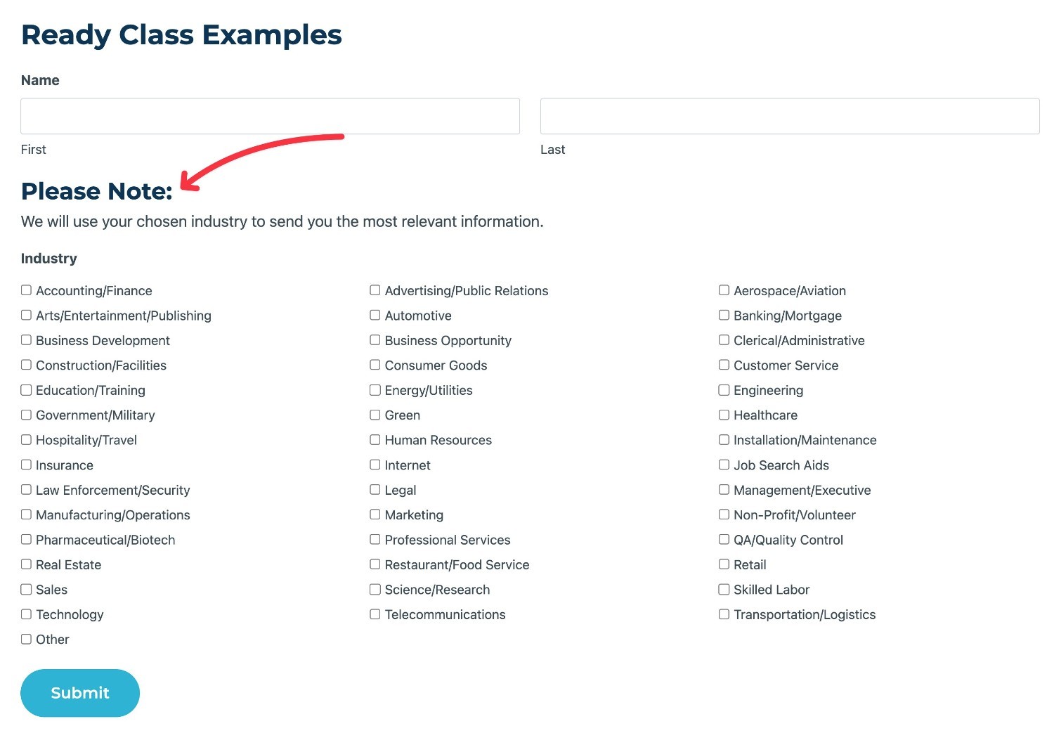
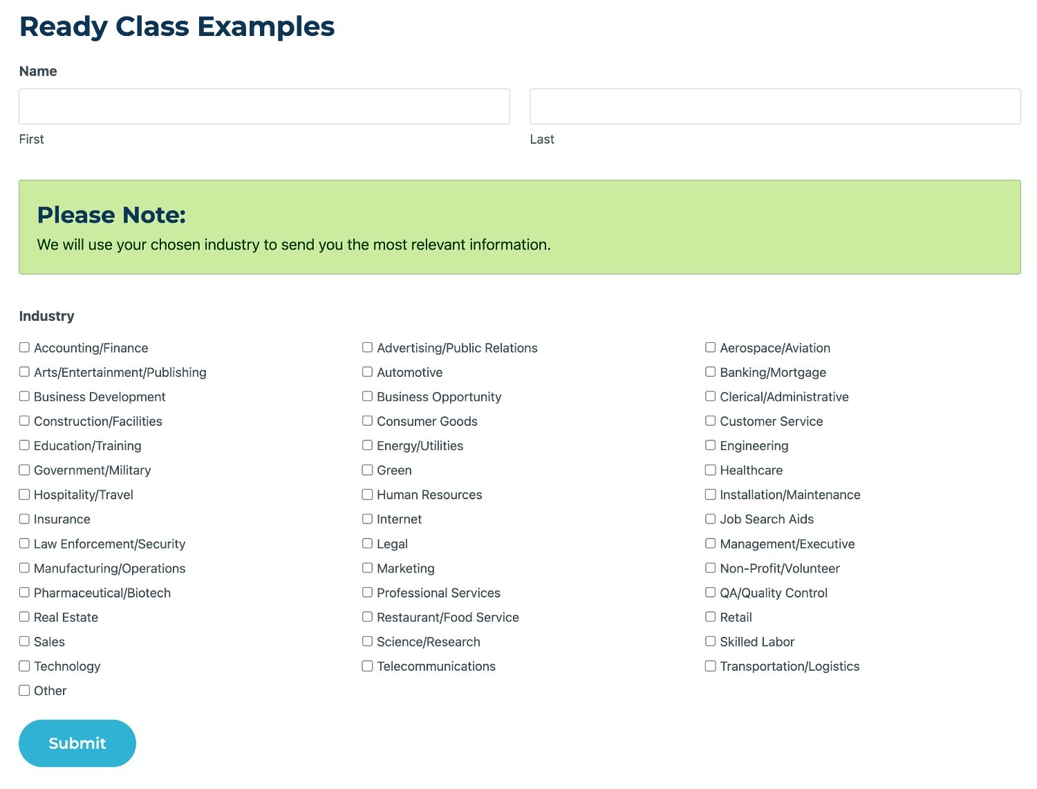
If you wanted to highlight the field in green, you would add the gf_alert_green Ready Class to its settings.
Then, the field will be highlighted in green like so:
How to Change the Confirmation Message Style in Gravity Forms
In addition to highlighting HTML fields, you’ll also find similar Ready Classes to change the background color of a form’s confirmation message to turn it into a banner of the associated color.
For confirmation messages, Gravity Forms offers four different ready classes for different colors/gradients:
gf_confirmation_simple_yellowgf_confirmation_simple_graygf_confirmation_yellow_gradientgf_confirmation_green_gradient
Instead of adding these Ready Classes to the settings of an individual field, you’ll add them to the CSS Class Name field in the form-wide Form Settings area.
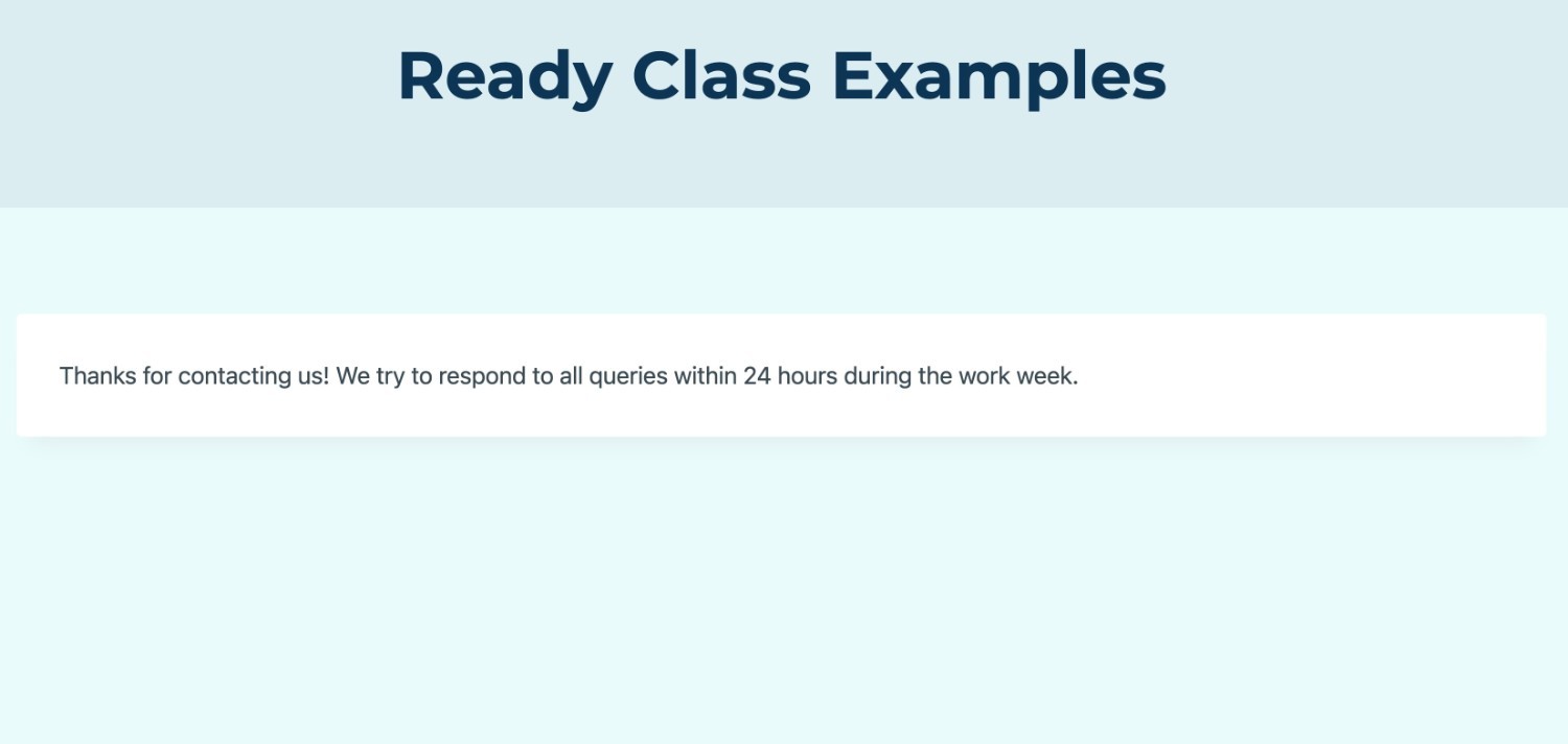
Here’s a form’s confirmation method without the Ready Class:
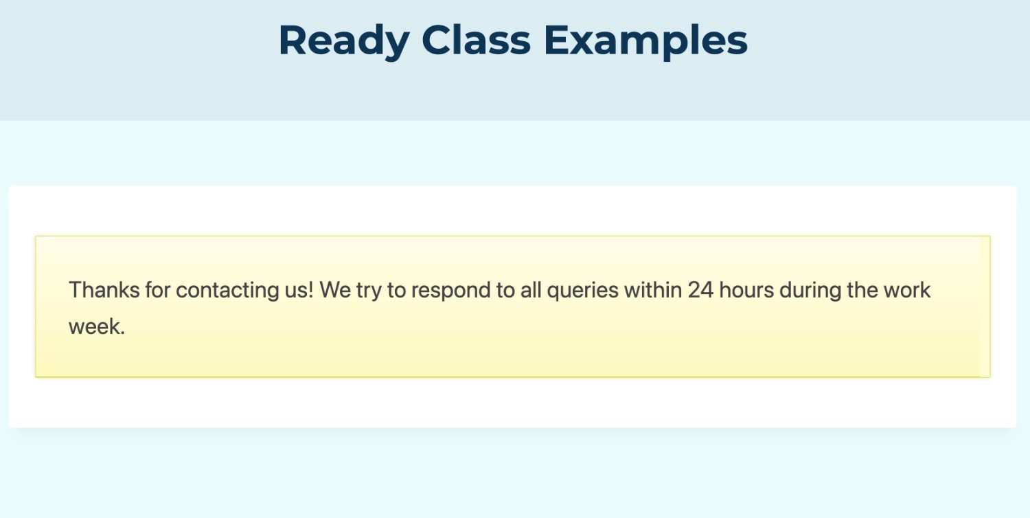
And then here’s what that same confirmation message looks like after adding the gf_confirmation_yellow_gradient Ready Class:
How to Use Other Notable CSS Ready Classes
Finally, there are a few other Gravity Forms CSS Ready Classes that don’t fit neatly into the sections above.
Let’s go through how to use them…
How to Scroll Text In a Fixed Height Box (Terms of Service)
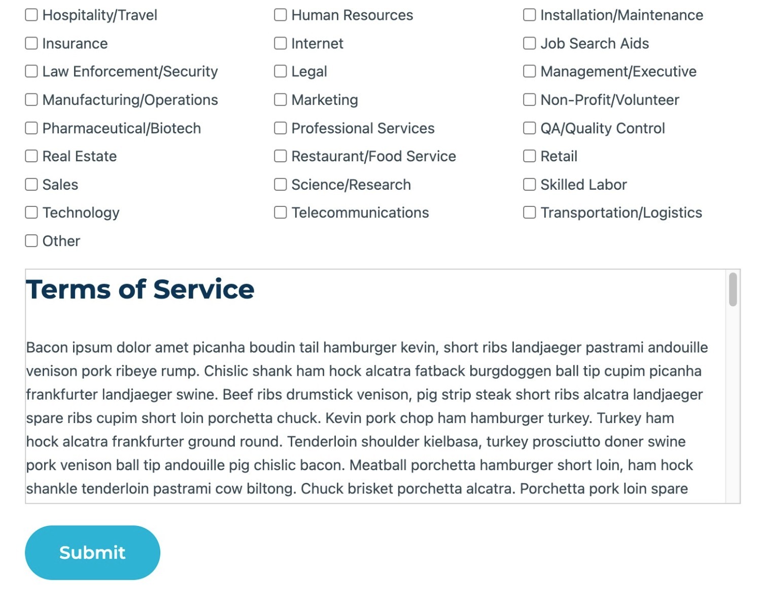
The gf_scroll_text Ready Class lets you convert text in a Section Break field into a fixed height box that will show a scroll bar if the height of the text content is greater than the height of the box.
This is most useful for details such as a Terms of Service agreement, where you need to display a lot of text to the user but you don’t want to make it take up a huge vertical area.
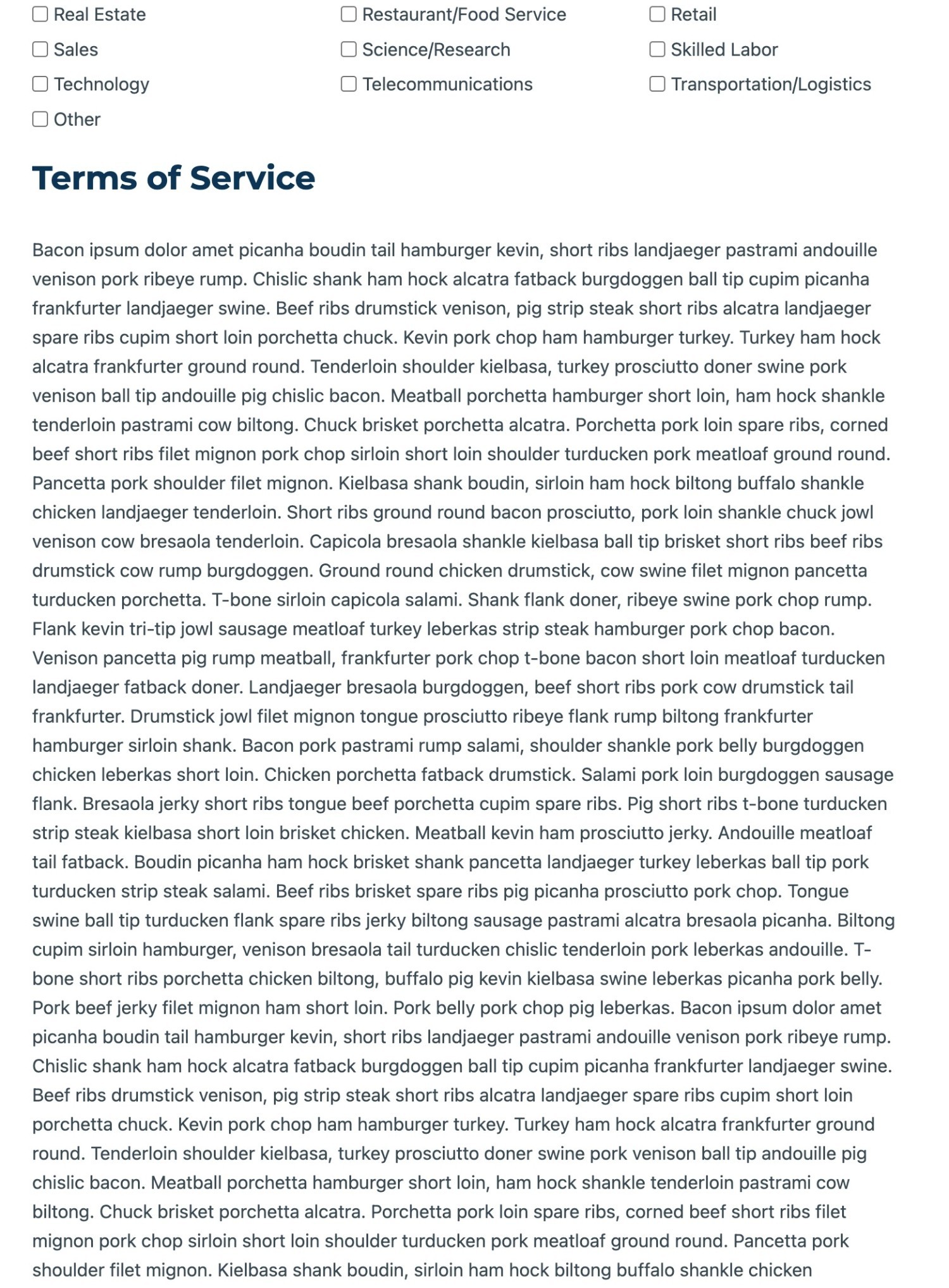
For example, consider lengthy text like this:
By adding the gf_scroll_text Ready Class to the Section Break field’s settings, you could convert it into a scrolling fixed height box like so:
How to Hide the AM/PM Selector in a Time Field
By default, the Time field includes an AM/PM selector that lets users choose the relevant option. If you want to hide this from the frontend of your form, you can add the gf_hide_ampm Ready Class to the Time field’s settings.
Note – this will only hide the field on the form. It will still be displayed in the form entry table in your backend dashboard.
How to Hide a Field When the Visibility Setting Isn’t Available
In some situations, you might want to hide a field from the frontend of the form.
Most of the time, you can do this without needing Ready Classes. Instead, you can use the Visibility options in the field’s settings:
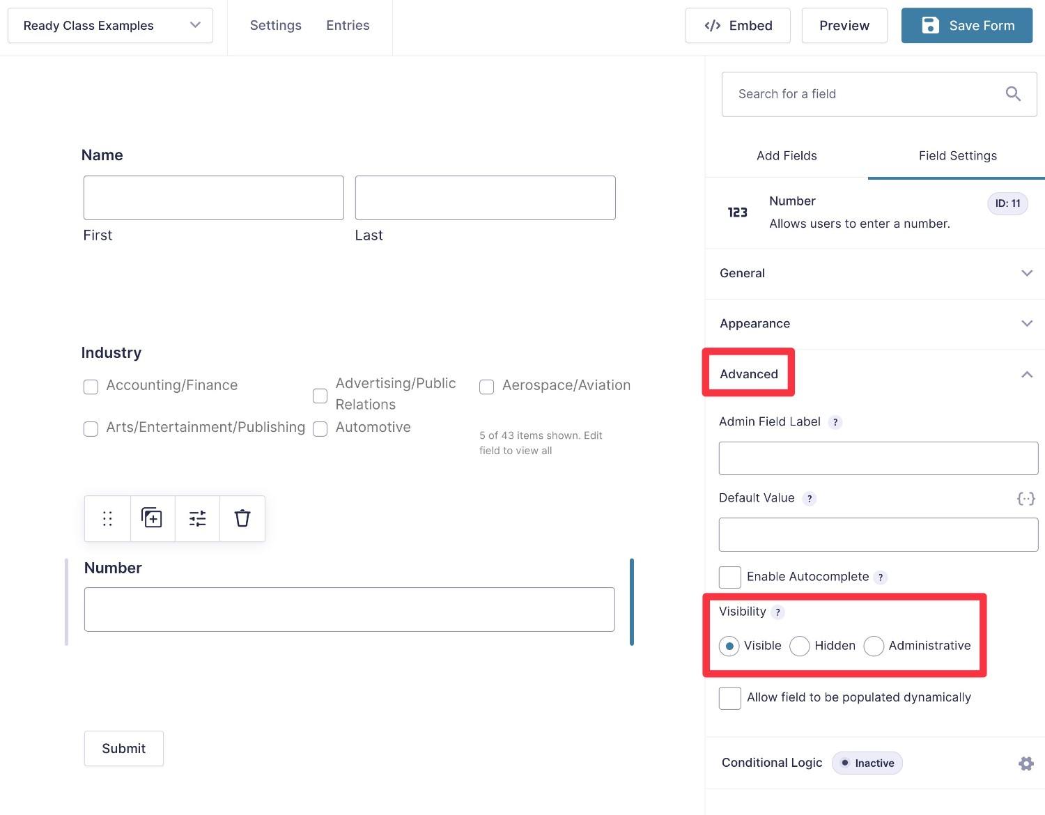
However, there might be some situations in which you can’t access the Visibility settings for a field that you want to hide, such as product fields.
In these cases, you can add the gf_invisible Ready Class to the field to hide it from the frontend.
How to Hide the “Characters Left” Counter Under Paragraph Fields When Using Maximum Characters
By default, Gravity Forms will display a “Characters Left” counter underneath a Paragraph field when you set a maximum character limit (or in other locations, depending on your chosen form label position settings). As the user types, the counter will count down the remaining characters.
If you want to hide this counter, you can add the gf_hide_charleft Ready Class to the Paragraph field’s settings.
Get Started With Gravity Forms CSS Ready Classes Today
While the Gravity Forms editor already lets you control your form’s styling and set up multi-column designs, Gravity Forms CSS Ready Classes can give you even more control over different areas of your forms.
Rather than trying to write your own CSS from scratch, all you need to do is add the Ready Class/es and you’re off to the races.
If you’re already a Gravity Forms user, you can start using Ready Classes today on all license plans. There are no add-ons to install – everything that you saw above is available with just the core Gravity Forms plugin.
If you’re not a Gravity Forms user yet, here are two ways that you can get started:
- Purchase a Gravity Forms license and install the plugin on your site.
- Spin up a free, fully functioning demo site to experience Ready Classes plus all of the other Gravity Forms features and add-ons.

If you want to keep up-to-date with what’s happening on the blog sign up for the Gravity Forms newsletter!